Café en Madrid
The second of a series, the header image from the Articles section originates from a photo that conjures up great memories with international friends. This is Café en Madrid…
The second of a series, the header image from the Articles section originates from a photo that conjures up great memories with international friends. This is Café en Madrid…

During my six-year tenure at Wired, we were acquired twice. Once by Lycos, then Lycos by Terra, a giant Spanish media portal. My position managing U.S. design standards opened up several opportunities for travel to Terra’s headquarters in Madrid. There, my local colleagues introduced me to the tradition of hopping from bar to bar to sample the tapas at each one, all while sharing stories, exploiting our language differences, and pulling practical jokes on each other. I speak just enough Spanish to communicate fairly well, but the team at Terra taught me the language of Spanish design. Planchetas, reglas, marcas, y más. I treasure their friendship.
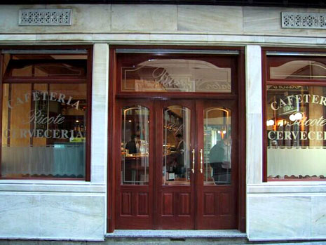
I love doorways and windows, and the typography that often graces their existence. While sightseeing on my own in Madrid (and later in Barcelona) I was enamored with the store fronts of many bars and cafes that make up so much of the Spanish urban livelihood. If I remember correctly, this beautiful cerveceria was just a stone’s throw away from Puerta del Sol.
Aside from the fact that one of the CSS techniques I wrote about uses “Doors” in the title, I think articles and tutorials are the doorways and windows which enable us to see and enter a different world. So this photo seemed appropriate to use as a base for the Articles section header. This header makes use of the most aggressive motion blur of any of them. Although I was going for texture and color (not recognizable imagery) I still enjoy having a purpose behind the imagery I use, no matter how abstract it becomes.