Last Updated: 10/26/2002 5:33:51 PM EDT
Wired News is about to take a long overdue step into the land of Web standards. We hope others are encouraged to follow as we help push the Web to a higher ground. In addition to the significant facelift, this redesign comes tightly bundled with an about-face shift to W3C-compliant XHTML and a total reliance on CSS (Cascading Style Sheets) for all page layout and design details. This redesign proves that large, content-heavy, database-driven, high-traffic, ad-supported websites can make the switch to Web standards and reap the benefits as many smaller independently-run sites have already done.
The use of XHTML (a reformulation of HTML in the powerful XML format) and CSS brings significant benefits to Wired News, our loyal base of users, our advertisers, and ultimately to the Web community at large. These benefits include backward and forward browser compatibility, greater accessibility and support for multiple browsing environments, easy portability to other media formats such as PDAs and other wireless devices, inreased speed for download time, and decreased serving and maintenance costs.
By placing all style rules into external CSS files, the structured data of each page and the style rules which define the look and feel of that data can be manipulated separately. Making one change in the CSS can propagate a design change instantly throughout thousands of pages. This means redesigns could theoretically take place in minutes, rather than the normal period of weeks or months, and also enables smaller design tweaks to be made easily without needing to restructure any HTML markup. External style sheets will also allow Wired News to tip its hat to prior HotWired designs, effortlessly changing entire color schemes of the site each day of the week.
These changes were possible with version 5.0 browsers, but the release of standards-compliant 6.0 and 7.0 browsers has finally given web content producers a suite of browsing tools capable of supporting a one-version many-media content strategy. The need to produce multiple content versions tailored for increasingly disparate browser capabilities has become a thing of the past. Though Wired News hides style sheets from browsers which may not completely support or appropriately render pages using CSS, the content throughout our site is accessible to all browsers. Standards-compliant browsers will see the new design in all its glory, while non-compliant browsers will still get all the content in a stripped down design, free of style rules which are not adequately supported.
We have not yet tackled every possible checklist item. But we have taken some major steps toward making Wired News a more accessible site. Compare this list with one provide by the W3C Web Accessibility Initiative (WAI) group (http://www.w3.org/TR/WCAG10/full-checklist.html).
These measurements were taken on September 16, 2002 from:
| Type | Front Door | Story Page | ||
|---|---|---|---|---|
| Old Design | New Design | Old Design | New Design | |
| All HTML | 49.9 KB | 24.5 KB | 31.8 KB | 19.1 KB |
| Images (n/i ads) | 61.3 KB | 38.4 KB | 7.73 KB | 13.0 KB |
| All CSS* | 0 KB | 30.3 KB | 0 KB | 30.3 KB |
| JavaScript* | 0 KB | 2.7 KB | 0 KB | 2.7 KB |
| Totals | 111.2 KB | 95.9 KB | 39.53 KB | 65.1 KB |
| Totals (non-cached) | 111.2 KB | 62.9 KB | 39.53 KB | 32.1 KB |
* Denotes items which are cached after the first visit, and not usually downloaded by the client again.
This Wired News design heavily relies on the use of CSS (Cascading Style Sheets). In fact, all style information should be completely contained within one or more CSS files. This means that no style or formatting information should be present within the HTML, other than basic element tags allowed within the W3C XHTML 1.0 Recommendation (http://www.w3.org/TR/xhtml1/). "Style information" for these purposes includes any of the following:
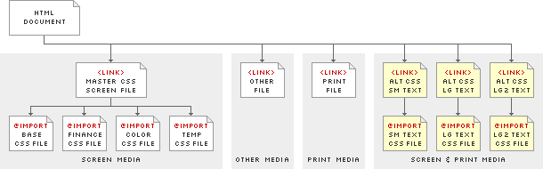
Style information has been split up into multiple CSS files to cover different media types, and call out specific color information required for changeable color schemes.
Note: All Wired News CSS files are prefixed with "wn" to keep site association clear.
CSS2 allows style information to be assigned to specific media types via the media attribute within the <link> element Media types can include screen, print, handheld, projection, tv, and a few accessibility-related types intended to help users with physical disabilities. Specific styles can be created for each media type, and each file can be linked in the header of the HTML document. The user agent will then choose the correct style information based on its own target medium. (Full explanation available in the W3C CSS2 specification at http://www.w3.org/TR/REC-CSS2/media.html.)
Wired News currently breaks out style information for three media types (screen, print, and aural/braille/embossed), and groups each set of style information into three separate files. All base style information for media="screen" (used to render page on screen) is contained in a file named wnScreenBase.css. This will be the base CSS file for all web pages we display to normal computer screens (the majority of cases). A secondary base CSS file named wnScreenFinance.css covers all financial information within Wired News. Style information for media="print" (used anytime page is sent to printer) is contained in a file named wnPrint.css.
Wired News does not currently specify much style information for browsers specifically tailored for users with visual disabilities. However, we will link to one CSS file, named wnOther.css, which will be reserved for specifying more detailed style information at a later date. This file contains style information for media="aural,braille,embossed". Currently, this style sheet will be used for suppressing the WaSP message that alerts users that our content is only "visible" within graphical browsers that support Web Standards. This message could be offensive and even incorrect in certain situations.
If used alone, the base style information within wnScreenBase.css will format everything using grayscale color values. To render the style information in color, a separate color CSS file must be used in addition to the base CSS file. Specific color schemes are contained within separate CSS files named wnColor.css. Color CSS files are stored within unique subfolders named with the color scheme name. Each color scheme is named with an "cs" (for color scheme), followed by the number or name of the specific scheme. (See Color Schemes below for a more detailed explanation). Color scheme #1 is contained in a CSS subfolder named cs1, color scheme #2 is contained in cs2, etc. For specific events or holidays, we may develop alternative color schemes with specific names (like "csJuly4"), so the color CSS file might exist within a subfolder with a name of csJuly4.
Wired News provides three Alternate Style Sheets for the purpose of altering text size for the entire site. The first CSS file is titled "Small text size" and reduces body text size within the three columns (explained in Column Structure) relative to the keyword size set for the body element. The second and third CSS files are titled "Large text size" and "Larger text size" respectively, and enlarge body text size within the three columns relative to the body element.
External style sheets can take on one of three forms:
rel attribute set to "stylesheet" and no title attribute specified, the style sheet is persistent, and will always be applied to the document.rel attribute set to "stylesheet" and those which are named with a title attribute, the style sheet is preferred, and will be applied to the document by default, unless the user has selected an alternate style choice.rel attribute set to "alternate stylesheet" and those which are named with a title attribute, the style sheet is an alternate stylesheet. Alternate style sheets are disabled by default, but become one of the applicable stylesheets for that document.Preferred and Alternate style sheets will show up in certain browsers (for now, limited to Netscape 6.x+ and Mozilla 1.x) as one of the style options under the "View" menu. Browsers which have not offered a means of picking an alternate style sheet must be addressed in another way. Wired News uses a JavaScript cookie-based "style sheet switcher" — orignally written and made available by Paul Sowden — to allow users another means of selecting either of the two alternate style sheets. (More information about use of the StyleSwitcher is available at http://www.alistapart.com/stories/alternate/)
rel and title attributes specified.Screen media CSS files for each color scheme are grouped together and imported via one master CSS file named wnScreen.css. The master file pulls in the base CSS screen file (wnScreenBase.css), a secondary base CSS screen file for table-based financial info and contact forms (wnScreenFinance.css), a CSS file for the network bar (inb.css), and the color-specific CSS file (wnColor.css). This master file uses a CSS2 @import rule to pull in other required CSS screen files. Use of this method is what hides all CSS information from browsers which do not adequately support CSS. Print, Alternate, and Other CSS information is imported directly via the <link> tag, since any value specified for the media attribute other than "screen" will also get ignored by browsers such as Netscape 4.x.
Note: Since master screen CSS files contain references to a specific color CSS file, each master screen file exists in the same subfolder as the color file.
Therefore, each HTML file for Wired News needs to link to six external master CSS files for:
This should be done with the <link> tag, ensuring values are also declared for rel, type, and media attributes. The link tags should be constructed very similar to the following:
  <link rel="stylesheet" type="text/css" media="screen"

      href="/v/20020914/css/cs1/wnScreen.css" />

  <link rel="stylesheet" type="text/css" media="aural,braille,embossed"

      href="/v/20020914/css/wnOther.css" />

  <link rel="stylesheet" type="text/css" media="print"

      href="/v/20020914/css/wnPrint.css" />


  <link rel="alternate stylesheet" type="text/css" media="screen,print"

      href="/v/20020914/css/wnSm.css" title="Small Text" />

  <link rel="alternate stylesheet" type="text/css" media="screen,print"

      href="/v/20020914/css/wnLg.css" title="Large Text" />

  <link rel="alternate stylesheet" type="text/css" media="screen,print"

      href="/v/20020914/css/wnLg2.css" title="Larger Text" />
Note: Alternate style sheets have a different value for the rel attrubute. Wired News specifies that these alternate style sheets apply to both screen and print media.
By nature, CSS is a very powerful formatting language, yet one which is very simple to read and quick to learn. A glance at some of the attributes of any declaration reveals a very easy-to-understand grammar: margin, padding-left, font-size, background-image, border-top-color, etc.
Wired News CSS files use comments to break the declarations up into logical groupings. Groupings exist for elements such as formatting structure, links, header, navigation, titles, story page elements, images, financial info, etc.
Now that all style information is entirely contained within CSS, the color scheme of the site can be changed by simply pointing to a CSS file in a different subfolder, and swapping out a few images. Because of this simplicity, Wired News now tips its hat to the former days of HotWired design by changing the entire color scheme on a daily basis. Five preset color schemes are available for each day of the work week, and a sixth scheme for a weekend edition. The general layout of the site remains exactly the same, but the color for key design elements can change drastically.
Each color scheme is named with an "cs" (for color scheme), followed by the number or name of the specific scheme. Thus, scheme #1 is named "cs1", scheme #2 is "cs2", etc. Occasionally, Wired News may alter the normal routine of color patterns for special events, holidays, or paid promotions. These special schemes will be named something more specific, such as "csJuly4" for quick identification.
In order to make the change of color-specific images as easy as possible, each unique image is given one name that is identical for every color scheme. To keep images separated and easily distinguishable, all color-specific images for each theme are grouped into a subfolder of the images folder. Each subfolder carries the name of the color scheme for which it holds images. Thus, images specific to scheme #1 are found in a directory such as /wired/images/cs1/. Images which are not specific to one color scheme (generic images, story art, Wired magazine covers, etc.) should be placed in the root images folder, or within any other pre-established filing system.
Note: This convention is also used for color-scheme-specific CSS files.
Current preset schemes use the following names and color palettes. Use the 'view scheme' link to see the design templates in that color scheme.
The newest and most important presentational feature CSS enables for Wired News is a flexible multi-column layout, without the need of tables to create that layout. Through the latter half of the 1990's, the HTML table element became increasingly popular in formatting Web pages to look exactly as a designer intended. Tables also became increasingly abundant within single pages, often "nesting" tables multiple levels deep to get around display intricacies of each browser, and to maintain control over complex layouts as precisely as possible.
Aside from the table's [intended] ability to render groups of data in a columnar fashion (such as finacial data), use of tables for page layout is an unfortunate hack that became de facto practice for all sizes of Web content publishers. Multiple tables (purely used for presentation's sake) often create headaches when performing maintenance or adjusting for a redesign. They can also perceptively slow down page-rendering time, create the need for additional non-semantic markup (such as the useless <font> tag placed in every table cell), and can quite effectively trip up tactile browsers and screen reader software used by persons with visual or physical disabilities.
With the arrival (and propagation of use) of version 5.x and 6.x browsers, the separation of all style and presentational information from purely structural XHTML markup is now possible. This separation has been possible since the introduction of CSS several years ago, but the results from browser to browser have been entirely unpredictable. With current browsers conforming much more strictly to W3C standards recommendations, presentation behavior when using CSS is now predictable (most of the time).
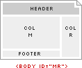
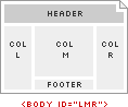
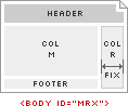
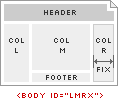
Within Wired News CSS, the outer divs are uniquely defined and referenced by using an id attribute. Each ID is only allowed to be assigned to one element within XHTML (thus, there may not be multiple divs on the same page which use the same ID). These IDs are intentionally kept very simple to aid in understanding of the column structure when looking at the XHTML markup. The three IDs used for columns in Wired News templates include:
colL - [Left Column] used for additional navigation and related informationcolM - [Main Column] used for the primary content of that pagecolR - [Right Column] used for additional navigation, information, or vertical ad units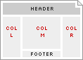
Each column can change properties, such as width or background color, and an element in the body of the page can change properties, depending on which column it falls into. In some cases, a Left Column or Right Column may not even appear. Rather than create a unique column ID for each instance of a Left Column (eg. colL-relative, colL-fixed, colL-blackbg, colL-fixed-blackbg, etc.), only the three previously mentioned column IDs exist. This simplifies how each column — and each object within that column — is referenced, and eliminates the need to change the column ID every time the layout changes.
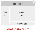
Since each column-type always carries the same ID for simplicity's sake (eg. Left Column is always id="colL"), another means must exist to alter the properties of that column for different column layouts. For Wired News, this is done by assigning different IDs to the <body> element. This allows the use of what are called contextual selectors to specify rules such as:
IDs for each <body> element have been constructed from the initials of the column and type of column which is intended to appear in its own respective layout.
Note: Relative-width columns are assumed, unless the column initial is immediately followed by a lower-case 'x', which implies a fixed-width column.
Body IDs for Wired News templates include:
M - Main column onlyLM - Left and Main columnsMR - Main and Right columnsLMR - Left, Main, and Right columnsMRx - Main column, with fixed-width Right columnLMRx - Left and Main columns, with fixed-width Right column
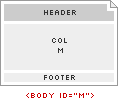
Note: Using a body ID of something like MR will hide the Left Column (colL) if one still exists in the HTML markup. However, the use of a body ID which omits a certain column(s) presupposes that Column is not needed, thus the markup for that column(s) should normally be removed entirely.
Body tags for Thumbnail Gallery and Image Browser pages should also contain an attribute of class="negBG", in addition to the id attribute. This class will change the page background color to black, and also automatically compensate the color and/or style of any other page elements through the use of descendant selectors reliant upon this class.
Features of CSS2 enable the ability to present page layout using either relative-width or absolute-width columns without the use of tables to display the columns. The design of Wired News uses both types of column layouts, and actually mixes them together, which presents some unique challenges to overcome. This requires a certain amount of careful planning and consideration to detail, both in design and development phases.
One of the challenges arises from the fact that relative widths of a column are difficult to mix with absolute values for that column's margin or padding, without accidently under-totalling or over-totalling the overall browser window width. If the overall browser window width (dependent on the users screen resolution and how large they have their browser displayed) is not carefully considered, a horizontal scrollbar may automatically appear and/or content may get rendered off-screen, no matter how large the browser window appears.
To overcome this challenge, Wired News templates use outer divs (with column IDs) to set column widths, the sum of which should always add up to exactly 100% of their parent's content-width (usually the document's <body>). Within each outer div, one inner div (always with a class of "content") is generally used to set horizontal margin and/or padding, which shouldn't affect the relative width of the outer parent div. This approach ensures total page width always stays within 100% of browser window width, except within extremely small browser windows (below 640x480 resolution), or in cases where content or fixed-width advertisements don't allow the overall width to shrink below a certain point.
For example, in a scenario using Left, Main, and Right columns (all relative-width), the body is assigned id="LMR". This means that Left Column is automatically sized at 25% of browser window width, Main Column at 50%, and Right Column at 25%. A simplified markup structure for the columns could look like the following:
<div id="colL">
  <div class="content">
    Left Column content goes here...
  </div>
</div>

<div id="colM">
  <div class="content">
    Main Column content goes here...
  </div>
</div>

<div id="colR">
  <div class="content">
    Right Column content goes here...
  </div>
</div>
Layouts using relative-width columns filled with text always have to assume and deal with relative heights. No height can be absolutely predicted if text is allowed to wrap in freeform ways, because height depends on how often the text wraps to a new line. The more text which wraps to more lines, the greater the height of an element. Relative height is made even more variable when relative font-sizes are used in CSS, which allows a user to resize type on the page by using menu font-size selections or custom browser preferences. This factor means the overall height of an element could also get larger if the user specifies a larger font-size, or vice-versa.
The importance of relative height comes in when any element is absolutely positioned vertically on the page, but there is also an element which could be variable in height placed on the page above the absolutely positioned element. If the absolutely positioned element does not take into account the variable height of the element placed above itself, the two elements could end up overlapping, effectively hiding portions of content, or making content underneath un-clickable.
This scenario plays out in the Wired News design with either Left or Right Columns (positioned absolutely) and the Network Bar, Header, and Navigation placed above the Columns. If the browser window is dragged small enough, elements within the Header and Navigation begin to wrap and take up more height than usual. These elements could also increase in height if the user increased font size in the browser. This means the main navigation strip could get covered up by the Left and/or Right Column if the variable height of the header and navigation is not taken into account.
Note: The wrap of elements and flexible font-size is by design — it could be prevented, but forcing any of these details could interfere with the accessiblity of the site at any browser width or font-size preference.
An absolutely positioned element can't inherently have a vertical position relative to another element which exists separately on the page. But it can be given a vertical position relative to a parent element which is relatively positioned on the page. In order to take into account the variable height of the page header, a wrap div (assigned to id="wrap") can start below the header, and "wrap" around any of the content which needs to be forced to appear below the header. If this wrap div is positioned relatively, it becomes the positioning parent to all elements within itself, and resets any positioning values of child elements relative to itself. So any child element positioned absolutely with a vertical (top) position of '0' is placed at the top of the wrapper, not at the top of the page. If the header gets larger, the parent wrap div gets pushed down lower, meaning the starting vertical position of all column content will get pushed down the same amount.
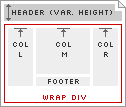
With the wrap div ensuring the column content will always appear immediately below the header and navigation, one more height challenge needs to be considered. The 468 ad banner is positioned below the navigation, but only extends across the Main and Right Columns. With a dynamic ad model, sometimes the 468 banner will appeear, requiring that the Main and Right Columns be pushed down an appropriate amount, other times the 468 banner won't appear, allowing all columns to be positioned at the same height. To take this variable into account, a second subwrap div is placed below the 468 ad banner, (assigned to id="subwrap") and is wrapped around the Main and Right Columns. This allows the subwrap div to move up on the page if the ad is not present, effectively positioning all columns at the same vertical point. If the ad does appear, it pushes the subwrap lower, which pushes down the starting vertical position of the Main and Right Columns.
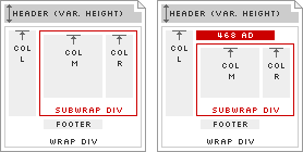
Taking into account a simplified header to start, then the wrap, subwrap, and the three column outer divs and each of their inner divs, the structure of a basic page would now look like the following:
<div id="hdr">
  Header, Search, and Navigation goes here...
</div>

<div id="wrap">

  <div id="subwrap">

    <div id="colM">
      <div class="content">
        Main Column content goes here...
      </div>
    </div>

    <div id="colR">
      <div class="content">
        Right Column content goes here...
      </div>
    </div>

  </div>

  <div id="colL">
    <div class="content">
      Left Column content goes here...
    </div>
  </div>

</div>
Notice that the order the columns appear is shifted around slightly. Main and Right Columns must be grouped together, because they must sit within the subwrap div. Considering browsers which will have style information hidden from them (thus will also not be displaying this information in multiple columns, but in one long list) Main Column content will generally be more important than the Right Column content, so Main Column gets placed before the Right Column. Similarly, content within the Left Column will not be as important as Main Column content, but the Left Column may not be placed between the Main and Right Columns, so the Left Column gets placed after both the Main and Right Columns. This determines the order: Main, Right, Left.
Both the wrap div and the subwrap div should always be part of the markup, and should always appear in the same relative location, regardless of which column layout is being used. If no Right Column is displayed (i.e., use of body ID M or LM) the wrap div should still be wrapped around all columns, and the subwrap div should be wrapped around the Main Column.
Wired News templates are configured to accept changing ad units on each page, sometimes altering the entire template based on ad unit inventory. When a specific ad unit is available for displaying on a page, an automatic space should open up in the template to compensate for the size of that ad. When that ad does not get displayed on a page, the space that ad would normally occupy should close up and behave as if the ad were never there. The following primary ad units can appear in the new templates:
<div id="wrap"><div class="ad468">ad goes here</div><div id="nav"></div><div class="ad728">ad goes here</div><div class="adMsg">ad goes here</div>MRx or LMRx).<div class="adSky">ad goes here</div><div class="adSky">ad goes here</div>Obviously, not every type of ad should be displayed on the same page at once. The following rules define specific combinations of primary ad units allowable on certain page templates:
Either a Leaderboard or a Full Banner can appear in any page template. If a Leaderboard appears on a page, the Full Banner should not appear, and vice-versa.
A Wide Skyscraper or Skyscraper can appear in the right column on pages other than the front door. Wide Skyscrapers are preferrable, since fixed-width Right Columns are defined at 160px wide.
A Medium Rectangle can appear in place of all other ad units. Because of the hefty real estate these unts take up, and because they are often interactive flash files, if a Medium Rectangle appears, no other ad unit should be included on the page, including any Skyscraper, Full Banner, or Leaderboard.
These two ad units require that the ad unit combination to be displayed on the page be determined in advance of choosing the body ID and rendering the page's content. The choice hinges on whether a Rectangle unit or the Skyscraper unit is to be displayed. If a Rectangle is to be displayed, the body uses id="LM", and the Rectangle gets positioned in the Main Column as described previously (in 5.2. Combination Rules). If the Skyscraper is to be displayed, the body uses id="MRx", and the Skyscraper gets positioned in the Right Column as described previously.
The AvantGo templates are constructed with all new images and new markup (restricted to HTML 3.2 as per AvantGo's support specification). Note-worthy items include:
<blockquote>'s are no longer wrapped around each story deck, use <p>'s instead<title> of each page has been altered on section and story pages. Titles on those pages are preceded with "WN: ", and story pages use the title of the story following this prefix. AvantGo will automatically chop off the page title after 15-20 characters (depending on device), so some page titles will get cut off — this is ok. For story pages, we have not been including a title at all, which shows up as "Untitled" in AvantGo.To emulate some of the obvious differences between the two extremes of device capabilities (within a normal web browser), a style sheet has been added to the header to simulate the appearance of the AvantGo channel in both a Palm OS device with a monochrome screen, and a PocketPC device with a color screen. The HTML markup does not change for either scenario, other than the CSS file pointed to in the header. The link to any CSS file should be removed from final templates which AvantGo caches.
The following list provides a reference of (and a link to active) page templates in various states of completion. Linked items point to a design template which is complete or in progress. All links within this list point to files using a default color scheme, which is currently "s1". To preview any other scheme, see the Color Schemes section of this documentation.