Making the absolute, relative
A reader wrote to question the use of positioning for the Adaptive Path navigation. Certain positioning requirements can be met by wrapping one positioned element with another.
A curious reader recently asked about the Adaptive Path redesign:
“I’m puzzling over why with the main nav bar you nested an absolute div into a relative div?”
A simple answer to his question is: Because I wanted optimum flexibility for the header and navigation, and to keep the navigation the same distance from the logo, no matter how the text is resized.
That’s the strategic answer providing rationale for the method. But I gather he might also be seeking a tactical answer. To answer his question thoroughly, I’ll backpedal a bit, and explain the workings of CSS absolute positioning in my own words, provide an example which demonstrates a different effect than the one achieved in the Adaptive Path design, then come back to the AP navigation.
Containing Blocks (Positioning Context)
Nesting an absolute-positioned element within a relative-positioned element is a fairly oft-used technique. More commonly, one may hear the inverse stated: a relative-positioned element is wrapped around an absolute-positioned element.
According to the CSS2 spec, an absolute-positioned element is positioned according to its containing block. Any element is considered “positioned” if it has a position value of relative, absolute, or fixed (anything other than static). “Static” is one of the possible values for the position property. It’s also the default value for any element if no other position is specified. Static basically means an element’s position is not modified, and the element will appear in the expected normal flow of the document in context with other sibling elements and containing blocks.
If an absolute-positioned element resides within no other containing block, (when no ancestor elements are positioned) it is placed relative to the page boundaries (called the initial containing block). Thus, an element styled with the following rule:
#topleft {
  position:absolute;
  top:0;
  left:0;
  }
will get placed in the top-left corner of the page. However, any positioned ancestor establishes a new containing block for all its descendant elements. If an ancestor element gets positioned, the positioning context of any descendant element is reset to the boundaries of that ancestor element (the new containing block). Thus, the box offsets in the rule above would position the #topleft element at the top-left corner of the positioned ancestor, rather than the top-left corner of the page.
Lost yet? It still sounds like gibberish to me too. I’ll pull up a common example to help drive it home.
Dynamic Positioning
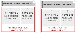
For stopdesign.com, (at the time of this writing) I use absolute positioning for the right column (#subcol). When I designed the templates, I wanted the right column to appear immediately below the header (#header) with no overlap and no gaps between each block. The header contains the logo and main navigation. Because the navigation is text, it can be resized via browser controls. This directly affects the height of the entire header. I could have positioned the right column in context to page boundaries, choosing a starting top position based on a measured header height. But since the header varies in height from browser to browser based on default text sizes, this means the right column would sometimes overlap the header if the header grows in height. Or a gap may appear between the header and right column if the header gets smaller than my initial measurement.
Diagram 1
To adapt to this variable header height, I use a positioned container element (#content). This container appears in the markup immediately after the header, and is assigned position:relative;. This allows the container element to appear in (and affect) the normal flow of the document; the top of the container will always appear immediately below the bottom of the header, no matter how large or small the header becomes. Because #content is positioned, this also resets the positioning context for any elements it contains. The right column (#subcol) is contained within #content, so the right column gets positioned in the top-right corner of #content, rather than the top-right corner of the page. This allows the right column to adapt in vertical position according to the height of the header, as modeled in Diagram 1.
Bottom-hugging Navigation
Diagram 2-A
Diagram 2-B
Finally, I circle back to the Adaptive Path navigation, which represents a different use of this making-absolute-relative technique. I could have easily assigned a fixed margin-top to the navigation and been done with it. But in this case, I want the header to always remain the same height, no matter how large or small the navigation text becomes. In other words, I don’t want the dark green border below the navigation to change in vertical position, relative to the logo, as shown in Diagrams 2-A and 2-B.
Rather, the navigation text is free to be sized up or down, but its baseline position remains constant. It always touches the dark green border, and never overlaps this border. By positioning the #nav element using position:relative; and assigning a specific height to this container (72px), the container establishes a new positioning context for the “inner” div. The inner div can now be absolute-positioned to the bottom of the #nav container using bottom:0;.
Other uses for this technique certainly exist. It’s not an uncommon desire to want to reset positioning context for an absolute-positioned element to something other than the page’s boundaries. The reasoning behind why I do what I do is often obvious to me. But it took a reminder that reasoning isn’t always so obvious to everyone else. Perhaps this technique is now a little more understood by others (maybe even obvious to them) as well.
Translations
This article is translated into the following languages:
- Brazilian Portuguese:
Posicionando relativamente o absoluto
by Mauricio Samy Silva


