New year, new design
With a bit of humility and even a little nervousness, it’s time to take the wraps off a new design I’ve been working on for nearly a month. My hesitation comes not from revealing the new design, but from my… ~1,400 words
With a bit of humility and even a little nervousness, it’s time to take the wraps off a new design I’ve been working on for nearly a month. My hesitation comes not from revealing the new design, but from my… ~1,400 words
Getting back into the swing of writing regularly here never really happened in 2006. When I look back at my archives, I see I only posted 11 times the entire year. And that includes three posts (1, 2, 3) that weren’t really writing-based, as much as they were simple design and code experiments. ~400 words
I’ve grown tired of the need to choose which syndication formats I support (between Atom and multiple versions of RSS). I’m not about to join the debate over which format is better. I simply don’t care. I acknowledge that RSS/Atom syndication is an important technology that has changed the way we distribute and access information. But my decision to publish a feed shouldn’t be complicated by which format or how many of them I publish just to ensure I cover all possible bases. ~900 words
Prior to seeing The Flop, you make judgements as to how strong your hand could be based on two cards dealt to you, face-down. You peek at the cards, calculate the odds, then call, raise, or fold, knowing the flop is coming. Remember, the flop can change everything in an instant. Just don’t get too cocky, because a turn and a river are potentially just around the bend. ~100 words
With the return of the full-color, fixed-width design to this site over the weekend, Stopdesign received numerous messages and even a few comments regarding the switch back. Some of the messages and comments are in favor, heralding the welcome return. Others cry foul as their Bleach is stolen away. ~500 words
Promised one week ago today, this is the next phase in a temporary exploration of page design and CSS layout for Stopdesign.
Ever wondered what your site would look like devoid of most of its color and imagery? Bleach the entire design, remove the saturation and leave behind the basic visual structure on a stark white background? Sure, some sites already use a white background for their design. But Stopdesign has been filled with deep colors and prominent header images since I launched this design a few months ago. ~600 words
By now, many of you may have seen François Briatte’s recent survey of 10 web sites he reads on a regular basis. My props to François for assembling an insanely detailed, and very well documented and explained study. I’ll add a few notes relative to Stopdesign’s position within the survey. ~900 words

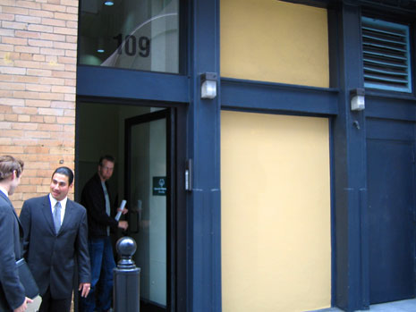
Next in the series of photos used for header images on Stopdesign is a candid photo I never would have expected to make use of in any kind of design, let alone Stopdesign’s Company pages. There’s nothing spectacular about this photo at first glance. Maybe even at second and third glances. In fact, any other designer probably would have passed it over. This is… Office shopping. ~300 words

Picking up where we

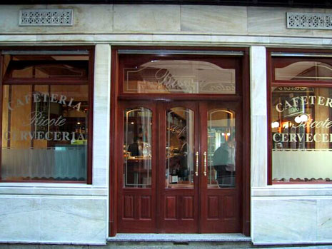
The second of a series, the header image from the Articles section originates from a photo that conjures up great memories with international friends. This is Café en Madrid… ~300 words

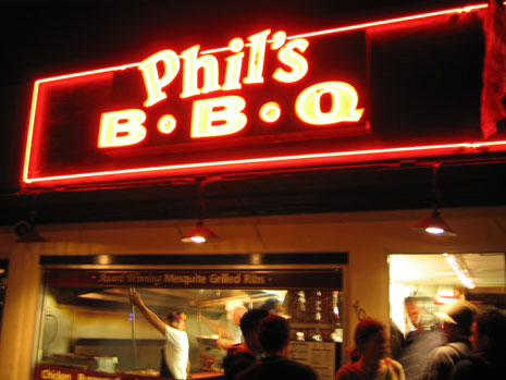
In the first of a series, I present the original, undoctored photo used for one of the header images on Stopdesign. This one: the home page. This photo was taken while visiting Miami in November 2002 for the AIGA
Welcome to Phase II of the new Stopdesign. Baby’s got new shoes. As if I weren’t busy enough as it is with current projects. For some reason, two weeks ago, I decided to start a full-blown redesign by yanking my own style sheets, encouraging me to do something sooner, rather than wait for a lighter workload. For those that count, this would be design version 3 (not counting the short-lived lightly styled version this one replaces). The most obvious change is the much more confident use of photography in the header, followed by a significant re-org of the home page. ~600 words
Remember what was said about a work-in-progress? Certainly you didn’t think Stopdesign could be left stripped of proper attire for long? Phase II is already well underway… ~27 words
The subject is covered frequently in the blogosphere. It’s nothing new for many of you. I’ve been bitten by Stopdesign’s Google page rank for specific search queries several times. I just noticed the most recent instance. What happens when Google gives a particular page too high a page rank? ~1,300 words
Ever wanted to ditch what you’ve got and start over? I sure have. I’ve been wanting to completely wipe the style sheets clean for this site and start over with a blank slate. Finally jumped off the cliff. Wonder if anyone saw me do it. And if they did, will they understand why? ~1,400 words
I’m sure Dave will write from his own perspective, but I thought I’d offer up some answers, information, and details about yesterday’s mischief. ~1,500 words
Feeling inspiration from others who’ve been redesigning, I finally decided it’s time to take this site’s design in a slightly new direction. I’ve been working on this one in the background for a while, whenever I’ve had spare time. The colors were inspired by a photo I took of the Brockton Point Lighthouse in Stanley Park while visiting Vancouver last year for the AIGA National Design Conference. ~100 words
I’ve seen some approximations that are different enough to write off as pure coincidence. The Stopdesign logo is strong and bold. But I will freely admit it’s a simple concept that is as old as Chinese Taoist philosophy and the Yin Yang symbol they use to represent harmony and equilibrium in the universe. ~200 words
Apparently, there’s been some huff and commotion out there about SimpleBits and Stopdesign dropping liquid layouts in favor of fixed-width designs. This probably wouldn’t have been as big an issue if we both hadn’t changed (by chance) the very same week. ~800 words
I’ve decided to make my collection of Links, Sites, and Books a public one, create a list of references I’ve used, and group it all under a new section for Stopdesign appropriately dubbed See Also. ~400 words
Matt Haughey provides great insight into how he’s taken advantage of MT’s flexibility to manage his sites in Beyond the Blog. Here’s how I did the same for my new portfolio relaunched last week. ~1,400 words
While I can change and control internal links pointing to my own content, lots of external links exist on other sites which point to files on stopdesign. I wanted to make sure as many of those links as possible still pointed to appropriate places on this site. ~700 words
The conversion to Movable Type is going smoothly so far. I’m continually amazed at the application’s flexibility, power, and speed. The ability to expand its functionality with the plugin architecture gives MT endless possibilities for small-scale sites like this one.… ~400 words
I’ve been talking about it for what seems like forever. Over the past week, I finally started to make the jump. If you’re reading this entry, the DNS changes have propagated to your neck of the woods, which means you’re… ~700 words
Based on recent experience with an indexing robot, I discovered a critical architecture flaw in the way I set up my calendar for viewing Log Entries by Day. Due to a bit of laziness, as well as intrigue of the… ~600 words
Thanks to the recent news and hype of Google’s Pyra acquisition, it seems Blogger has been quite bogged down recently. Lots of transfer errors. Connection problems. Most likely due to every Blogger user trying to post about the story.… ~500 words
It didn’t take long for the person (or group) behind the website I mentioned on Friday to pull down or move the site to another address. Perhaps they were too embarrassed, or never intended the site to be seen —… ~300 words
is flattery. But I’m not sure what I think about this recently discovered copy. It’s obviously a work-in-progress. Remnants of my content still poke through in places. I don’t know how long it will stay up, but I’ve taken a… ~600 words
Progress on the stopdesign.com redesign continues. I now have the entire portfolio entered into a sortable, reusable database. I’ve created a bunch of server-side scripts (ASP) to create each portfolio page dynamically based on two templates. One template drives the… ~200 words
I’ve been debating how to build out my portfolio pages for the last few days. The current pages are all flat files that required a ton of work to create, and have been a nightmare to update. I’d like to… ~100 words
I started batting around ideas for a redesign of stopdesign.com a few weeks ago. Today, I actually made progress by sketching out some rough ideas and planning a simple architecture. The site has basically remained untouched in the four years… ~200 words
It’s with great humility that I hammer out this first post. Humility, because I enter the game way after many others. Humility because others have been practicing and polishing their writing on a daily — or somewhat daily — basis… ~300 words