Menu
  • A fairly thorough retrospective of Google and the huge impact the company had over the past year. Check out the list of releases and new ideas Google pushed in 2009. Impressive and scary at the same time. I wish the little blip about me leaving earlier this year weren’t present, though I’ll admit that’s how I found this article. This paragraph toward the end sums it up best:

    Google in late 2009 is now covering or aiming to cover web apps, the browser that runs the web apps, the OS that runs the browser, and, according to rumors, even the computer that runs the OS.

  • Helping Adactio get that perfect pitch. To nail it, even. You should probably link to his page too, if you’re so inclined to fight DMCA take-downs for the sake of SEO.

  • I agree. Time for the end of bottom-posting arguments.

  • You’re encouraging the random and random is how you’re going to win. Random is how you’re going to discover a path through a problem that no one else has found and that starts with breathing deeply.

    Even though the subject matter and approach differs, this pairs nicely with an article on A List Apart last week: Burnout, by Scott Boms.

    Your life should be just that—a life

    Good words, all around.

  • Emphasis is my own…

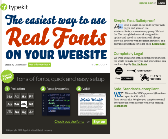
    As a Typekit user, you’ll have access to our library of high-quality fonts. Just add a line of JavaScript to your markup, tell us what fonts you want to use, and then craft your pages the way you always have. Except now you’ll be able to use real fonts. This really is going to change web design.

    Also worth checking out, Jeff posted a preview of the Typekit home page yesterday. Looking forward to how this will change typography and design for the web.

  • Mr. Clarke advocates creating one single universal style sheet to handle all styling in IE6, and to stop worrying about making content in IE6 look anything like the high-end experience.

    I’m now advocating to my clients (and to you), that where feasible, not to waste hours in time and a client’s money on lengthy workarounds in an unnecessary attempt at cross-browser perfection. Instead, you and I should provide simple but effectively designed HTML elements. This means just great typography for headings, paragraphs, quotations, lists, tables and forms and no styling of layout.

    This will work well for content-focused web sites. And then maybe it’s officially time to completely drop support of IE6 for web apps.

  • Interesting take on the future of Wired (mag vs. website).

    Wired is great print, but if the magazine can’t make money and is shuttered, taking the website down with it, I’m going to be livid. Not that making money online is easy—it’s not, especially without sacrificing your ethics and your voice—but if any mainstream outlet should be able to make the transition, it should be Wired.

    I fear that may be impossible, not just for Wired but for all these old brands, because they can’t accept that the work at which they have excelled for years will be just as important when it’s online—and online only.

    Reading though the comments provides an even more interesting story and a broader perspective. Comments by several former and current Wiredlings, including a few responses by Chris Anderson who passes blame to corporate (Conde Nast) decision-making.

  • The best design is that which does its job and stays out of the way. Jared Spool on invisible design:

    While all these things are what the designers at Netflix work hard on every day, they go unmentioned by their customers. It’s not because these aspects aren’t important. It’s because the designers have done their job really well: they’ve made them invisible.

  • Craig directed me to this piece today after I complimented him on the new version of Twitterrific for the iPhone, stating how much I love seeing different approaches to Twitter client design. I hadn’t seen his post (from December 2008) before today, but it’s a good read that gives insight into some of the decisions behind Twitteriffic’s design that are still applicable now.

    Personally, I welcome this competition. Seeing the work of other developers whose work I respect and admire acts as an inspiration. Looking at how other developers tackle a problem domain often adds insight into solving similar issues with my own code. In other cases, it shows me how I don’t want to implement a feature (without the need to prototype.) In short, competition will make Twitterrific better.

  • Cameron asks the inevitable question about width on the Web. Probably not time yet for mainstream. But for showcases of design, why not start experimenting with the new real estate?

  • Stephen Anderson:

    The more we learn about people, and how our brains process information, the more we learn the truth of that phrase: form and function aren’t separate items. If we believe that style somehow exists independent of functionality, that we can treat aesthetics and function as two separate pieces, then we ignore the evidence that beauty is much more than decoration. Our brains can’t help but agree.

    Can’t say that I agree with all the examples he used. But important points that stand on their own, nonetheless.

  • Nice going, Ethan. Definitely one to keep in the ol’ bag o’ tricks.

  • Apple notebook packaging comparison

    Interesting comparison (my own) of packaging for Apple notebooks. I’ve been noticing a trend over the last few years to cut way down on box size for both hardware and software. But I still think it’s interesting to see side-by-side ~200 words

  • Andy Baio digs into the reuse of certain content by AllThingsD for their Voices section:

    Ultimately, if authors are happy, there’s no problem. But it seems like there’s a divide between two types of writers online: unaffiliated independent bloggers running their own sites and bloggers employed by larger online magazines.

    Also, be sure to read the related response from Anil Dash about how the Associated Press plans to handle a similar reuse of content:

    If the Associated Press made its argument on the basis of credibility and reputation, transparency and accountability, as the web-native publishers have, it would be far easier to defend their desire to share in the business model developed by the aggregators.

  • Hello, Twitter

    Part 2 of 2 (here’s Part 1) Yesterday was my first day at Twitter. Yes, it’s true. After reading a bit of speculation over the past few weeks, I’ll confirm here that I am, indeed, joining Twitter. I don’t ~500 words

  • Goodbye, Google

    Part 1 of 2 (here’s Part 2) Today is my last day at Google. I started working in-house at Google almost three years ago. I built a team from scratch. I was fortunate to hire a team of ~600 words

  • I love this in-depth look at implementing grids for liquid layouts. Ethan goes into detail just how it all fits together, and the magic formula needed to make it all work. Now if we could just have the ability to easily scale images inside a liquid layout (without resorting to clipping background images), we’d be golden (pun intended).

  • Eric Meyer elaborates on why we need a better layout mechanism for web content (whether it be via CSS or not). We know we shouldn’t use tables for layout. Floats are a hack, positioning is flawed, and display:table-cell is no better than using a table itself. But Eric explains here why table behavior works moderately well for layout:

    … this is why the old “only use tables for layout” argument keeps coming up over and over: strip away the overheated rhetoric and obvious link-baiting, and you find the core of a real need. Because as powerful as CSS can be, table cells do certain things very easily that CSS makes very, very hard. Cells stretch vertically, keeping equal heights as a matter of their intrinsic nature. They stay out of each others’ way, while still being allowed to sit next to each other and use any sizing dimensions. They tie their layout to their parent elements, and vice versa.

  • WordPress plugins in use

    There are a few WordPress plugins that help me publish this site as I want it. Here are a few of the key plugins I currently use on Stopdesign. ~400 words

  • Trading places

    I know traffic here is far from representative of the rest of the web. Regardless, I see an interesting trend developing. The numbers are drastic enough, I wonder if they prove the trend extends beyond the focus of Stopdesign and ~300 words

  • Paul Boag lays it down. A must read.

    You need to take control of the design process. It’s your site and you should get the design you want. The role of the designer is to implement your idea. Do not allow him to drag you down into endless discussions about ‘users needs’, ‘accessibility’ and ‘usability’. These are all distractions from the primary aim – to impress your boss and earn that next promotion.

    Ok, I’ll admit, it took me reading past the first point to calm down and avoid jumping through the screen to grab Paul’s throat.

  • If Twitter existed in 1937, and farmgirls had web access, this is how we would see one teen girl’s account of daily life during the Depression. Fascinating in a strange, time-travel kind of way. Here’s the back story and a few answers to FAQs from David Griner, the great nephew, who is maintaining the account. (via Biz)

  • Recreating the button

    Until some future version of HTML gives us new native controls to use in a browser, at Google, we’ve been playing and experimenting with controls we call “custom buttons” in our apps (among other custom controls). These buttons just launched ~1,800 words

  • Beautiful (and scary at the same time) visualization of the growth of Walmart from 1962 through 2007. It’s like a virus that spreads across our country. Compare the Walmart viz with another Nathan just posted for Target today. From Nathan’s post describing the Target work:

    You might guess that Target and Walmart expanded similarly (I did, at least), but you’d be wrong. Both started in Central United States, and both were officially founded in 1962 by two men who both owned stores under a different name before the Target and Walmart boom. However, besides more rapid growth, Walmart first expanded outwards from its home state before going country-wide while Target seems to have gone wherever opportunity knocked…

  • Credit where it's due, part II

    Truth as I know it: this design would not be what it is — nor would I be the designer I am nor care as much about what I do — without the inspiration, critiques, guidance, mentorship, contributions, camaraderie, encouragement, ~600 words

  • After subscribing to the feed last week on Inauguration Day, I’ve been reading updates on President Obama’s actions on an almost daily basis. I’m not sure if they can keep up the frequency of posts that have filled the blog already. But isn’t it amazing that we’ve never had this level of insight into the President’s activities — and on such a regular basis — before now?

  • Free service from a datacenter in Germany that allows you to check the rendering of any website in IE 5.5, 6, 7, or 8. It’s fast — it returned each screenshot for me in about 5 seconds. Screenshot size seems to be fixed at 1024×768, so you won’t see anything “below the fold” and there doesn’t seem to be a way to modify that size. But hey, it’s free. They also list and describe other screenshot services. (via Dan Benjamin)

  • New year, new design

    With a bit of humility and even a little nervousness, it’s time to take the wraps off a new design I’ve been working on for nearly a month. My hesitation comes not from revealing the new design, but from my ~1,400 words

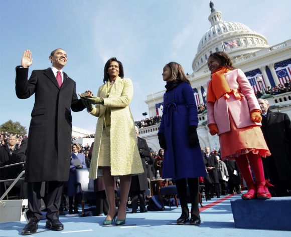
  • How could I not link to these photos of Obama’s Inauguration posted yesterday on The Big Picture? For some reason, despite numerous other photos that were better composed or more striking in their angle, I was really moved by photo #23, and stared at it for a good 5 minutes, considering everything that was going through Vertie’s mind at the time.

  • Interesting shift in what Apple allows into the App Store. Previously, some assumed 3rd-party apps that provided duplicate functionality to the core iPhone apps weren’t allowed. Though somewhere, one of the sources I saw about this story noted that each of the approved browsers are based on WebKit. So that premise may exclude Opera or Firefox from ever appearing in the App Store.

  • An extension for Dreamweaver that validates HTML/CSS, verifies microformats usage, and checks other nuances of standardista fare. It’s actually branded with the name of The King (of WebStandards).

  • The full text of articles in John Allsopp and Maxine Sherrin’s first issue of Scroll Magazine is now online. Includes pieces by Indi Young, Aaron Gustafson, Joe Clark, Ethan Marcotte, Veerle Pieters, and Jeff Veen.

  • Once again, beautiful work by Jon Hicks on icons for FontExplorer Pro. Plus a look at the sketches and process he went through to arrive at the final results.

  • John lays down the criticism on they way the W3C is approaching HTML5. He (rightly, IMO) argues that adding new elements is not the way to make HTML5 backwards nor forwards compatible. Toward the end of the article, he suggests that adding new attributes might achieve both goals. Seems logical to me.

  • Apple introduces revolutionary new laptop with no keyboard. My favorite quotes:

    Just press both sides of the wheel concurrently, and center-click, and there, you have an alphabetical listing of every file on your hard drive. Everything is just a few hundred clicks away…

    and

    I like how the email automatically says ‘Sent from MacBook Wheel.’ That way people know you have one.

  • No optician required. (via Jason Fried)

  • Bookmarking this late. But an interesting perspective into Jason Santa Maria’s simple system for creating the dynamic layouts of his recent entries.

  • Eric goes into detail on why he chose HTML5 for the AEA site, and what some of the differences are compared to what we already know.

  • Jeffrey Zeldman details the design of the new AEA site.