Growing Twitter Design
We’re expanding the Twitter Design Studio. Whether you’ve ever thought about working at Twitter or not, think about it now. We have a few open spots that we’re looking to fill in the next couple months. ~700 words

We’re expanding the Twitter Design Studio. Whether you’ve ever thought about working at Twitter or not, think about it now. We have a few open spots that we’re looking to fill in the next couple months. ~700 words
Ethan’s “Responsive Web Design” is an eloquently worded, logical evolution of modern, responsible web design.
Emphasis is my own…
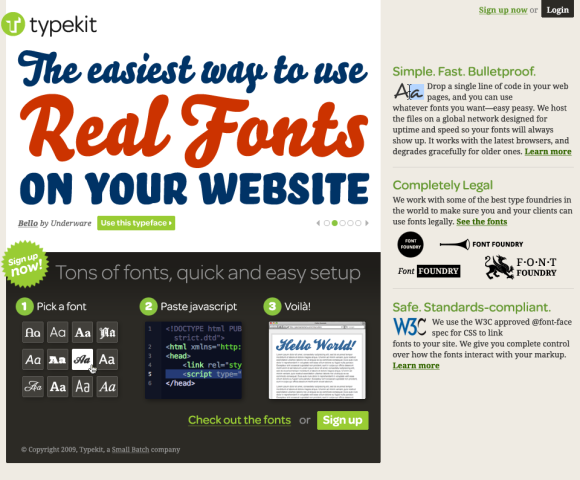
As a Typekit user, you’ll have access to our library of high-quality fonts. Just add a line of JavaScript to your markup, tell us what fonts you want to use, and then craft your pages the way you always have. Except now you’ll be able to use real fonts. This really is going to change web design.
Also worth checking out, Jeff posted a preview of the Typekit home page yesterday. Looking forward to how this will change typography and design for the web.
The best design is that which does its job and stays out of the way. Jared Spool on invisible design:
While all these things are what the designers at Netflix work hard on every day, they go unmentioned by their customers. It’s not because these aspects aren’t important. It’s because the designers have done their job really well: they’ve made them invisible.
Craig directed me to this piece today after I complimented him on the new version of Twitterrific for the iPhone, stating how much I love seeing different approaches to Twitter client design. I hadn’t seen his post (from December 2008) before today, but it’s a good read that gives insight into some of the decisions behind Twitteriffic’s design that are still applicable now.
Personally, I welcome this competition. Seeing the work of other developers whose work I respect and admire acts as an inspiration. Looking at how other developers tackle a problem domain often adds insight into solving similar issues with my own code. In other cases, it shows me how I don’t want to implement a feature (without the need to prototype.) In short, competition will make Twitterrific better.
Cameron asks the inevitable question about width on the Web. Probably not time yet for mainstream. But for showcases of design, why not start experimenting with the new real estate?
Stephen Anderson:
The more we learn about people, and how our brains process information, the more we learn the truth of that phrase: form and function aren’t separate items. If we believe that style somehow exists independent of functionality, that we can treat aesthetics and function as two separate pieces, then we ignore the evidence that beauty is much more than decoration. Our brains can’t help but agree.
Can’t say that I agree with all the examples he used. But important points that stand on their own, nonetheless.
Part 2 of 2 (here’s Part 1) Yesterday was my first day at Twitter. Yes, it’s true. After reading a bit of speculation over the past few weeks, I’ll confirm here that I am, indeed, joining Twitter. I don’t… ~500 words
Part 1 of 2 (here’s Part 2) Today is my last day at Google. I started working in-house at Google almost three years ago. I built a team from scratch. I was fortunate to hire a team of… ~600 words
Paul Boag lays it down. A must read.
You need to take control of the design process. It’s your site and you should get the design you want. The role of the designer is to implement your idea. Do not allow him to drag you down into endless discussions about ‘users needs’, ‘accessibility’ and ‘usability’. These are all distractions from the primary aim – to impress your boss and earn that next promotion.
Ok, I’ll admit, it took me reading past the first point to calm down and avoid jumping through the screen to grab Paul’s throat.
Until some future version of HTML gives us new native controls to use in a browser, at Google, we’ve been playing and experimenting with controls we call “custom buttons” in our apps (among other custom controls). These buttons just launched… ~1,800 words
Truth as I know it: this design would not be what it is — nor would I be the designer I am nor care as much about what I do — without the inspiration, critiques, guidance, mentorship, contributions, camaraderie, encouragement,… ~600 words
With a bit of humility and even a little nervousness, it’s time to take the wraps off a new design I’ve been working on for nearly a month. My hesitation comes not from revealing the new design, but from my… ~1,400 words
It’s rare these days that something pulls me out of the woodwork to write something here on Stopdesign. A few recent posts by Jason and David at 37signals (Why we skip Photoshop and Web designers should do their own HTML/CSS, respectively) got me thinking though. This post began as a response on an email thread at work. I’m expanding it here to a wider audience. ~1,000 words
Stopdesign proudly announces the new design for Capgemini, a global leader in consulting and technology with headquarters in Paris, and regional operations throughout Europe, North America, and Asia Pacific. Stopdesign worked with Happy Cog Studios and Capgemini’s corporate web team to redesign the site of this worldwide consultancy, showcasing how Capgemini collaborates with each of their clients as partners, working with them to meet unique requirements. ~200 words
Garrett Dimon shares his view of a design firm’s responsibility in “One Idea is Better than Three“. His premise is that presenting three directions to a client, then leaving it up to them to choose between the three falls short of our duty to create — and guide them to — the best design. ~600 words
Jeffrey Veen and I will be conducting a one-day workshop in San Francisco a week from Monday, the 8th of November: Redesigning Blogger. We’ll be covering the process and thinking we used when Adaptive Path and Stopdesign worked with Google to simplify and redesign Blogger earlier this year. Jeff and I have worked together for a little over eight years now. We’ve learned a lot from each other, and from our successes and failures on various projects. ~300 words
Check out the latest Stopdesign mini-project: Mighty Goods, a new shopping blog by Margaret Mason, known for her long-running Mighty Girl weblog. Margaret came to me wanting a simple, clean design with integrated images for most of the items she posted. This is the end result of holing ourselves up in Canvas for a Saturday a little over a month ago. ~200 words
With the return of the full-color, fixed-width design to this site over the weekend, Stopdesign received numerous messages and even a few comments regarding the switch back. Some of the messages and comments are in favor, heralding the welcome return. Others cry foul as their Bleach is stolen away. ~500 words
Promised one week ago today, this is the next phase in a temporary exploration of page design and CSS layout for Stopdesign.
Ever wondered what your site would look like devoid of most of its color and imagery? Bleach the entire design, remove the saturation and leave behind the basic visual structure on a stark white background? Sure, some sites already use a white background for their design. But Stopdesign has been filled with deep colors and prominent header images since I launched this design a few months ago. ~600 words
Google recently launched another new feature for hosted-blogs that further improves the design and experience for Blogger’s users and all of their readers. In a bold move that meets a long-standing request by many of its users, Google recently removed the awkward ads on Blogspot-hosted blogs. In the ad’s place, a new, much slimmer navigation bar gets tucked into the top of the browser window, adding functionality to each blog. ~300 words
My favorite photo from a 10-minute visit (that’s all the time I had) to Seattle’s Rem Koolhaas-designed Central Library. ~80 words
Interesting that the same topic I wrote about at the end of last year (
Welcome to Phase II of the new Stopdesign. Baby’s got new shoes. As if I weren’t busy enough as it is with current projects. For some reason, two weeks ago, I decided to start a full-blown redesign by yanking my own style sheets, encouraging me to do something sooner, rather than wait for a lighter workload. For those that count, this would be design version 3 (not counting the short-lived lightly styled version this one replaces). The most obvious change is the much more confident use of photography in the header, followed by a significant re-org of the home page. ~600 words
Remember what was said about a work-in-progress? Certainly you didn’t think Stopdesign could be left stripped of proper attire for long? Phase II is already well underway… ~27 words
Ever wanted to ditch what you’ve got and start over? I sure have. I’ve been wanting to completely wipe the style sheets clean for this site and start over with a blank slate. Finally jumped off the cliff. Wonder if anyone saw me do it. And if they did, will they understand why? ~1,400 words
When creating web comps, it’s not uncommon to underline some of the links on the page. Despite the fact that users have been asking how to underline text in Illustrator for several versions now, Adobe somehow manages to exclude this feature in each new release of the software. Here’s how to work around that limitation. ~1,400 words
For those of us involved in the project, we’ve been waiting months for this day to come. At long last, I’m proud to announce the launch of a project representing the latest collaboration between Stopdesign and Adaptive Path: the redesign of Blogger.com. Congratulations to the entire Blogger team on completing hundreds of hours, and expending tremendous effort to fit so much into this launch. This is Blogger’s first major overhaul since getting acquired by Google in February 2003, and it’s a biggie. ~1,900 words
I’m sure Dave will write from his own perspective, but I thought I’d offer up some answers, information, and details about yesterday’s mischief. ~1,500 words
Feeling inspiration from others who’ve been redesigning, I finally decided it’s time to take this site’s design in a slightly new direction. I’ve been working on this one in the background for a while, whenever I’ve had spare time. The colors were inspired by a photo I took of the Brockton Point Lighthouse in Stanley Park while visiting Vancouver last year for the AIGA National Design Conference. ~100 words
I’ve seen some approximations that are different enough to write off as pure coincidence. The Stopdesign logo is strong and bold. But I will freely admit it’s a simple concept that is as old as Chinese Taoist philosophy and the Yin Yang symbol they use to represent harmony and equilibrium in the universe. ~200 words
Apparently, there’s been some huff and commotion out there about SimpleBits and Stopdesign dropping liquid layouts in favor of fixed-width designs. This probably wouldn’t have been as big an issue if we both hadn’t changed (by chance) the very same week. ~800 words
Spawned by recent conversations with friends, I’ve been thinking about people who are known for designing and working with web standards. Specifically those who have a strong interest in CSS or are already using style sheets to compliment or construct beautiful design. In these conversations, we’ve noted that this space seems heavily dominated by men. ~600 words
It’s not very often that I point out or write about standards-compliant site designs and launches which get sent to me by email, especially personal sites. But Cameron Adams just launched a site that I think is worth your attention. ~200 words
When I was designing Wired News last year, I was limited by what I knew I could implement. It’s obvious to me whenever I look at Wired now: there are things I would have designed differently had I known how — and been able — to pull them off. ~400 words
A follow-up to the popular “Sliding Doors of CSS” (Part I, published at A List Apart) which fills in a few gaps of missing information, and covers additions and variations on the technique introduced in the original article. (Translated into: French I, French II, Italian, Russian) ~200 words
We’ve read words about a relaunch, seen hints of a new logo, and gazed at a teaser screen that promised it was coming soon. After weeks of patient waiting, the new version of A List Apart is here. As is my contribution to ALA 3.0, “Sliding Doors of CSS”. ~400 words
In two days, I’ll be heading north to Vancouver, B.C. for the AIGA National Design Conference, the power of Design. ~300 words
If you happen to speak or understand French better than English, I’ll point you to a new translation of my design process article at Pompage.net: Les coulisses d’un design. ~97 words
If you live in the Bay Area (or happen to be visiting next week) and have a passion for typography like I do, no doubt, you’ll be interested in “Spaced Out, Black Holes in Typography”, happening next Wednesday, 1 October at 7pm. ~300 words
Sometimes, I go through phases where I just want to design. ~300 words
Today, I can announce completion of the first major publicly available Stopdesign project since the redesign of Wired News last October. Last night, Adaptive Path completed the launch of a brand spanking new redesign of their website. ~700 words
In a related note, Quark recently redesigned their site using XHTML for structure and CSS for presentation and table-free layout. The pages are simple and beautifully clean. The main navigation features slick slide-down subnavigation, though they could have built this… ~100 words
A detailed look at the process and decisions which were part of a design for the CSS Zen Garden submission titled, Golden Mean. (Translated into: French) ~1,900 words
I returned last night from a relaxing holiday weekend spent in Pismo Beach with a few good friends. One afternoon, while most of the others retired to their rooms for a midday siesta, I pulled out my laptop, settled into… ~1,200 words
Over at Mezzoblue, Dave Shea introduces a wonderful space in which we can explore and experience the intersection of beauty and innovation. His CSS Zen Garden offers examples of aesthetically-pleasing layouts constructed with clever techniques intended to showcase the power… ~200 words
Via tonight’s episode of Food Network’s Unwrapped, the Society of Design Administration (SDA) and the American Institute of Architects (AIA) founded a creative and worthwhile design competition held in multiple U.S. cities each year called CANSTRUCTION®. [Caution:… ~200 words
Via a post on css-discuss from the lead designer, Cingular Wireless launches the next big commercial site to adopt XHTML for markup and a heavy reliance on CSS for layout and presentation. Apart from my natural interest level in this… ~500 words
Online content producers and software developers are learning new lessons about opening up their design process to public scrutiny. Good design firms involve and include their clients early and often in many of the design decisions. Both independent and commercial… ~600 words