Recreating the button
Until some future version of HTML gives us new native controls to use in a browser, at Google, we’ve been playing and experimenting with controls we call “custom buttons” in our apps (among other custom controls). These buttons just launched…
Until some future version of HTML gives us new native controls to use in a browser, at Google, we’ve been playing and experimenting with controls we call “custom buttons” in our apps (among other custom controls). These buttons just launched in Gmail yesterday, and they’ve been in Google Reader for two months now. The buttons are designed to look very similar to basic HTML input buttons. But they can handle multiple interactions with one basic design. The buttons we’re using are imageless, and they’re created entirely using HTML and CSS, plus some JavaScript to manage the behavior. They’re also easily skinnable with a few lines of CSS, which was a key factor now that Gmail has themes.

I thought it would be interesting to provide a portion of the background on our buttons here, and discuss some of the iterations we’ve been through so far to get to the current state.
Background
Today’s web apps allow increasingly complex interactions. Users can view, create, manage, and manipulate all kinds of data, from email messages to feeds to photos to blog posts, or even choosing what their DVR records on any given night. We’re at the point where these apps need something beyond standard HTML form controls and basic hypertext links to represent the actions a user can take.
A basic <input type="submit"> could be used for single actions, a <select> element could be used for a compact menu of actions, and <input type="radio"> could be used for selecting mutually exclusive options. But we’re left with no way to represent other interactions common in desktop apps. Such as a checkbox that represents more than just on or off. Or the use of auto-complete to refine or narrow the options in a drop-down menu. On top of this, the controls we can render have significantly different appearances across browsers and platforms. Even within a single browser, buttons and select menus have quite different designs.
Enter: the concept of custom buttons.
The first iteration
Not long after I started at Google, I remember seeing mockups for a new product that eventually become Google Spreadsheets. The mockups I saw used simple buttons that looked similar to default HTML buttons in certain browsers. But they were subtly different than any default buttons I had ever seen before. The giveaway was seeing three buttons sandwiched together to make a pill button:

At first, I thought they were just generic browser-agnostic representations — and wishful thinking for the appearance — of actual HTML buttons. But once we started using an internal-only version of the product, I realized this button design actually got built into the product. That was fine. But I cringed when I realized how the buttons had been implemented. Each button was set up with a nine-cell table so they could place each corner image, and still allow the button to expand in all four directions according to the width and height of the text inside:

Eliminating the table and corner images

I knew there had to be a better way to render these buttons than using tables, and especially nine-cell tables just for the tiny little corners. So I tried creating a few prototypes to improve our button code. My first button attempt, which I named Custom Buttons 2.0, (version 1.0 would be the nine-cell tabled version done by one of our engineers) used a similar trick that I used for event chips in Google Calendar: the top border was one element with 1px left and right margins, the middle of the button was another element with left and right borders, and the bottom border recycled the styles of the top border with 1px left and right margins. This created a one-pixel notch in each of the four corners, giving the subtle illusion of a small rounded corner.
That 2.0 attempt was fine, and worked pretty well (as I expected) in almost all browsers. But it required that each button as a whole either be floated or positioned absolutely with a width. I wanted a set of buttons that could be treated as inline elements, and that would take up as much horizontal space as the text inside each button needed.
Going inline
My 3.0 attempt relied on treating the buttons and everything inside them as inline elements. The top/bottom borders still needed to be rendered separately from the left/right borders to get 1px-notched corners. The left/right borders were rendered on the outer element. The top/bottom borders were rendered on the inner element. Because borders don’t compound and add to the width or height of an inline element, we get the 1px notches in each corner. I ran into a lot of frustration with this inline approach until I remembered display: inline-block. That seemed to solve everything at once.
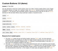
A demo page for Custom Buttons 3.0 shows my progress to this point. As you can see there, I built in affordances for changing the border color on hover, and for reversing the gradient direction for the active/click state to make it feel like the button is actually pressable. I also attempted to show how we could sandwich multiple buttons together to form a pill button. The pill button wasn’t perfect — I didn’t want gaps in the top/bottom borders between each button. But it was a start.
The magical inline-block solved everything, except in IE. That’s where the genius of Google engineers came in. They knew how to get tricks working in all browsers, and this technique interested a couple of them enough that they dedicated the time to make it work.
So 3.0 buttons were fine. After some modifications by our engineers, they made it into live production code. I believe 3.0 buttons are currently still in use for edit buttons in Google Sites, and in editor modes for Google Docs. (As of this writing. Expect those to change in the near future to buttons described below.) But I was still bothered by the requirement of a background gradient image. Not only was this an extra request to the server, but if anyone wanted to change the colors of a button, they’d be required to create a new gradient image. This wasn’t flexible enough, in my opinion, and I thought we could push further.
Eliminating the gradient image
Instead of rendering the gradient with an image, I thought we might be able to simulate a gradient with a few bands of color. With a few light grays laid beside each other that were close enough in value, we’d get something that looked like a gradient. With only two bands of color, I got a glossy-looking button with a sharp division between the two bands of color. Not what I wanted. Adding a third band of color between the first two colors blended each color together better. So three color bands it had to be.

To get that band of color and fake the gradient, I had to insert one more element in the button code. I chose <b> because it was short, and semantically, it didn’t mean anything. That element was absolutely positioned, so it could live inside the button and behind the text without affecting anything else. For the button itself, I used the almost-white #f9f9f9. For the <b> element I used #e3e3e3. The <b> element was absolutely positioned to the bottom of the button, and given a height of 40%. To get the middle band of color, I added a top border of #eee to the <b> element.

Another demo page for Custom Buttons 3.1 shows my attempt at getting this pseudo-gradient to work. It works in Firefox and Safari, and probably a few other modern browsers. But not everywhere. It was never perfect, and I don’t recommend using it in production code. Again, I couldn’t get this working right in IE. Google eng to the rescue again. To see the final code we ended up using in Gmail and Reader, you’ll have to reverse engineer the button code in one of those products.
Sweating the details
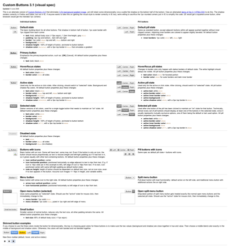
If we were going to undertake the task of recreating basic HTML form controls, we knew there were a lot of details that need to be accounted for and thought through. Like all the possible states of a button: resting, hover, focus, active, toggled-on, and disabled. There are also the accessibility ramifications of creating non-standard controls. I’m sure we haven’t factored in or solved every access issue yet. But engineers are working on that. Here’s a glimpse of the many states and types of buttons, along with the visual specs we had to think about and create if we were really going to replace default buttons and menus:

Major credit
I certainly didn’t create the concept of custom buttons at Google. Nor did I write the final code that made it into production. I merely initiated a couple steps to improve the methods we use to render custom buttons. My portion of the iteration is what’s documented here. There were many other steps in making these buttons a reality.
These buttons never would have made it into production code without the help of several Google engineers. One of the primary aids, Emil Eklund, helped fix a lot of my code for these custom buttons, and got it working in the browsers Gmail supports. He just posted an entry on the Official Gmail Blog yesterday about the label and folder-like functionality behind the new buttons in Gmail. Two developers (no longer at Google) also contributed heavily to the original button code: Ryan Carver and Greg Veen. They deserve huge props too.
Even more credit for the launch of these buttons in Gmail goes to one of the Gmail designers, Michael Leggett, who dreamed up all the fancy new functionality and interactions behind applying labels. Michael gave me lots of feedback and suggestions as we were building the original specs for 3.0 and 3.1 buttons. He also created countless iterations of the button interactions for Gmail, and endured numerous reviews and feedback cycles to finally get them launched in the product. If you like the new labeling menus in Gmail, Michael is the one to thank. The menus are especially slick if you use the new v and l keyboard shortcuts, along with auto-complete to apply labels (and even archive at the same time) without ever touching your mouse.
There are numerous other designers, developers, and engineers at Google who touched these buttons at one point or another. They all deserve credit too. I’ve only given props to four of the most prolific people who made these buttons a reality.
These buttons don’t permeate the entire Gmail or Reader interfaces yet for all browsers. (e.g. Compose view is still using default buttons for older WebKit browsers.) But now that these buttons are reusable components, expect to see us using them in more places throughout Google as we find good uses for them.

