New year, new design
With a bit of humility and even a little nervousness, it’s time to take the wraps off a new design I’ve been working on for nearly a month. My hesitation comes not from revealing the new design, but from my…
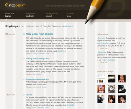
With a bit of humility and even a little nervousness, it’s time to take the wraps off a new design I’ve been working on for nearly a month. My hesitation comes not from revealing the new design, but from my decision early on to make the site more personal, and feel less like an “agency”. I also hesitate because of the elephant in the room: the fact that, up until now, my writing here trickled down to a few entries a year.
Why now?
The new design was brought on by multiple factors. I’ve been wanting to write more. But the few times I pulled up the site last year, I felt uninspired to write, knowing the design was feeling stale and dated. I wanted a new design, but never knew when I’d have time to undertake the seemingly huge, uphill task. The past few years have been filled with major personal changes for me. Getting married, working for Google, buying a house, and our latest adventure, the birth of our first child. All of these replaced the time I spent previously on my own projects. It’s difficult to crank out a new design when I only get a few hours at night after everyone but the dog goes to sleep, or in the morning before they wake.
The kicker that finally got the new design going: my server was hacked toward the end of last year, causing Media Temple to lock down everything, including any scripts or admin access. Malicious files were spread throughout my server, in random locations. The reps at Media Temple blamed it on an old version of MovableType that I hadn’t ever taken the time to upgrade. Oops. (Here’s a plug to update any old software you’re using, if only for security reasons.)
Because there were so many files in so many locations, and not all of them could be easily found, Media Temple provisioned a brand new server for me. They asked that I not copy everything over wholesale, for fear of unintentionally copying over files that were not mine. So I had a clean slate, albeit a forced one.
Grids rule
This design is way overdue. The last big redesign here was in 2004, a time when many of us were still designing for 800×600 resolutions. Time to move forward with a cleaner, simpler design, a wider width, more white space, and an obsessive attention to small details that most people will never notice. Like using a baseline grid (more on that in a future entry). The layout is based on a fixed-unit 12-column elastic grid, sized in ems. It creates just enough restraint, but still provides flexibility for today’s simple layout configurations, plus a few more future variations. I can check the grid on any page by simply adding ?g=1 to the URL, like so.

My type
I’ve always liked Helvetica as a typeface, and chose to use it for everything (with exception of the logo). The restraint of one typeface, along with a limited selection of type sizes, placed extra burden on spacing and arrangement to convey hierarchy. I tried to stick to the absolute minimum amount of content and navigation necessary to find one’s way around. More could be added later, but I liked the stripped down nature for most of the templates.
All colors, together as one
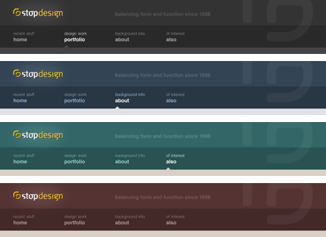
Never content with a single color throughout the site, I modified a few headers to give each section a slightly different feel. I’ve done this for the last few versions of Stopdesign, and I wasn’t about to skip that for this one. I get different headers simply by hooking on to already-existing body ids with a few additional CSS rules.

Technical nerdery
Some who read the footer will notice I switched to WordPress. This wasn’t so much prompted by the MovableType exploit of my previous server, as much as it was due to the difficulty and frustrations I had trying to upgrade MT after the compromise. Plus, I started using WordPress a little over a year ago for another personal site at dougandcam.com. In fact, if you visit that site, you’ll see a lot of design and content similarities to this one. This design was a chance to elaborate on what I had done at D&C D&C was the proving ground for WordPress, and where I learned how its template system and syntax works. Ultimately, I switched to WordPress because I was familiar with it, and had lost all my familiarity with MovableType. With no offense to my friends at Six Apart, development on WordPress seems to be happening at a faster pace. And it just fits more in line with what I want to do for now.
The particulars of which CMS I use aside, it was a lot of work to start over from scratch, rather than just modifying existing templates. So not only did I create a new design, I also completely switched template languages, plugin capabilities, and even a bit of my site structure. Previous versions of this site already relied on PHP extensively. So it was a welcome change to be able to interact directly with WordPress via PHP. (I never tried MovableType’s PHP templates–seemed like too much work at the time.)
IE6: the new Netscape4
This version of the site is also my first opportunity to give IE6 the proverbial finger. It was liberating to develop this site without checking my work in IE. Time for everyone to say I dropped IE6. Hello :before and :after pseudo-selectors, attribute selectors, adjacent-sibling selectors, and all kinds of other simple selector tricks that should have worked years ago in every browser.
I didn’t even check any version of IE until last night, when I figured I should at least take a peek to see how gloriously IE6 barfed all over a 10-year old CSS2 specification. Impressive, it was. For now, I’m using conditional comments to serve a custom stylesheet for IE6 just to turn off most of the styles. This seemed like the lesser evil, and at least ensures the poor souls still using IE6 can at least read my content. IE6 gets a stripped down, single-column view that will get no more attention of love after this. I’ll be able to yank those conditional comments and the entire stylesheet anytime I want. I noticed IE7 had one major problem with a negative margin, so IE7 gets its own little stylesheet too.
Getting personal
I mentioned above that I wanted a more personal feel to the site. Since I’m working in-house at Google, I’m not hustling contract work, so there’s no need to market Stopdesign like an agency or firm right now. Because of that, I decided to focus much more on the text of the site, downplay most of the imagery, and go with a very subdued, minimal presence. I chose to display recent Twitter status messages, Flickr images, and my current reading list on the home page to make the site even more personal. Forgive me if you’re not into baby pics–my daughter occupies the majority of my non-working and waking hours, so she’s the subject of almost all photos for the time being. That will change over time. Just ignore the cuteness in the sidebar if babies aren’t your bag.
Watch for sharp edges
Some of you may have already seen the new design a few nights ago when a slight gaffe of my own doing broadcast the new server’s IP address in a feed aggregated by Hot Links. That’ll teach me not to change Feedburner settings before I’m actually ready to pull the trigger.
I haven’t had time to polish every last little detail. But if I keep worrying about that, I’ll never get this design out there. There are still a few glitches in the site here and there. And there may be a few broken links or some missing pages now and then. I’ve done my best to prevent link rot by being diligent with mod_rewrite rules. But you may encounter some oddities or inconsistencies, especially if you dig back through older entry and archive pages.
I’ll do more explaining in future entries. I already have 5 drafts started.
So here’s to a new year. To our new President and the hope he brings. To many more ideas to share. And to a brand new design.
