A curious reader recently asked about the Adaptive Path redesign:
“I’m puzzling over why with the main nav bar you nested an absolute div into a relative div?”
A simple answer to his question is: Because I wanted optimum flexibility for the header and navigation, and to keep the navigation the same distance from the logo, no matter how the text is resized.
That’s the strategic answer providing rationale for the method. But I gather he might also be seeking a tactical answer. To answer his question thoroughly, I’ll backpedal a bit, and explain the workings of CSS absolute positioning in my own words, provide an example which demonstrates a different effect than the one achieved in the Adaptive Path design, then come back to the AP navigation.
Containing Blocks (Positioning Context)
Nesting an absolute-positioned element within a relative-positioned element is a fairly oft-used technique. More commonly, one may hear the inverse stated: a relative-positioned element is wrapped around an absolute-positioned element.
According to the CSS2 spec, an absolute-positioned element is positioned according to its containing block. Any element is considered “positioned” if it has a position value of relative, absolute, or fixed (anything other than static). “Static” is one of the possible values for the position property. It’s also the default value for any element if no other position is specified. Static basically means an element’s position is not modified, and the element will appear in the expected normal flow of the document in context with other sibling elements and containing blocks.
If an absolute-positioned element resides within no other containing block, (when no ancestor elements are positioned) it is placed relative to the page boundaries (called the initial containing block). Thus, an element styled with the following rule:
#topleft {
position:absolute;
top:0;
left:0;
}
will get placed in the top-left corner of the page. However, any positioned ancestor establishes a new containing block for all its descendant elements. If an ancestor element gets positioned, the positioning context of any descendant element is reset to the boundaries of that ancestor element (the new containing block). Thus, the box offsets in the rule above would position the #topleft element at the top-left corner of the positioned ancestor, rather than the top-left corner of the page.
Lost yet? It still sounds like gibberish to me too. I’ll pull up a common example to help drive it home.
Dynamic Positioning
For stopdesign.com, (at the time of this writing) I use absolute positioning for the right column (#subcol). When I designed the templates, I wanted the right column to appear immediately below the header (#header) with no overlap and no gaps between each block. The header contains the logo and main navigation. Because the navigation is text, it can be resized via browser controls. This directly affects the height of the entire header. I could have positioned the right column in context to page boundaries, choosing a starting top position based on a measured header height. But since the header varies in height from browser to browser based on default text sizes, this means the right column would sometimes overlap the header if the header grows in height. Or a gap may appear between the header and right column if the header gets smaller than my initial measurement.
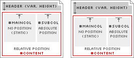
Diagram 1
To adapt to this variable header height, I use a positioned container element (#content). This container appears in the markup immediately after the header, and is assigned position:relative;. This allows the container element to appear in (and affect) the normal flow of the document; the top of the container will always appear immediately below the bottom of the header, no matter how large or small the header becomes. Because #content is positioned, this also resets the positioning context for any elements it contains. The right column (#subcol) is contained within #content, so the right column gets positioned in the top-right corner of #content, rather than the top-right corner of the page. This allows the right column to adapt in vertical position according to the height of the header, as modeled in Diagram 1.
Bottom-hugging Navigation

Diagram 2-A

Diagram 2-B
Finally, I circle back to the Adaptive Path navigation, which represents a different use of this making-absolute-relative technique. I could have easily assigned a fixed margin-top to the navigation and been done with it. But in this case, I want the header to always remain the same height, no matter how large or small the navigation text becomes. In other words, I don’t want the dark green border below the navigation to change in vertical position, relative to the logo, as shown in Diagrams 2-A and 2-B.
Rather, the navigation text is free to be sized up or down, but its baseline position remains constant. It always touches the dark green border, and never overlaps this border. By positioning the #nav element using position:relative; and assigning a specific height to this container (72px), the container establishes a new positioning context for the “inner” div. The inner div can now be absolute-positioned to the bottom of the #nav container using bottom:0;.
Other uses for this technique certainly exist. It’s not an uncommon desire to want to reset positioning context for an absolute-positioned element to something other than the page’s boundaries. The reasoning behind why I do what I do is often obvious to me. But it took a reminder that reasoning isn’t always so obvious to everyone else. Perhaps this technique is now a little more understood by others (maybe even obvious to them) as well.
Translations
This article is translated into the following languages:
- Brazilian Portuguese:
Posicionando relativamente o absoluto
by Mauricio Samy Silva
36 comments
Jeff Croft 5 years ago
Great article, Doug. This is a complicated and often confusing aspect of CSS, and you’ve done a great job of putting it into human-readble form!
Jeff
Fred2000 5 years ago
You just wanted an excuse to make pretty diagrams using that bloggerific tiny block font!
Jai 5 years ago
I wish more tutorials explained this! This was a great read Doug!
Seamus 5 years ago
Great article. This is something I stumbled acrossed a few months ago and have been able to use in many ways. It is one of those tips that really is nevered talked about.
Caspar Fairhall 5 years ago
Thanks for writing with such clarity and authority on this subject - very enlightening. It’s not an intrinsically complex subject I suppose, but it is easy to become confused at first. Well done.
s t e f 5 years ago
Doug, just for the sake of theory, why not have used a float element for your navigation and a margin-right for your content?
The result would have been the same without even needing the container, wouldn’t it?
caio chassot 5 years ago
stef, I have an experience that it’s usually better if you can avoid using floats.
theoretically, using either floats or positioning would indeed achieve the same result.
in practice, floats would wreak havok in some *cough* ie/win *cough* browsers depending on what you did inside the floated divs, as, for example, floating more stuff inside it.
lastly, with positioning you have better control over linear content order than you have with floats.
Rahul Choudhury 5 years ago
I wish CSS-3 would just get done/supported by browsers already so we could use columns and its other features instead of having to do all these workarounds with positioned and/or floated elements…
kimBlim 5 years ago
Doug - your “articles” are an inspiration to me (and many others, I suspect). Thank you for providing such great tutorials..
Michael Guitton 5 years ago
Thanks for the article however diagrams won’t print (!?) Maybe you need to tweak your print style sheet.
scotbebop 5 years ago
The article is excellent. This CSS novice just had to say thank you.
Tobias 5 years ago
Thanks for this great article!
Now some important facts got more clear to me :).
Really nice diagram-design! Beside loocking good they are very helpfull to understand what you are talking about :).
Paul Michael Smith 5 years ago
Yep, nice read doug.
Josh Heyer 5 years ago
Doug,
I appreciate your detail-oriented style of explaining things. You’ve cleared up some positioning clouds in my mind that have been tough to see through. I particularly like the diagrams, which really help with the clarity of the article. A much recommended read!
Luke Redpath 5 years ago
Great one Doug - nice to see somebody point out this technique, because IMHO this method of absolute positioning can be a lot easier and more reliable than using the float system, which is very quirky.
I used the technique here for a 3 column layout, no floats, which some people might find useful:
http://www.sonicdeath.co.uk/stuff/3colnofloat.htm
Luke Redpath 5 years ago
Sorry - to save you hassle - 3 Col, No Float
blakems 5 years ago
Great article, well written. I have found using positioning, absolute and relative, the main reason to switch to CSS for layout. I have had to switch column positions in the past for clients and all it takes is switching the positioned div from “left:0; to right: 0;” Works like a charm.
Anthony 5 years ago
Thanks so much, Doug. I have been wanting to redesign and move to a tableless layout but every time I delve into positioning I get confused and have unpredictable results. This was very enlightening and I think it will help enormously.
Todd Dominey 5 years ago
Say it with me now…book. Book. BOOK. Write a book! Nice tutorial.
Doug 5 years ago
stef (from #6): Doug, just for the sake of theory, why not have used a float element for your navigation and a margin-right for your content? The result would have been the same without even needing the container, wouldn’t it?
True, floats can often produce similar results. I find the use of floats or absolute positioning depends on the design and the effects the designer wants to achieve. I started out using floats when I redesigned Stopdesign last year. It was actually the main content column which was floated, the right-side navigation left unfloated, for benefit of order of content. However, I found that for the details I was going for on Stopdesign, absolute positioning produced the results more accurately and more reliably.
Floats are used extensively for columns throughout the Adaptive Path design. But to gain control over widths, content order, and reliability, I actually use two separate containers which are wrapped around the columns. Someday, I plan to write up a description of how the column layouts work in the AP design, and how the team can dynamically change layouts by simply changing the body class.
Jai 5 years ago
I agree with the BOOK statement… but I digress to different consideration; semantics. Do you think it’s semanticly ok to place a container div around stuff, or is that breaking the semantic markup for the sake of sanity? Just a pondering I’m having…
Lea 5 years ago
I say “Aye!” to the book. ;) Really, Doug, if you taught classes on this stuff, I would go every day and not fall asleep. I swear. Just reading your articles really clears up the cobwebs about some CSS confusion. Good on ya.
Doug 5 years ago
Jai: Do you think it’s semanticly ok to place a container div around stuff [...]?
Many times, divs are placed into the markup purely for the sake of control over presentation. This is usually considered a “bad” thing. But with the current state of browser support for CSS, I still see it as a requirement in some cases. If CSS2 selectors were widely supported in all modern browsers, we’d be able to ditch many of the style hooks we currently find the need to leave in the markup.
If I see no other way to make a layout work without using a generic container div, I at least like to give it meaning by identifying it as somthing — in Stopdesign’s case the column wrapper is identified as:
id="content", which could be used to scrape content or as an anchor position for skip link.Darin 5 years ago
Is it valid to position a div relatively (to take advantage of position: absolute in one of its contained elements), without actually positioning it anywhere? For example, let’s say its horizontally centered using “margin: 0 auto;”. Can I declare “position: relative” without an accompanying top/bottom and left/right value?
Doug 5 years ago
Darin: Is it valid to position a div relatively [...], without actually positioning it anywhere?
Yes, it is. The top/bottom and left/right values are just box offsets. They can either take length measurements (as you’re probably thinking), percentages, but can also be auto, which is their default value.
An element may be assigned to any of the position values without using any box offsets at all (leaving them as auto).
Submunition 5 years ago
Heh, great stuff, I love it. Now, what I need to master is the art of footers, but I think that this article has provided me with some insight that I can apply to my struggle.
Oh yea, what is that tiny font called again?
Doug 5 years ago
That ever-so-common font is Silkscreen, created by Jason Kottke
Mike 5 years ago
Great stuff Doug, thanks in particluar for taking the time to share something like this in such a thorough manner. This stuff makes me stop taking for granted what I know and rethink the methods I use.
Michael Romero 5 years ago
this is a great article that explores some of the idiosynchracies of css2. what i don’t understand yet (at least — i’m still pretty new to xhtml/css based design) is to do one thing here on stopdesign that you’ve done, and that’s have the black bar for your subcol go ALL the way down the right side. on the site i am working on i’d like to be able to do that, but don’t know how to properly code the css for it. right now i’m cheating it by passing a style declaration to the div on each page, but this is an inefficent hack of an inexperienced coder. i’d like to learn how it works.
however, this information was very useful :D
Chris Hester 5 years ago
Why not use a border? That way you can get a right column that matches the height of the main one. In this case, the border would be the black space. The right column text is merely laid on top with a transparent background.
I’ve used this trick on my site. Take a look.
Hrunting 5 years ago
The only issue with the wrapper content method is that IE6/Win (possibly other IEs as well) does not expand the wrapper relative element’s height to include the inner absolutely positioned element. If the maincol content is shorter than the subcol content and the subcol height does not fit in your browser window, you cannot scroll to see it. It looks like the inner absolute DIV is removed from all rendering calculations completely.
See what I mean here vs. here (the second uses two absolutely positioned columns).
There may be a non-JavaScript workaround, but I haven’t found it.
Kris 5 years ago
Absolute positioning of the columns outside the #content DIV would have been perfectly possible by using ems for top or margin-top property. How many ems depends on your skill with a pocket calculator.
Nevertheless, Doug, your story explains a principle I have not thought about before.
Hrunting 5 years ago
Leave it to comments to pave the way to success. A few hours after posting, I discovered that I could resolve my issue by assigning a width to the outside content DIV. That’s why the second link doesn’t exist anymore.
As for relative vs. absolute, the relative wrapper is nice for when you don’t want to have to worry about possibly adding additional preliminary content (like a note or another menu bar) later on. You can just add it and rest assured that your old content will render below it, without having to bust out your pocket calculator again.
Ben 5 years ago
This works perfectly on either IE 6 and Mozilla (both PC version)
If I take the same code and apply an absolute position on the left (instead of right, in the example), I’ve got a bug on IE 6 PC (www.flapsdesign.com/test.html). The left: 10px value is measured from the left border of main div instead of left border of content div…
This bug doesn’t appear in Mozilla or Safari !
Is there a way to correct that ?
bla
bla
Steve Cote 5 years ago
I’ve had a little trouble making fixed centered layouts using floats. They break when the content gets too big.
In a nut shell, are you saying I can abandon the floats if I make my main centered div relative position I can use absolute position for the child divs?
Kris 5 years ago
Doug,
Thanks for the write up! I think I am slowly grasping the answers to some of the niggling little problems I often run into.
Thanks again.