Still throwing tables
On the one year anniversary of the article: Throwing Tables Out the Window, I thought it appropriate to reveal some behind-the-scenes info regarding the Microsoft example discussed in the article.
On the one year anniversary of the article: Throwing Tables Out the Window, I thought it appropriate to reveal some behind-the-scenes info regarding the Microsoft example discussed in the article.
When I published that article last year, the words and advice contained within were welcomed warmly by large numbers of people. The article was translated into at least eight different languages, and continues to be referenced in other writings and in academic curricula. On the flip side, the same article was also the cause of flaming, accusations of ignorance, and general vitriol thrown my way, claiming I was over-hyping CSS and deceiving the multitudes of its capabilities. Those claims were voiced more loudly when readers couldn’t find any proving example code whatsoever. Those who refused to let go of their old ways assumed that I fabricated the entire case study.
I still stand behind that article. And I promise the example code is real, and still resides in the same location where it has been for the past year. You just had to know where to look for it.
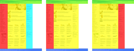
I intentionally omitted any links or references to my working code examples in that article because the point was not to get hung up on details or to demonstrate the methods used. I wanted to step back and look at the overall picture. After experience with recoding Yahoo Search, I no longer believe in reworking (in CSS) some other organization’s site, then publicly rubbing anyone’s nose in it by posting the code for all to see. I wasn’t trying to target Microsoft for bad CSS support in IE, nor make a fool of its home page code. Rather, last year’s home page of Microsoft.com was chosen as an example because it was a high-profile representation of a very common design model used on thousands of sites: header across the top, three columns of content, and footer across the bottom. If a site doesn’t use a three-column content model, it may simplify the same model down to two columns:
I gave this presentation for the first time in Seattle, right around the corner from Redmond. So I thought the selection of reworking Microsoft would turn a few more heads. Those who attended my talk at Digital Design World had full access to the Microsoft example code during and after my presentation. It was never hidden from them, because it was used as a tool to aid in learning the methods and benefits of tableless design.
In an odd bundle of circumstances, Microsoft ended up redesigning its home page just one month after my Seattle presentation, significantly reducing the file size of its code. The design was simplified and the amount of text on the page was significantly reduced as well, so this wasn’t solely a reduction due to leaner code. However, all spacer gifs seem to be gone from the markup, and only eight tables remain in the current version, so that points to progress from last year’s 40-table version.
Fast-forward to today
Now that a full year has passed since the article was published, and because Microsoft no longer uses the design I made an example, I also moved on and now use another design for my tableless presentations. Because of these factors, it now seems appropriate to share more broadly the final example code I used, and the full set of slides I used during my Seattle presentation to cover the reworking of Microsoft.com.
- Example code: 2004 Microsoft home page using CSS
- Seattle presentation: No More Tables
The portion covering the recoding of Microsoft.com doesn’t start until somewhere around page 32 of the presentation. Once the presentation gets to Step #3, small links at the bottom of the page point to in-progress files representing the work done up to that step.
By sharing even more information surrounding this case study, I hope having everything in context to this case study helps enlighten others to the means and the power in using CSS to implement and control layout and all other details of design.