Zoom layout
In a presentation for @media entitled, Zoom the Web, Joe Clark revealed and explained several possible options (a new trend, hopefully) for making sites more accessible and readable for low-vision users. In the continuing effort to make our sites accessible as possible, many have assumed accessibility best practices deal primarily with blind people who often use screen readers.
In a presentation for @media entitled, Zoom the Web, Joe Clark revealed and explained several possible options (a new trend, hopefully) for making sites more accessible and readable for low-vision users. In the continuing effort to make our sites accessible as possible, many have assumed accessibility best practices deal primarily with blind people who often use screen readers.
In reality, there are many more people who aren’t blind but experience some form of vision loss or impairment. These people would never have need for a screen reader, and wouldn’t necessarily benefit from the typical measures we’ve taken to ensure our pages are accessible to blind people.
To some extent, we’ve been ignoring this large group of low-vision users, assuming their browser controls for resizing text are enough to enable reading of our pages. Or that their own screen magnification software does the job well enough, so we don’t need to bother.
Some designs I’ve seen easily handle quite a few bumps up in text size. Others start to fall apart more quickly than they should because of narrow, fixed-width columns. Many of you probably know how difficult it is to read text when you’re forced to scroll both vertically and horizontally. This can parallel the experience of using a screen magnifier to read most multi-column pages.
Enter the Zoom layout
Another means of giving your visitors control over the content on your website. If a site already takes advantage of CSS for layout, offering a Zoom layout option is trivial.
Case in point: While Joe was giving his presentation in London, I thought, “Implementing a single-column layout with larger sans-serif type isn’t rocket science. Why don’t I already have one? I’ll just create one right now.“
So I opened up my laptop and cranked out a quick style sheet for a Zoom layout. I had it mostly complete by the end of his presentation. I’ll admit that I was already familiar with Joe’s concept, having seen his article, Big, Stark & Chunky, on A List Apart. And I had seen his referenced examples from Cameron Adams and Sergio Villareal. Stopdesign already had a Preferences page for switching styles and font sizes. So I was at a slight advantage when Joe gave us his homework assignment of creating and tweaking our own Zoom layouts.
I’ll save you from any further description of a Zoom layout, and instead, encourage you to read through Joe’s detailed notes from his presentation.
Making it real
Once I got back to the States, I spent time polishing the style sheet I had pulled together in London, and split my work into two versions for Stopdesign’s Zoom layout: a positive version with dark text on a light beige background, and a contrast version using an inverted color scheme of light-color text on a dark blue background.
Zoom (positive)
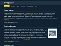
Zoom2 (contrast/inverted)
Both are available as permanent settings on the Preferences page, which appears as the fourth link at the top of this site for any non-Zoom style. (Those first four links actually exist toward the end of the markup, just before the footer.) Base text size can also be changed to one of four values on the same page.
The heavy lifting for both Zoom layouts is done only once (zoom.css). For the high-contrast/inverted color scheme, the background, text, and border colors are changed via a secondary style sheet (zoom2.css) linked in addition to zoom.css.
Users of browsers other than IE will notice a nice scaling effect on the width of the layout as the text size gets bumped up. The single-column is given a max-width in em values, with no physical width defined. This allows the layout to remain confined to readable line-lengths at smaller text sizes. Yet it also allows the layout to expand as text size is increased. The layout will expand to the width of the browser, then stop expanding, preventing the appearance of any horizontal scrollbars — unlike the new Yahoo!, though nice because its layout expands with the text size, it quickly expands beyond the browser window width as text size increases, necessitating all kinds of scrolling.
A few more tips
If you’re considering offering such a layout to your visitors, first, make sure you read through Big, Stark & Chunky and Joe’s presentation notes to understand the purpose and suggestions for creating a Zoom layout. Follow most of his advice, and you’ll be well on your way.
From my own experience, I’ll add a few tips to consider in the process:
- Re-examine your markup: Going to a single-column forces you to take a look at the order of your content within the markup. Try to keep your most important content — and the content which changes from page to page — toward the beginning of the document. Use common sense in determining order.
- Simplify navigation: Too many choices at the top of the page will be confusing, and may push the content completely off-screen when the text is bumped to a larger size. Keep the list as short as possible, and consider making the list
inline, orfloateach navigation element. Do this in a way that it doesn’t look broken if the navigation wraps to more than one line. If long lists of navigation must be present, consider moving them toward the end of the document, then reposition them for your default style in your original style sheet. - Avoid pixels: I’m not talking about type here — Joe covers that in his notes. Don’t use pixel values for width or height measurements of content containers (columns, etc.) And as much as possible, avoid the temptation to use pixel values for any margin/padding and line-height values. Use percentages, or even better, ems, which scale gracefully with the text size, retaining chosen proportions. If appropriate, use pixel values sparingly around fixed objects that won’t be changing in size anyway, such as the logo. You may also want to use a fixed-pixel value for the outer (
body) margin or padding, to avoid those values getting too large as the text size increases. - Remember form elements: Just as you bump up text size in general, don’t forget to do the same for form elements. Not all browsers allow every form element to resize with the text (shame on them), but do your best to make form elements as easy to use as possible for your low-vision users by bumping up their default size as well.
- Good and bad insets: Even though you’re striving to keep all content in a single column, it’s still OK to float the occasional image, as long as said image is not overly wide or tall. As long as text can flow freely around the image, the low-vision user still gets the benefit of seeing the image in context. The image won’t be scaling up preventing the flow of text around itself. That said, insets of text-based (non-image) content can be a bad thing, because that inset text needs to scale too. This can be distracting as different lines of large text compete for attention.
- Start from scratch: If at all possible, wipe out any existing site styles before applying new Zoom styles. In my opinion, it’s much easier to build a single-column design from scratch, rather than needing to go back and make sure you’re overriding all original style sheet values. This requires some server-side scripting to change the default style sheets that are linked or imported in the
<head>of each document, and may not be possible for everyone.
Zoom style sheet availability
You may need to apply a few tweaks for use on your own site, but feel free to grab Stopdesign’s zoom.css file, or both that file and the zoom2.css file to use as a base/starter for your own Zoom layout. Both style sheets are licensed under a Creative Commons Attribution-ShareAlike 2.5 License. Creating a single-column style sheet isn’t difficult, but if these two files give you a jump on the action, be my guest. Cheers.
(It should go without saying, but this does not grant permission to freely copy and use any other Stopdesign style sheets verbatim for any purpose other than studying and learning how they function. Thanks.)
Update: Joe is now building a repository of information about zoom layouts, including links, references, and examples.