IE Factor, exemplified
After writing about the
After writing about the IE Factor several days ago, I thought I’d detail a specific example which had me pulling out my hair last week. I’ll also provide the solution I came up with. As I stated Monday:
Tweaks that should have worked had no effect, prompting me to try things that made absolutely no sense to try.
This bug was no exception. It took a lot of isolating and trying remote possibilities to come up with the solution that fixed it. I also mentioned different combinations of IE’s can drive a CSS author mad. This bug shows up in IE5.5, but not in IE5.0 (Win). IE5.5 certainly renders CSS a little better than its predecessor, but with IE5.5’s release and improvements, new bugs — which did not previously exist in IE5.0 — suddenly appeared. Some of those same bugs were carried into IE6.0.
The problem: A simple series of content boxes (I call them “modules”) appearing in succession within a 200-pixel wide sidebar. Nothing out of the ordinary, certainly nothing complex. Each module started with a title marked up with the <h2> tag. Each module’s title was followed by two generic paragraphs of text.
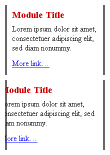
The example file I’ll provide is stripped down, with almost all design details removed. Titles were given a bit of style to reduce font size and top and bottom margins. For what I was creating, borders for each module only existed on the sides. I’ve exaggerated them to make this bug more obvious. To see it misbehaving, view this example of the bug in IE5.5 or IE6.0, then view it in any other browser to see the correct behavior. For those not fortunate enough to have either of those two Windows browsers, here’s a screenshot of the first and last modules, as rendered by IE6.0:
Notice how the text gradually slips further to the left for each module. The bug only begins to appear in the second module, then gets progressively worse for each module below. Until the last module’s text slips so far to the left, it gets clipped by the module’s container. The problem gets infinitely worse as more modules are added. No other browsers have problems rendering the text correctly.
Obviously, this problem wasn’t acceptable. I had no idea how many modules the client might need to stack together in the sidebar. I tried every trick in the book I knew to prevent the text from slowly slipping over. The problem was seemingly incomprehensible, as each module was completely independent of the next. The code was completely valid, and no containers overlapped each other. I tried it with the 200-pixel sidebar, and without. I removed padding, applied margins, removed the titles. No luck.
I walked away, went to lunch, then came back to find the root of the problem. I discovered the text was slipping to the left by four pixels from one module to the next. At the time, each of my side borders were only 2-pixels wide. So the text slippage between each module was equivalent to the width of left and right borders combined. I removed the side borders, the bug disappeared. (See example)
Ok, so it was the border. But the effect I was going for required the side borders. At one point I tried adding top and bottom borders to the module: Bam! problem solved. Turns out it’s actually the presence of a bottom border (any width) which fixes the bug. It makes no sense why a missing bottom border on one element would affect another element on the page. But in IE5.5/6.0, it does.
So the bug could ultimately be described as this: If left and right borders are applied to one container element without a bottom border, the side borders on the first container will adversely affect the text position in the next successive container element.
To fix my instance of the problem, I added a 1-pixel bottom border for each module, making it the same color as the module background to keep it mostly invisible. (In the example, background and bottom border are white.) Since the border isn’t necessary in all other browsers, I really didn’t want it there when it wasn’t needed. So I added one more rule to turn off the bottom border for them:
.module {
  margin:0 0 15px;
  border:4px solid #666;
  border-width:0 4px;
  border-bottom:1px solid #fff;
  padding:2px 10px;
  }
html>body .module {
  border-bottom-width:0;
  }
By using a child selector, that final zero-width border rule is hidden from all versions of IE/Win. (View the final solution) I also discovered that applying a width to each module also solves the text-slippage problem. But IE5/Win’s broken box model needs to be dealt with if the modules use left or right padding. And widths should not be necessary for individual modules, given that a width is already specified for the parent #sidebar. So I stuck with the add/remove bottom border trick to avoid the need to re-specify module widths.
This is just one example of the inexplicable bugs which caused delay for my latest project. If anyone else encounters the same bug, hopefully this example will save some of their hair, and prevent them from facing the same frustration.

