Wired.com: 20 years later
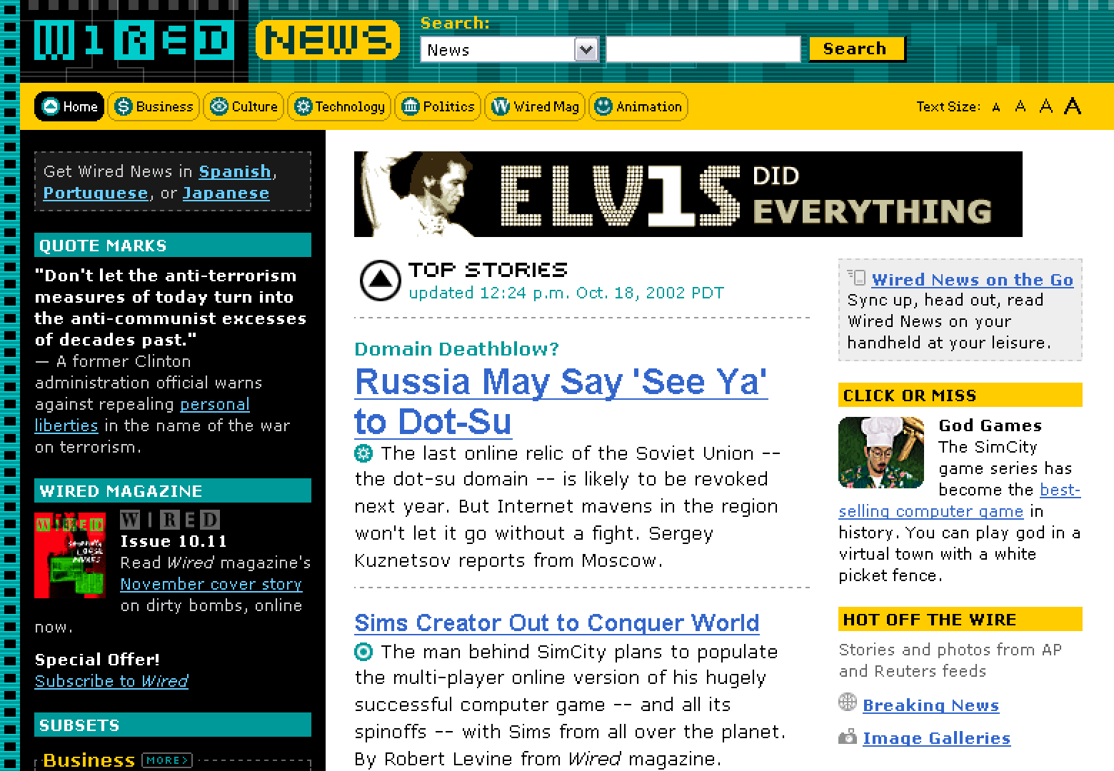
Twenty years ago today, Wired launched a seminal redesign of its website that helped catapult forward web technology and what our industry understood as possible for commercial websites.

Twenty years ago today, Wired launched a seminal redesign of its website that helped catapult forward web technology and what our industry understood as possible for commercial websites.

A few years back, I added the redesign date to my calendar to help mark the passing of time. Each year, just as baseball’s Postseason ignites in early October, I get a reminder that takes me back to the early days of the web, even before the dot-com craze. It was a different era, marked by experimentation, exploration, and curiosity.
A decade ago, I wrote “Wired.com: Ten years later” looking back at the redesign and how far we had come since then. Another 10 years later, the redesign is now 20 years in the past, and long gone. Replaced by multiple designs many times over. Twenty years is so much time. And with internet years being like dog years, the early era of the web feels like another lifetime ago.
The World’s Wild Web
When Wired launched HotWired (its online sibling) in 1994, the World Wide Web was still a wild world filled with unknown territory and unfamiliar terrain. Wired, the magazine, kept us connected to new trends in the tech industry. Wired News kept us updated on the tech in between monthly issues of Wired.
Wired was known for its avant-garde approach to design. The design (in print and on screen) felt inspired by the techno-pumping raves its designers had just left several hours before coming into the office. Not all designs were successful or even legible. But each design introduced us to new ideas, people, and companies that were shaping our future. Every one of us familiar with Wired expected it to keep us on the cutting edge. To do so, it not only had to cover the edge, it had to *be* the edge.
Wired’s design and aesthetic were intentionally experimental. Partially out of preference, mostly out of necessity. Wired carved its own paths, inventing many of the patterns, interactions, and systems it wanted to try, because no one else had created them yet. That Wired.com was the first large commercial site to launch a standards-based table-free design is obvious in hindsight now. It was expected to practice what it preached, living on the edge of the industry it chronicled.
Gravity of the Status Quo
Despite those expectations, the 2002 redesign of Wired.com almost didn’t happen. At least, not as the standards-embracing, table-free, CSS-for-layout example we know it as today. We were already pretty far along in the redesign process. We had no plans to do anything different than the status quo at the time. The site was undergoing a visual and structural update, necessitated by updated feature and advertising requirements.
Design and Engineering at Wired Digital back then were still very divided in terms of domain and responsibility. There was little overlap, and often not very much communication between the two. Designers created their initial designs (usually in Photoshop, occasionally in Dreamweaver, if I remember right), then shared them with Engineers, who then wrote the code to recreate those designs.

In HotWired’s early days, many of the network’s pages were coded by hand as static HTML. A simple update to the navigation meant using a text editor’s search/replace function across hundreds of files. But as the engineering team progressed, they took advantage of server-side includes for common components, and crude frameworks that could be considered early content management systems began to emerge.
Eventually, we migrated some of the bigger sites like Wired News over to Vignette (one of the first big, commercial content management systems). A CMS like Vignette meant more power to handle increasing scale and variability. It also meant more abstracted, complex code, and a need for greater specialization of roles among engineers. Using Vignette meant some loss of control in the exact output of final HTML. Some of that output was controlled deep within the layers of abstraction Vignette offered (as a feature), and took a lot of work to alter or control to a finer degree.
Throughout our work on the redesign, I had been reading articles on sites like alistapart.com. I consumed and deconstructed examples from Jeffrey Zeldman, Eric Meyer, and Molly Holzschlag. I had worked for years alongside Jeff Veen. I was working at cafes with Tantek Çelik and Matt Mullenweg. I kept seeing examples and rationale for adopting web standards the way they were intended to be used. I read posts about accessibility, semantics, proper nesting of front-end code, microformats, the power of CSS, and dropping tables and spacer gifs as a crutch for supporting layout and design features.
As I looked at the code we were planning to use for the new design of Wired.com, there was a huge disconnect between what we were using, and the forward-thinking approaches I kept reading about. I knew better. We weren’t pushing the edge of technology; we were lazily falling into the gravity of the status quo. The larger a company gets, the harder it is to resist that gravity and actively work against it. Our team at Wired was falling into the same rut.
Such an approach didn’t feel very wired. It was the opposite of wired. Wired’s editors used a name for outdated, uninspired tech: tired. Our team needed a jolt to wake us up. To remind us that Wired’s whole purpose was to find the edge.
Owning the Unknown
Doing something for the first time can be nerve-wracking. There’s no familiarity to ground your expectations. Being the first one to try a new thing for the first time can be even more debilitating. There’s no one to look to who can tell you what it will be like. What are all the risks? How much benefit is there? What’s the worst-case scenario? If you jump, where’s the bottom? History is full of examples where people took a risk and made the leap into the unknown. They were driven by curiosity and a belief that there must be a better, different way, despite not fully knowing what the outcome might be.
Despite not knowing that outcome, we had to change course with the redesign. We had to resist the gravity and push forward into the unknown. Not only was it the Wired thing to do, I fundamentally believed it was the right thing to do. So I stayed at the office late into several nights, reworking our front end code, separating content from design, and using what I knew to write XHTML and CSS as I knew it should be.
Mid-way through rewriting the code, I pitched the change in approach to the engineers, to my manager, and to the producer of Wired News. Everyone tried to predict potential advantages and asked about the risks. The engineers couldn’t guarantee how much control we’d have over the final output of XHTML, but were willing to try to reign in the output. My manager asked how shifting would impact our schedule, and if/how advertising would be impacted. The producer wanted to know the impact the change would make on the editorial team workflow, and what we would do with browsers that didn’t yet support some of the new code.
We had some answers, but we had even more unanswerable questions. We ultimately trusted instincts and agreed it was worth the time and effort to push forward with the new approach into the unknown, despite not having any other examples from which to learn. The ethos of experimentation and pushing to the edge drove all of us to take more risks. Those risks didn’t always work out. But we often discovered new possibilities, and we learned from every experimental attempt.
In this case, the outcome of the Wired.com redesign:
- reduced the front-end markup size by over half (from 48KB down to 23KB)
- dropped from 24 nested tables that controlled layout down to only 1 table that appropriately rendered financial market data
- dramatically improved accessibility of the site for users of assistive technology
- simplified the markup the CMS needed to support
- limited most design changes to simple CSS updates
When I look back at Wired.com then, I see how much design on the web has evolved. We crammed so much in the top of the page (those early ad banners!). We had limited options for fonts (Arial, Verdana, Times), text was pretty small (11px Verdana!), and often made with images (remember Silkscreen?), icons and images were pixelated and blurry. But I was proud of what we achieved with that design. And I liked how easy it was to completely change color schemes on a daily basis because of the use of CSS.

With the exception of the accessibility improvement in #3, the rest of the outcomes above are debatable how relevant they are today. It’s hard for most of us to imagine a commercial web page measuring less than 50KB now. (Some of the site-wide CSS files I write now are more than 50KB alone.) We’ve come so far since this redesign in 2002. We no longer trip ourselves up trying to fit everything above an imaginable fold. Designs respond to various screen sizes. Text is comfortably larger and screens display at a much higher resolution. We tend to give everything more breathing room.
More importantly, the web now supports an unimaginable amount of tasks, purposes, and messaging, all viewable, consumable, and interactive on a multitude of devices of varying sizes and capabilities. Every one of those advancements since the early days was the result of someone or some company taking a risk and trying something new. Something where they didn’t entirely know what the outcome would be, or how well it would be accepted in the marketplace. They still took the risk, owned the unknown, and pushed us all forward by doing so.
Wired’s 2002 redesign was a just small nudge in the bigger push forward to evolve the web’s purpose and utility.
