Throwing tables out the window
With the CSS waters thoroughly tested by many sites that have taken the plunge, it’s time for us to start cheering from the water below, coaxing and encouraging those who haven’t yet jumped in, to make that jump. There’s no longer any reason to use tables for layout, nor is there reason to maintain multiple versions of a site solely for different desktop browsers. Throw the tables out first. Trust us, they’re not needed anymore.
Those who were at Digital Design World in Seattle this year saw me present a session titled, “No More Tables, CSS Layout Techniques“. In that session, we reviewed proper use of tables, and a few pointers for styling them with CSS. Then we turned to tableless layout, reviewing examples and an overview of the two basic approaches (positioning and floats).
Half way through the presentation, I switched gears and announced we’d be converting a real-world example from tables and spacer gifs to a pure CSS layout. I could have created a fictitious example to work with in the presentation. But that idea would have seemed too contrived. If I created my own example, it would have been nice and tidy. Everything would have rendered exactly as I wanted it to, staying free and clear of any “trouble spots” I already knew to avoid.
Fictitious wasn’t good enough. I wanted a real challenge. So I chose the site of a small, local-to-the-Seattle-area company I thought a few of the attendees in the audience might be familiar with: Microsoft
Ok, maybe more than just a few attendees were familiar with this not-so-small company. Many users arrive at Microsoft’s home page every day. Microsoft’s literal home page may or may not be as well-known and oft-used as search giants Google and Yahoo! But microsoft.com in general gets tons of traffic, and the people which pass through its domain every day quite likely number in the millions.
The shame is that Microsoft’s site isn’t as optimized as it could be. They haven’t taken the plunge yet. Users download unnecessarily larger pages, and servers waste extra bandwidth to keep up. At 40 KB, the HTML for Microsoft’s home page is not exactly a bloated beast. But it is burdened with inaccessible, kludgy, table-based markup filled with proprietary attributes and some awkward JavaScript. Notice I didn’t mention whether it was valid markup or not. Despite using the flavor of XHTML, Microsoft omits the doctype on their home page.
Why Microsoft?
Is this just another “pick on Microsoft” thing?
Bluntly and honestly… no.
I didn’t choose Microsoft to jump on the bashing bandwagon, or to toss a few more pot shots at a company some people in our industry love to hate. (I didn’t pass up any opportunities to question certain decisions they’ve made, but I avoided passing judgment.)
I admit that I purposely chose and targeted a high-profile company. It’s my nature to go after the top guns. But it’s also an example with which almost everyone is already familiar. Microsoft.com was (and is) a perfect candidate for a standards-compliant CSS makeover.
Here’s why…
Reason #1
Because of the inefficient use of an abundance of tables and spacer gifs used to layout the page. Pages are more locked down when their content is laid out using tables, and can often be less accessible as a result. Microsoft is not alone here. An overwhelming majority of sites on the Web today still use lots of tables for page layout and other purely visual purposes. I chose Microsoft because it could serve as a well-known example (and eventually a model) that relates to the same issues many sites still need to address.
Reason #2
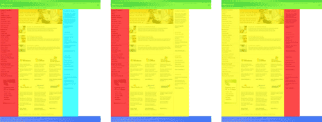
Because the basic structure of Microsoft’s current design is a model that thousands of websites use for their own site design: Header + 3 columns + Footer. Specifically: a Header that spans all the way across the top of the page, a Left column containing mostly navigation, a Main column for content, a Right column for extra “stuff”, and a Footer that sits below all three columns and also spans the entire width of the page. If it’s not a 3-column layout, many sites might use a 2-column variation of this same basic structure with a Sidebar to the left or right of the Main column:
Reason #3
Because Microsoft’s home page uses CSS for little more than FAC (fonts and color). I’d love to see the company that basically invented the concept of style sheets in an application environment, lean more heavily on CSS, and less on old-school methods.
Reason #4
Because Microsoft is currently serving a different version of their home page depending on which browser is used to view it. One version for Internet Explorer for Windows (v5.5 and above). Another somewhat “dumbed-down” version for all other browsers (including IE/Mac) that omits some of the imagery and all product logos. The non-IE/Win version leaves out some of the functionality (e.g. fly-out menus) and renders page elements with different techniques. If you have IE/Win 5.5 or higher, plus another browser available, you can check for yourself. If not, here’s a screenshot of the two versions, with differences circled in red:
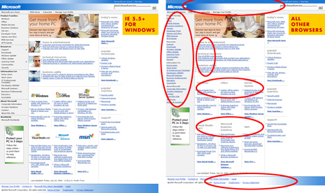
The non-IE/Win version is noticeably more anemic than the full version served to IE/Win. We all know it doesn’t need to be this way. If you’re wondering, it’s not just sloppy coding that works in some browsers and not in others. Microsoft intentionally does a JavaScript browser detect, and redirects the browser to a different file if the browser is IE5.5 or higher. Instead, Microsoft could just maintain one version that works in all browsers.
At least Microsoft serves a version of its page to non-IE/Win browsers. Some developers may not even go that far. The frequent reason we hear cited for dropping support for other browsers is that MSIE/Win is THE browser used by a MAJORITY of people, and that it takes TOO LONG to develop for (and render properly in) any other browsers. Others complain that development for browsers other than IE/Win is TOO EXPENSIVE. Both the too long and too expensive claims are false.
Many developers believe these claims because they start by developing for — and checking in — IE. Then they view it in another browser and become frustrated when they see all kinds of supposed “bugs” they think they’ll have to fix.
IE interprets CSS more loosely than other browsers that have been iterating versions over the last couple years (Mozilla, Firefox, Safari, Opera…). Starting with IE means fewer problems with development work will be detected early on. Developing for IE initially, then trying to retrofit for other browsers will increase time and cost in the long run. But there’s a better way to approach development that’s faster and less costly.
Start with the stricter, more compliant browsers that (usually) render things how they’re supposed to render. Get everything working there. Then, double back and create a few “patches” for IE. Development is much faster this way. It may be counter-intuitive to initially avoid the browser that represents the majority of your traffic. But the process is much more fluid and efficient if you don’t become accustomed to — or depend on — IE’s relaxed rendering behavior. Start with IE, and you may start with bad code that takes much longer to fix for other stricter browsers.
Going this route, we still have the IE Factor to contend with. However, as we gain more experience with IE’s CSS misbehavior, the IE Factor eventually starts to minimize. There is hope.
Just the Facts, Please
For the second half of the presentation, we stepped through the entire process of converting Microsoft’s table-based spacer-gif-laden page to a more accessible, purely CSS-driven version that works in all browsers. This is not new. Others have re-coded microsoft.com before. Many regular readers of this site have been creating tableless designs for a year or more by now. But we don’t see everyone else jumping into the water yet, despite the water being fairly thoroughly tested by now. Thus, the presentation at Digital Design World, and this follow-up article.
Continuing the presentation, we broke down each stage of the process into manageable chunks. I highlighted each of the major steps of the process, including the dumping of tables, conversion to more semantic markup, and the CSS techniques used to faithfully reproduce each portion of Microsoft’s home page design.
Throughout the presentation, we examined lots of visuals (diagrams, screenshots, and pictograms) that aided in understanding the techniques used to render each section. I also had the code saved out as separate “pre-baked” files I could refer to for each stage of the process.
One of the reasons for writing this follow-up article is to publish the final results of the Microsoft.com makeover, which are kind of hard to ignore:
| Current Design (IE/Win) | Current Design (other) | Makeover | |
|---|---|---|---|
| Tables used | 40 | 36 | 0 |
| Spacer gifs | 35 | 76 | 0 |
| Total <img> tags | 43 | 122 | 6 |
| CSS bg-images | 1 | 1 | 11 |
| Browsers supported | 2 | Most modern | Most modern |
| HTML file size | 40 KB | 39 KB | 15 KB |
| File size reduction | – | 3% | 62% |
Going Further
The numbers get even more interesting when we start doing Meyer/Davidson ESPN-style estimates and projections. According to a public Microsoft page titled “Inside Microsoft“, Microsoft’s published traffic numbers state that microsoft.com got 1.2 billion page views during the month of May 2004. In this presentation, I showed how to decrease the markup from one page by 62%, or 25 KB. I also predicted that about 25 KB is a fair savings estimate per page if Microsoft was to get more aggressive about using CSS site-wide. If multiplied out by an average of 38.7 million page views per day, that 25 KB savings per page could add up to about 924 GB in bandwidth savings per day, or 329 terabytes per year.
These numbers alone should be enough to turn a few heads.
Now, toss in the fact that the makeover is just one version, and supports Microsoft’s more “advanced” design, (as currently seen in IE/Win) and does so in many more modern browsers.
Companies like Microsoft may or may not want to maintain just one version of their home page that works in more browsers, loads faster, and is more accessible to all kinds of users and devices. Regardless, I thought it was worth pointing out that it’s now very possible to demonstrate and walk through how they — or any company — could create one super-powered version that uses leaner markup, works in more browsers, and increases accessibility. All demonstrated within the time span of an hour or two…
Additional Points and Caveats
- If you’re curious, and like to be thorough, the CSS only increased from 3 KB and 5 KB (IE/Win and non-IE/Win versions, respectively) to 8 KB for the makeover version.
- The fly-out menus seen in IE/Win’s version for two options in the left-side navigation are possible to reproduce as well. All done with pure CSS and simple, semantic, accessible markup. The makeover uses the
:hoverpseudo-class to toggle on/off a nested unordered list when mousing over the parent list item. One consideration: IE doesn’t support:hoveron list items, so the JavaScript method Microsoft is already using would still be necessary to support fly-out menus in that browser. Or something like Suckerfish Dropdowns could be used to keep the same semantic nested-list markup the makeover version uses. - The hefty jump in number of image tags for Microsoft’s current non-IE/Win version is due to heavier spacer-gif usage. The non-IE/Win version also calls every bullet image individually, rather than via one CSS declaration, as the IE/Win and makeover versions do.
- All of the JavaScript found in Microsoft’s markup was removed. As were hundreds of proprietary attributes in anchor elements that were/are apparently used for click-tracking purposes. Microsoft would likely want to add some of this layer back in — though hopefully through a valid means of doing so.
- As mentioned above, the point of this article is to publish the potential results and benefits of using CSS and simpler, more semantic markup to build pages. It merely uses Microsoft as a well-known example. This article intentionally omits linking to the final makeover code. I understand that many people could learn from the work done for this presentation, without seeing the presentation, by studying the changes made to the HTML and CSS. However, I do not want to downplay anyone’s role at Microsoft by publicly releasing modifications to their source code before having a chance to present them directly to Microsoft, and discuss the changes and techniques with appropriate team members, if they ever wish to do so.
Translations
This article is translated into the following languages:
- Brazilian Portuguese: Jogando as Tabelas Pela Janela by Humberto Oliveira
- Simplified Chinese: Throwing Tables Out the Window by Gregory Song
- Dutch: Tabellen uit het raam gooien by Nick Verstappen
- French: Passer les tableaux par la fenêtre by Benjamin David
- German: Tabellen aus dem Fenster werfen by Eric Eggert
- Italian: Gettare le tabelle fuori dalla finestra by Giuseppe Di Carlo
- Japanese: Throwing Tables Out the Window by Kohei Yoshino
- Polish: Wyrzucanie tabel przez okno by Pawel Grzesiak
- Spanish: Tirando las tablas por la ventana by Hermann Kaser
- Turkish: Tablolari Pencereden Disari Atmak by Mehmet Dogan
Update: As of 27 July 2005, the example code and corresponding presentation slides were released and made available to everyone. See Still throwing tables for background information and links to the code and presentation referenced in this article.