Twitter brand evolution
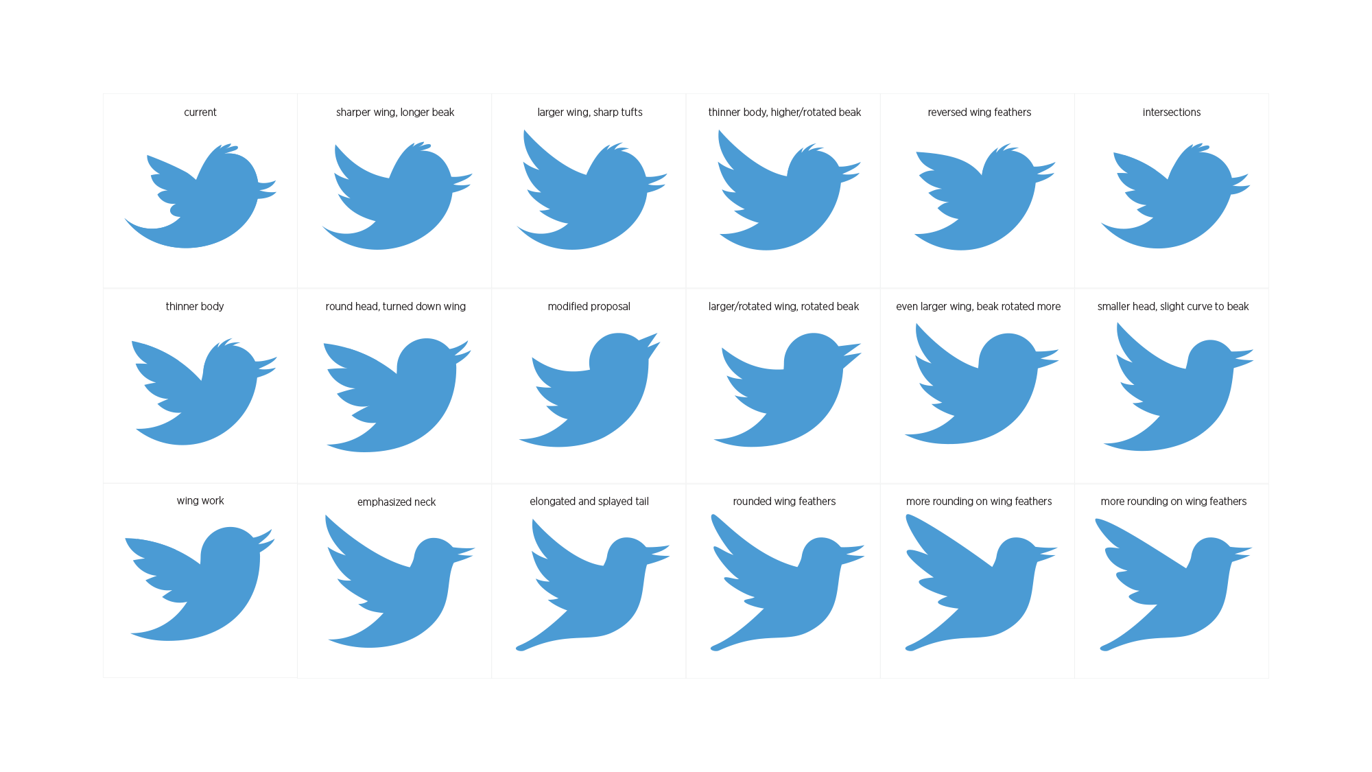
Aviary evolution
As Creative Director at Twitter, I directed and oversaw both UX and Marketing design teams, and was the shepherd of the Twitter brand as the company and network evolved from a tiny startup to one of the most used and depended-on social services anywhere.
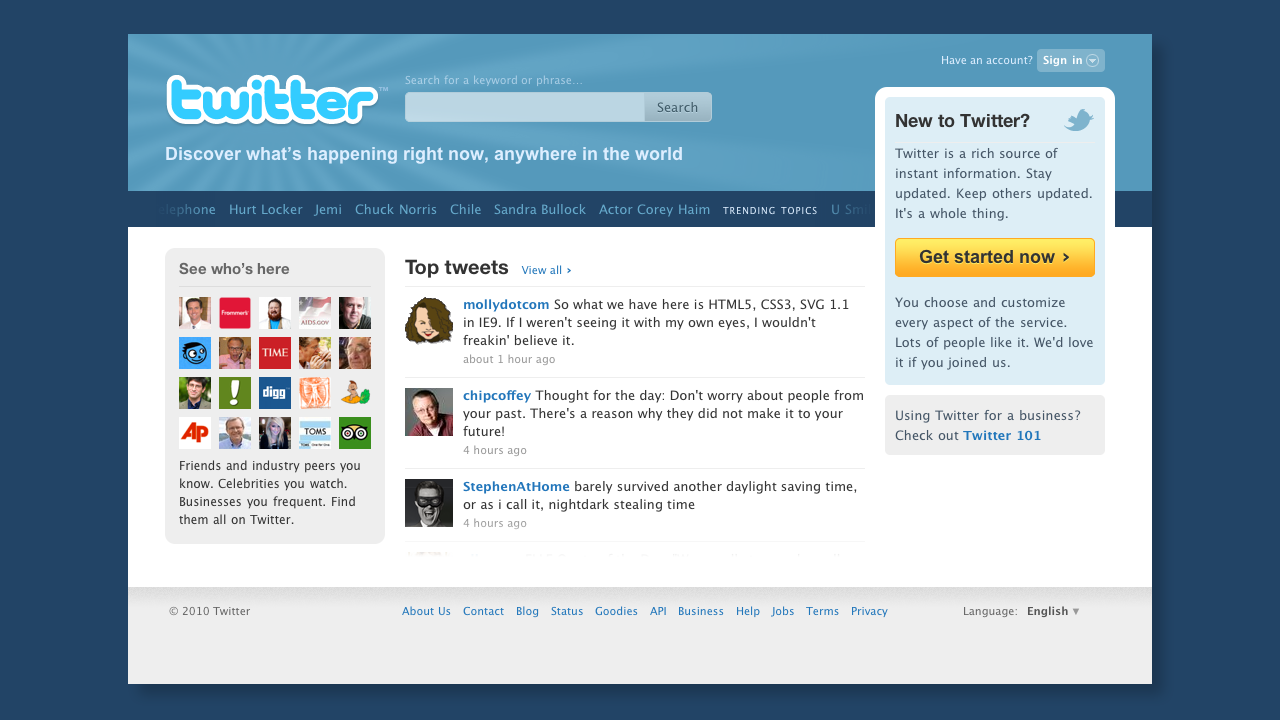
Show, don’t tell
My first set of changes to the logged out homepage changed it from a static marketing page that told users about Twitter, to an active preview of the tweets, trending topics, and popular accounts users could find on Twitter.
Pre-logo Larry the bird
When I joined as Creative Director, Twitter had been using a bird known internally as “Larry” (illustrated by Phil Pascuzzo, under direction of Biz Stone). Larry was used on supporting materials, but was not yet on the site, nor as Twitter’s logo.
First bird as logo
For Twitter’s first substantial redesign under my direction, known as #NewTwitter, I modified our logo and added Larry to it (shown below), predicting we would one day want use a bird alone as a logo, similar to Nike’s swoosh and Apple’s apple.
Current evolutionary form
Twitter’s current logo was executed by an outside firm under the direction of Jack Dorsey, Andrei Herasimchuk, and myself in 2012. This was the first time we eliminated all text from the logo, using only a bird to represent Twitter everywhere.

Inspired by the sketch comedy television series, Portlandia, we created a shirt design, and we put [our] bird on it.
I created the first version of Twitter’s logo to incorporate Larry, the bird, placed next to an evolved logotype I adjusted from the original.
I created some of the icons Twitter used throughout the product, including the birdhouse used for our Home timeline.
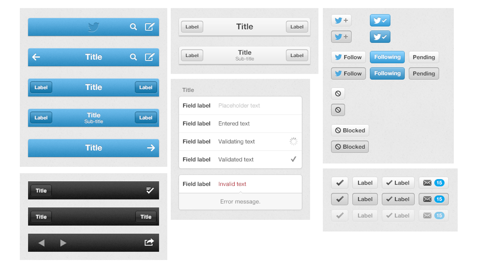
We developed an ever-evolving set of common components for Twitter that had to stay fresh and in congruency with each platform and its UI changes.
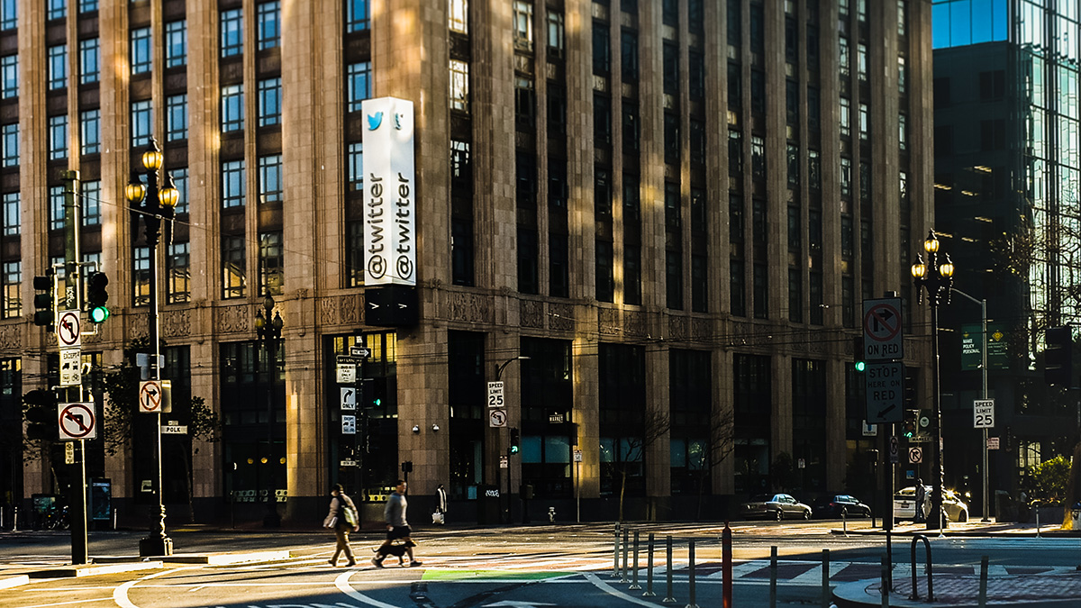
I worked with our facilities team on the design of Twitter HQ’s signage on our building in San Francisco. I pushed heavily for the sign to use “@twitter” in homage to Twitter’s popularization of the @username format, and because of the physical location it represented for anyone who could see the sign.
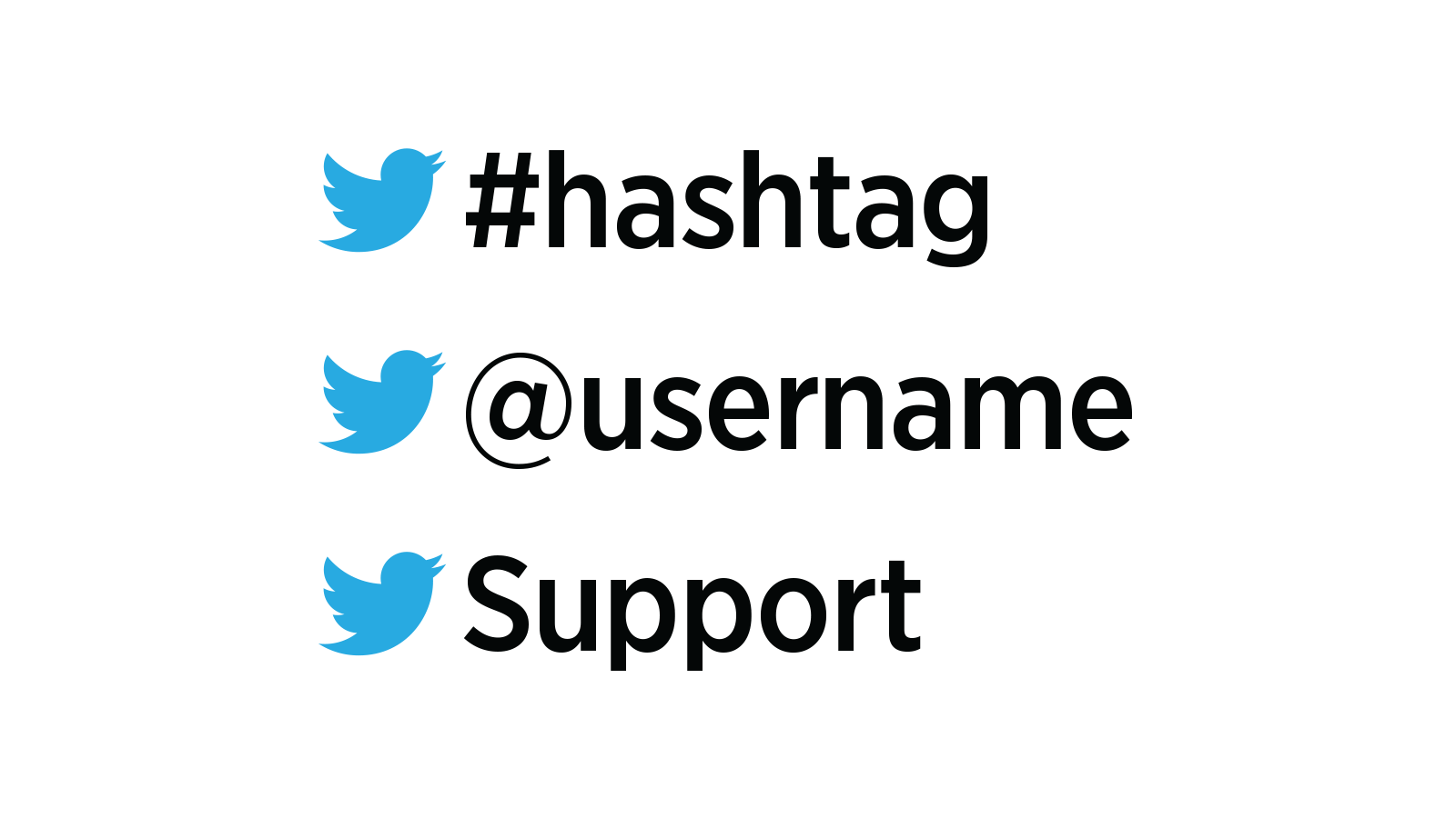
After changing our logo to the bird, we defined lockups of bird + text for use in print and on screen when identifying common Twitter features and departments.