Blogger redesign
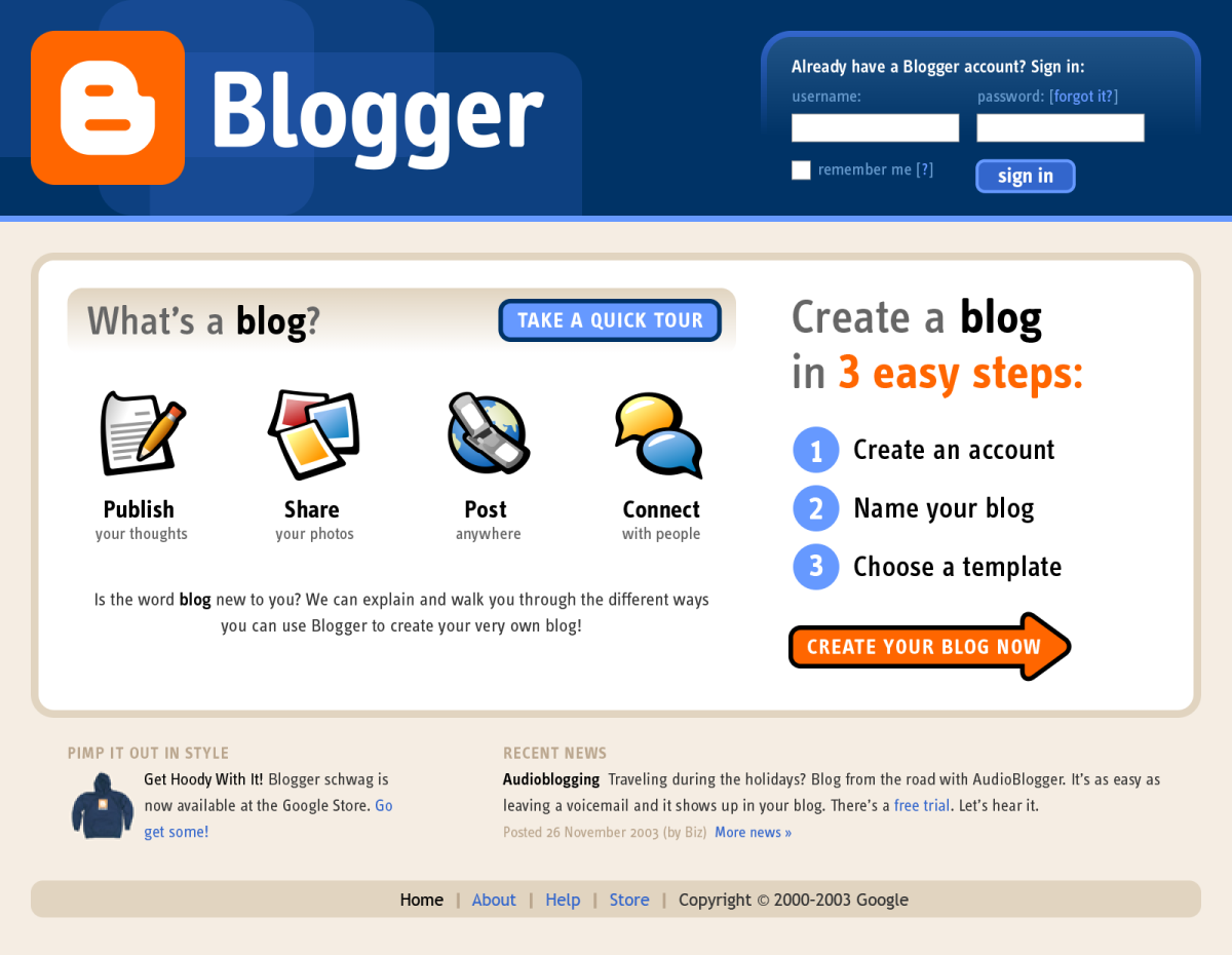
Defining a blog and Blogger’s easy registration process
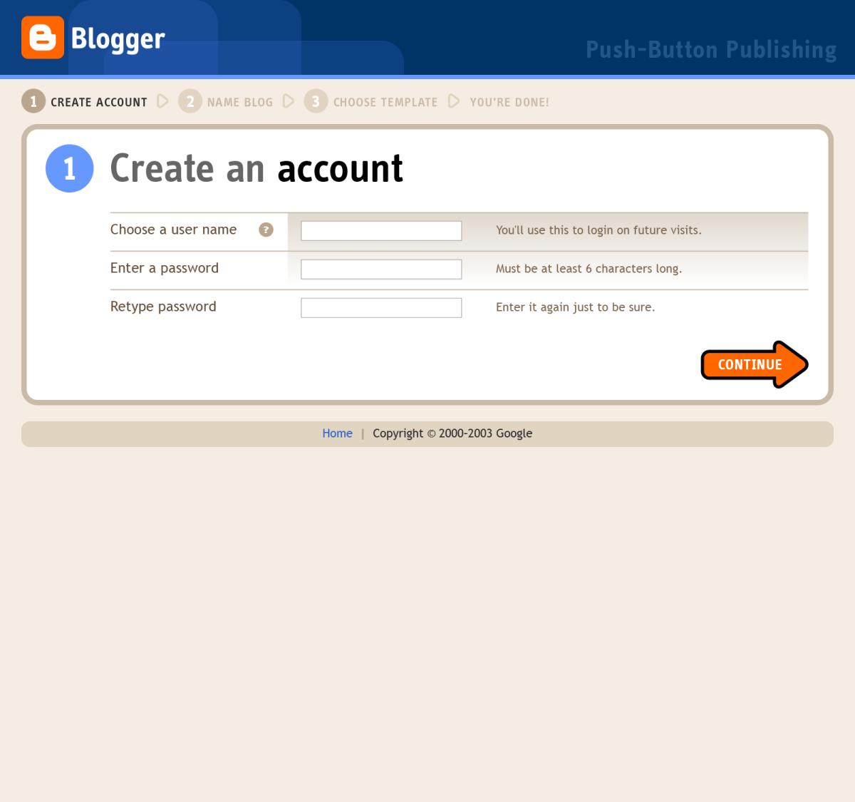
Immediately after getting acquired by Google, Blogger was flooded with an influx of people discovering this new service, but confused by what a blog was, why Google was linking to it, and how to sign up. A huge percentage of those people started the blog creation process, but bailed before completing it because of its complexity. Blogger worked with Adaptive Path and Stopdesign to redesign its home page, registration flow, and logged-in dashboard. The new home page helped define a blog and offered a new tour for more details, and highlighted the three easy steps to create a new blog.
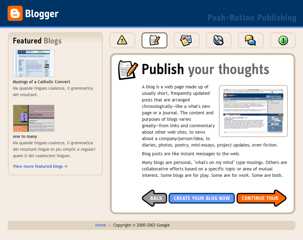
An introductory tour
For people who were still curious about blogs and what they were, we created a short tour linked from the home page that introduced the concepts of a blog and the act of blogging.
A simplified 3-step registration flow
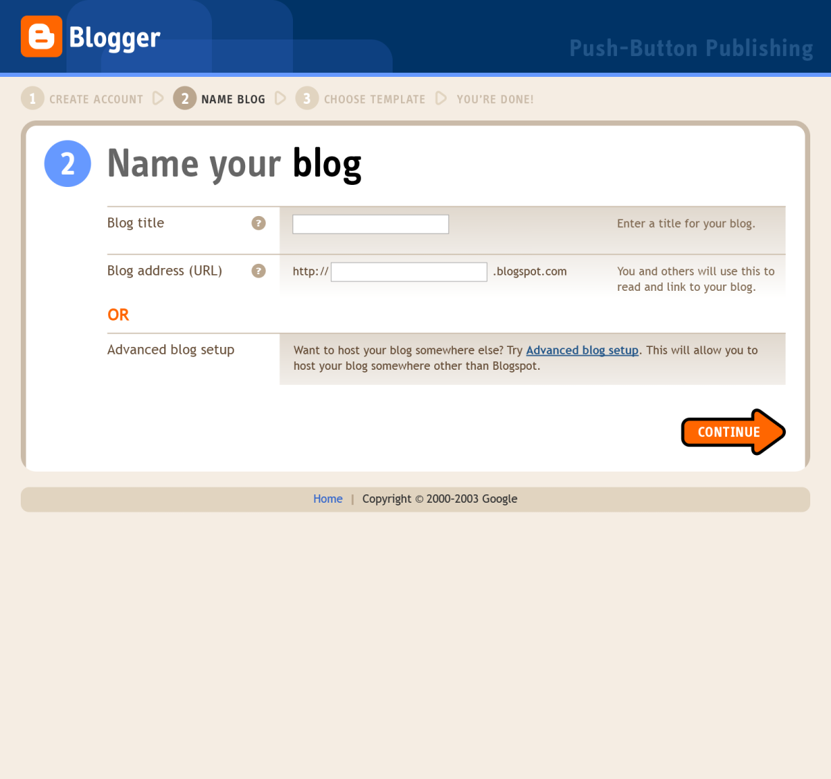
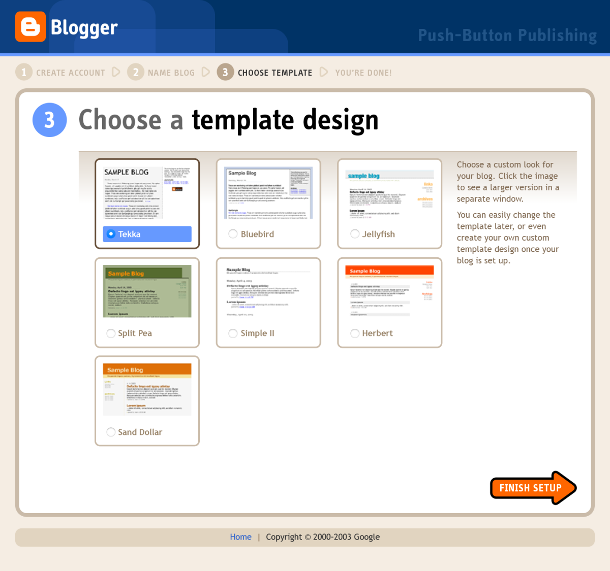
As part of the redesign, we identified a problem with the original nine-step registration flow that asked for lots of technical information that many people didn’t know, have, or really need to create a Blogger-hosted blog. We reduced the registration flow down to three easy steps: choosing a username and password, naming the blog, and choosing a pre-configured template design. We also reduced the amount of form fields to the bare minimum necessary.
Advanced setup
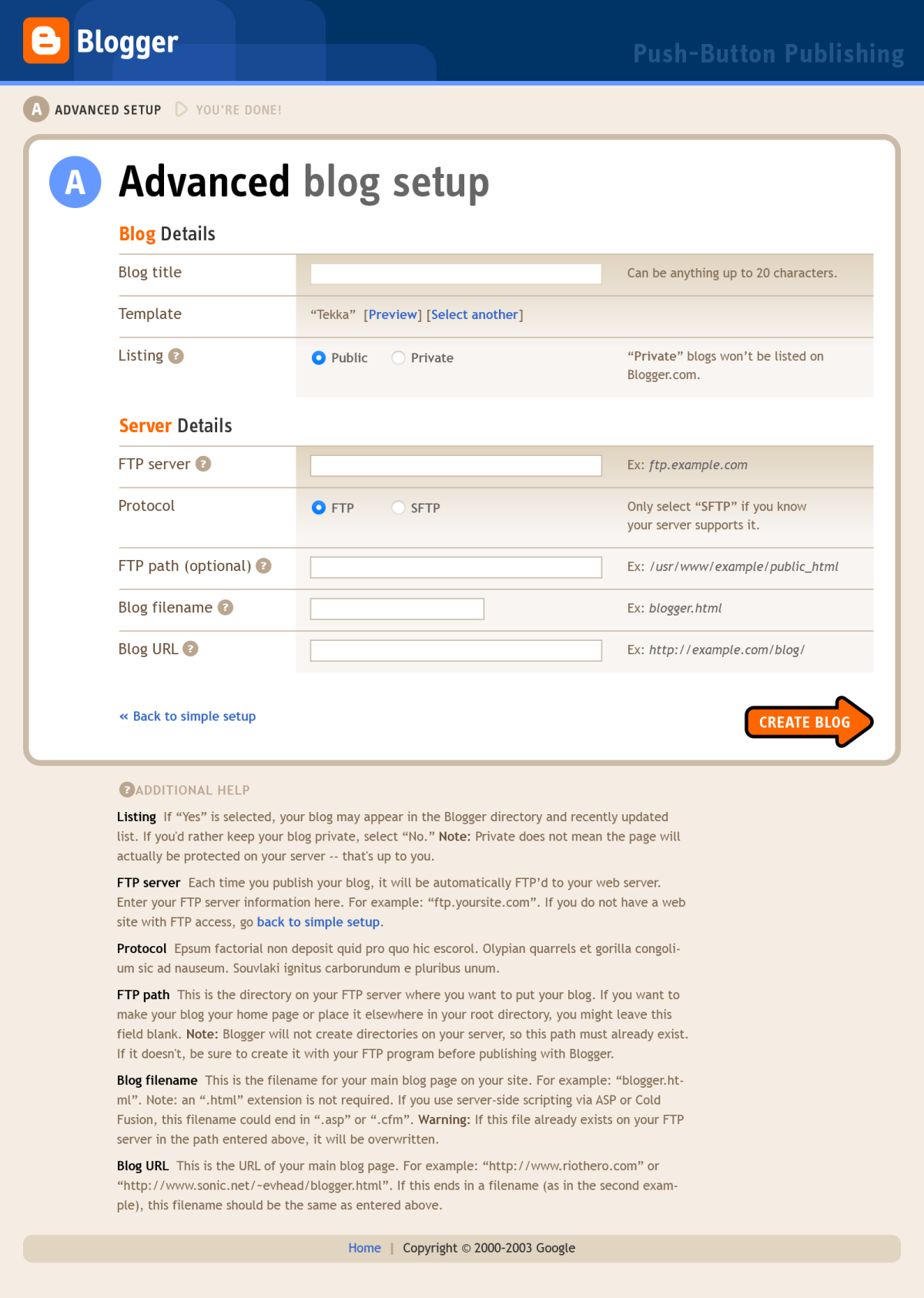
For users who wanted to self-host their blog, we created a branch from the regular flow to an Advanced blog setup screen where they could enter in server details. This kept more advanced fields separated from the main flow to avoid confusing users who had no idea what FTP or Protocol meant.
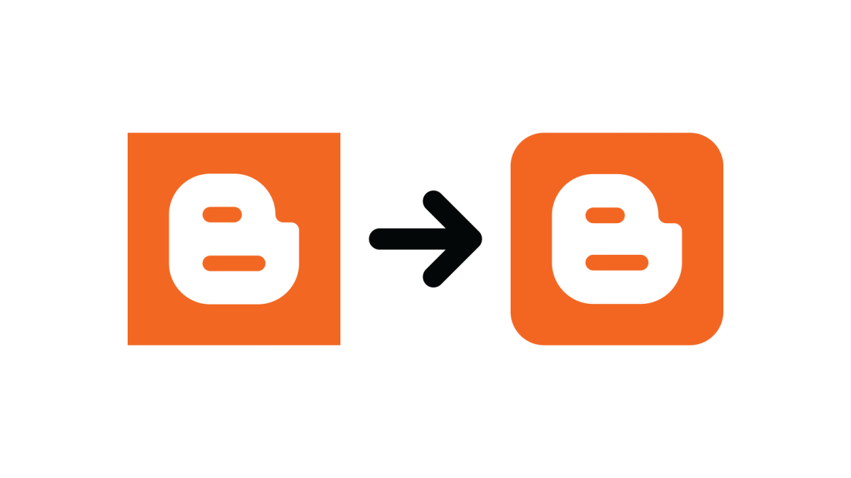
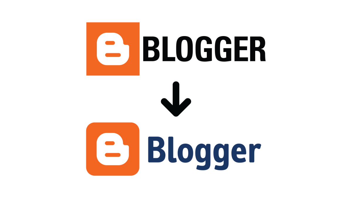
Refined logo to complement the redesign
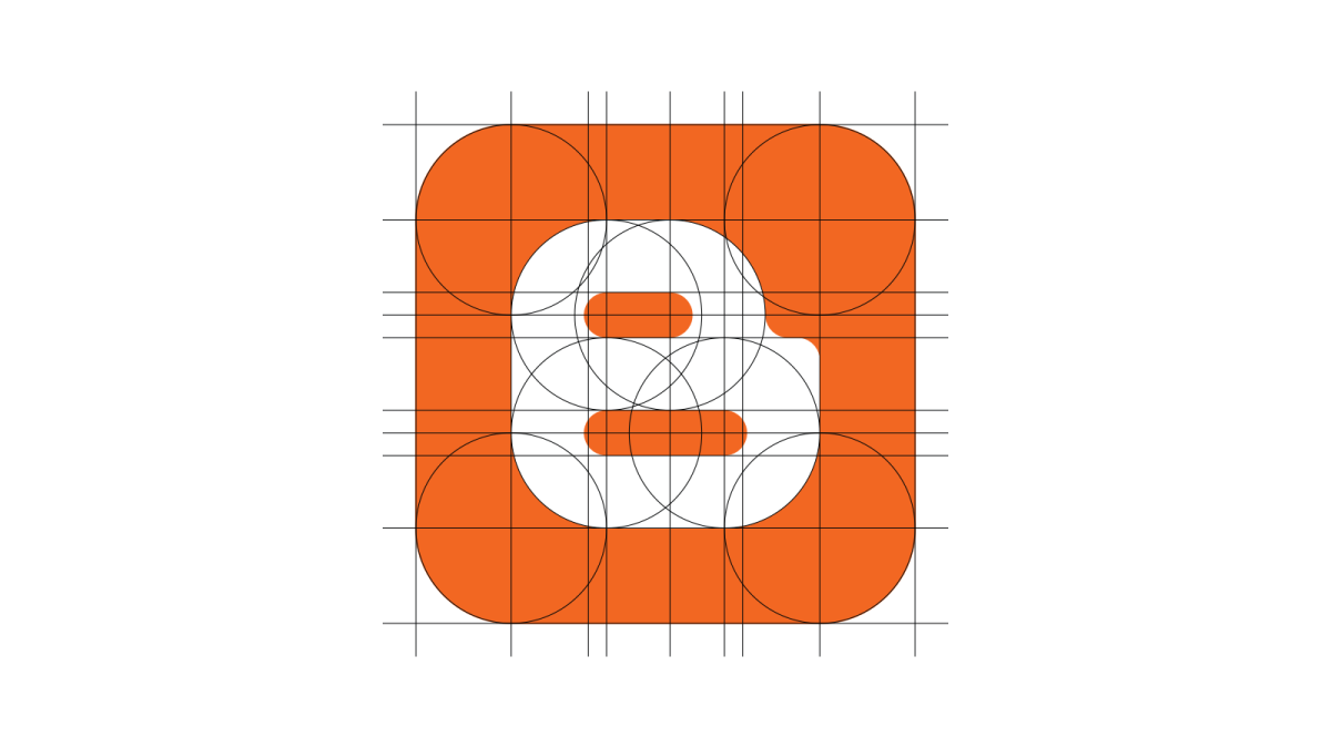
In conjunction with the redesign, I also refined the Blogger logo to give it a slightly friendlier feel. I rounded the corners, and made slight structural changes to the B to fit the new look. I also changed the logotype from Univers Condensed Bold to Info Web Bold.

