Google Calendar design
Internal resources were strapped
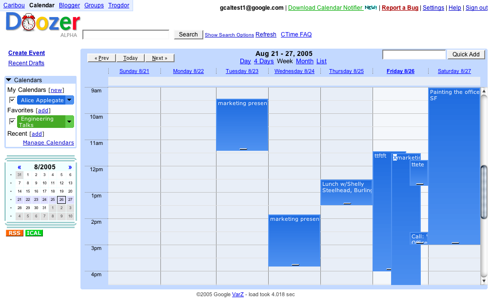
Google’s engineering team had been working on a brand new calendar web app (codename: Doozer) for nearly a year. They had a basic, working prototype at the time, but its design was rough and little more than a skeleton. Google internal design resources were strapped and unavailable. So Google approached me seeking help with the visual design of Google Calendar.

A companion to Gmail
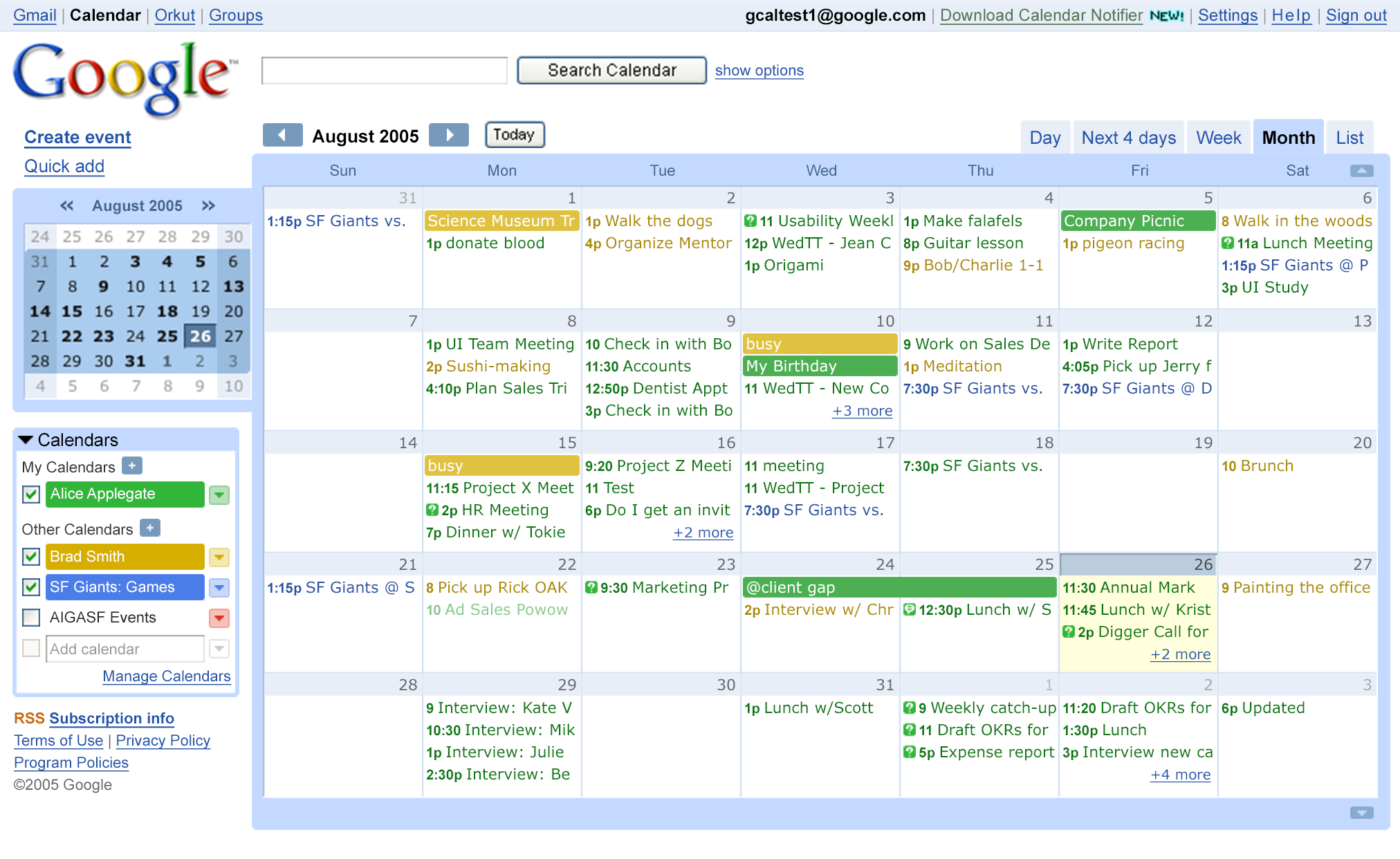
I worked with the Calendar team to create a design that hinted heavily in Gmail‘s direction, so that Google Calendar would feel like a companion to Gmail. We started with the Week view and the notion of event “chips” that could be dragged and dropped anywhere on the calendar.
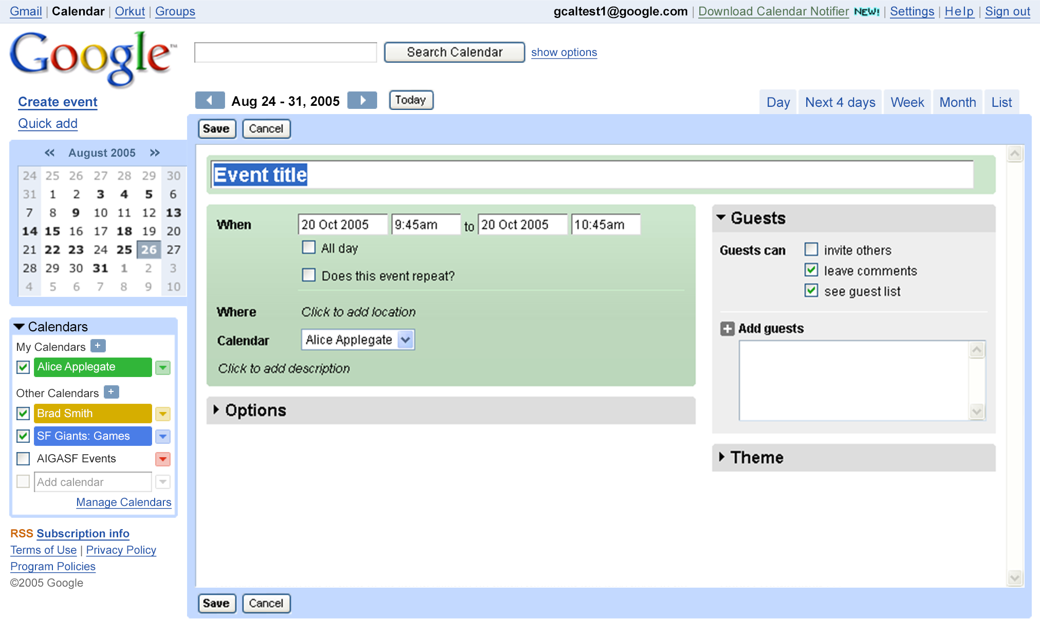
A full calendar system
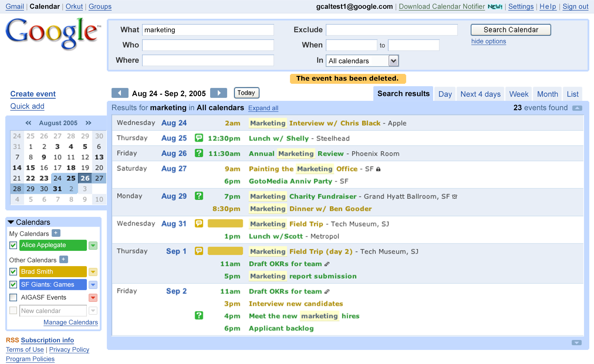
The team wanted updated designs for every single screen within the Calendar app, including multiple calendar views, event creation pages, search, settings, error states, and more. The design also consisted of components and features that Google had never offered before. Consistent with Google’s product philosophy, Google Calendar sought to be a game-changing web app that made online calendar/event creation, sharing, and publishing super simple.
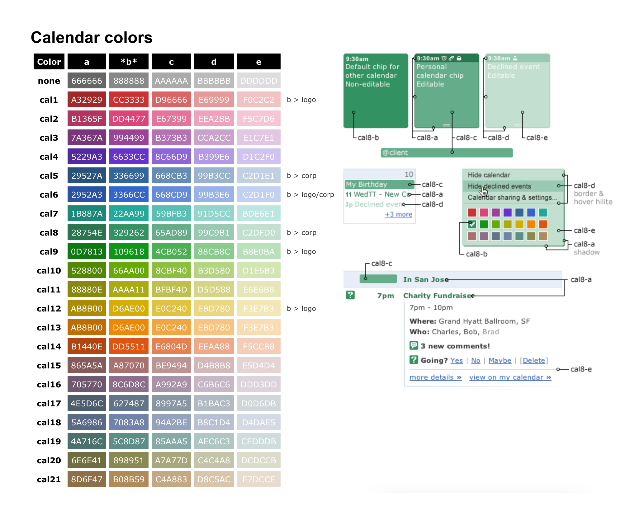
Detailed specs plus HTML & CSS
My participation in the Google Calendar project consisted of numerous design and review phases, from early visual concepts through final design. I also created a full color palette and produced detailed specs, including the HTML & CSS for many of Calendar’s key UI components, much of which ultimately got compiled into the final code for the product launch.