Twitter profile hover cards

Quickview for profiles
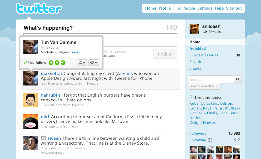
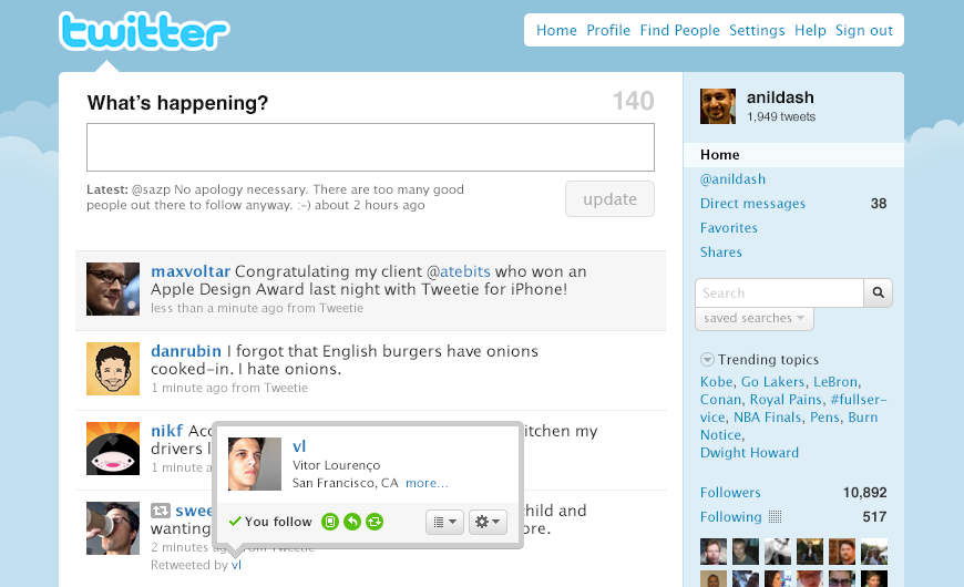
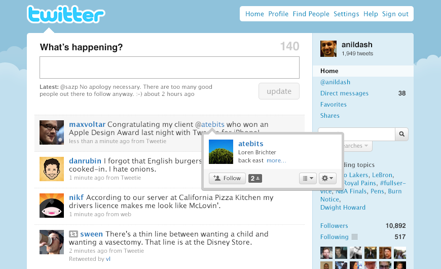
As Twitter evolved from a simple website with 140-character text-based status updates, we continued making improvements to the user experience over time. One of those improvements was adding hover cards to the timeline so users could preview information (location, bio, stats) about other accounts without navigating away to another page and potentially losing their place on the timeline when they came back. Hover cards also enabled users to take quick actions on those accounts, like following, adding to lists, or direct messaging users who were mutual follows.
Power to the user
The addition of hover cards was all about making the experience of consuming on Twitter as powerful and painless as possible. Because of the 140-character limit, Tweets were inherently riddled with abbreviated syntax that wasn’t always easy to decipher, especially for newer users. @usernames were a power-user invention to represent and link to other people, one that Twitter eventually embraced throughout the product. I worked with another designer and a small engineering team to add hover cards to every username and profile photo, giving users a much lower friction way to see who was behind each one.


