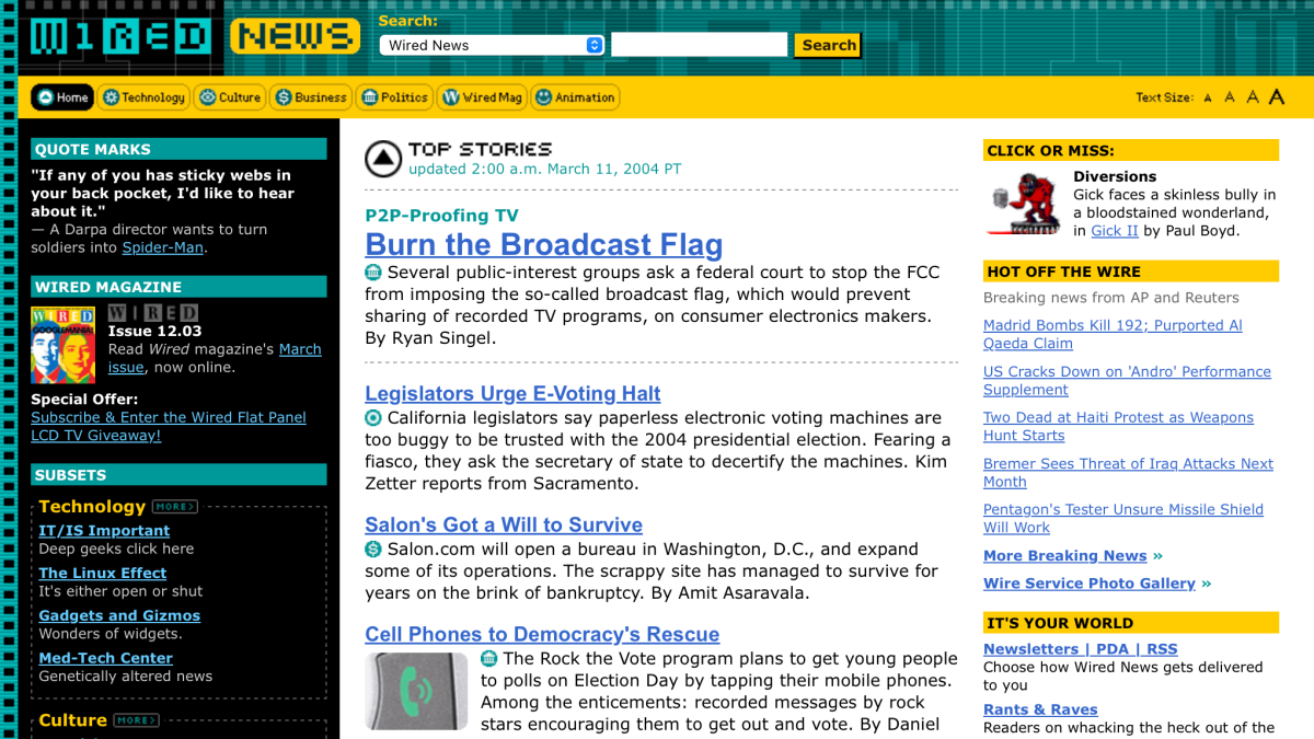
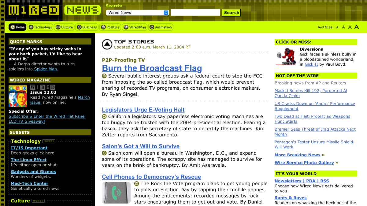
Wired News redesign
Cutting the edge
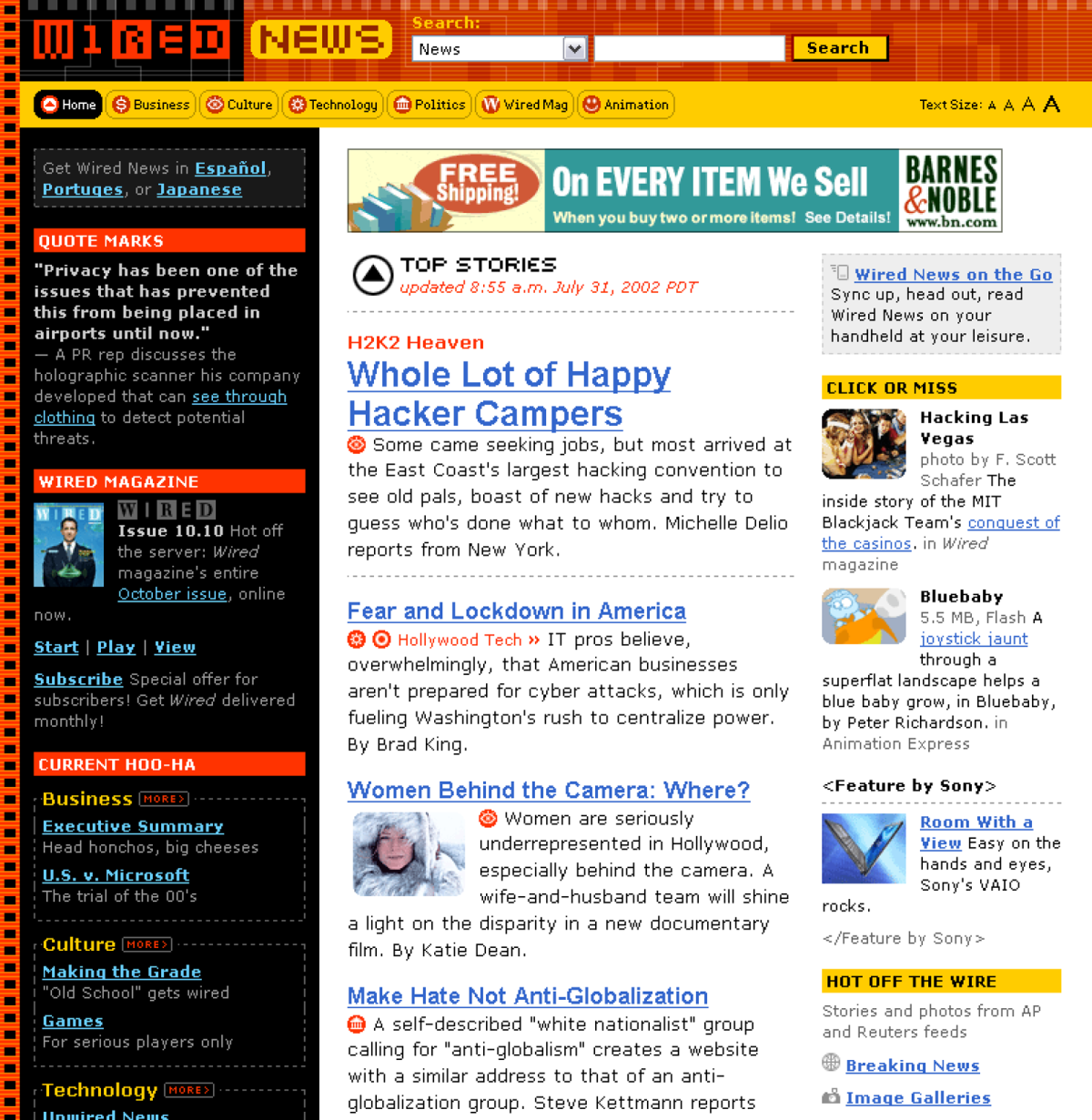
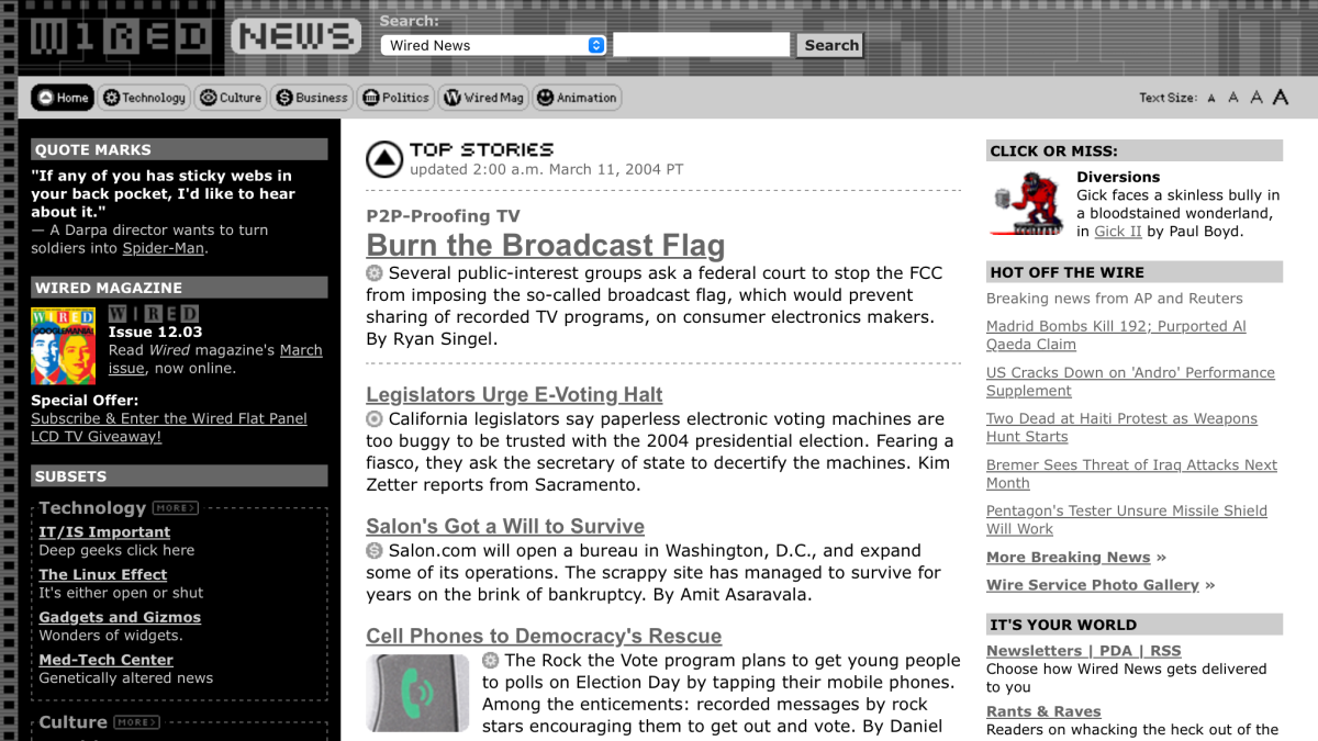
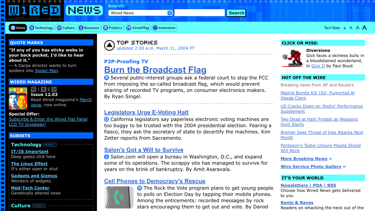
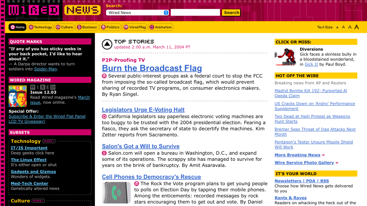
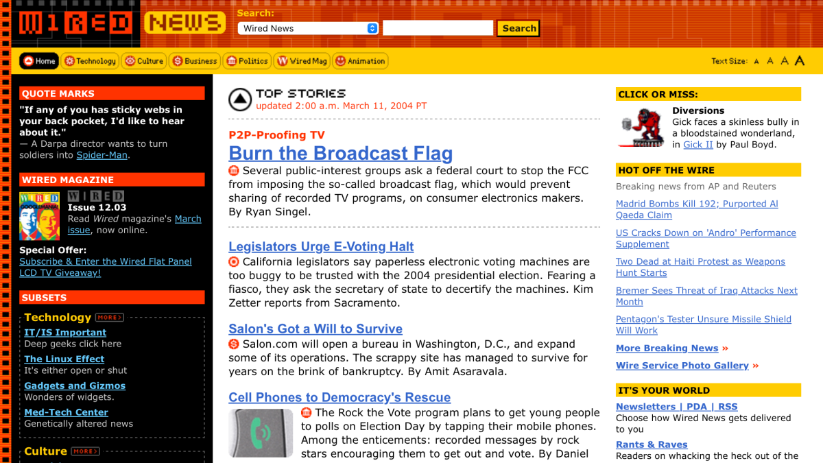
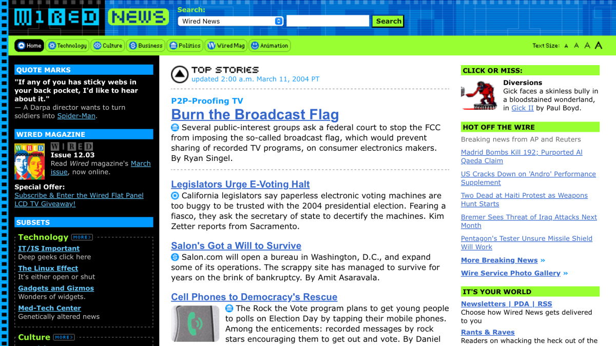
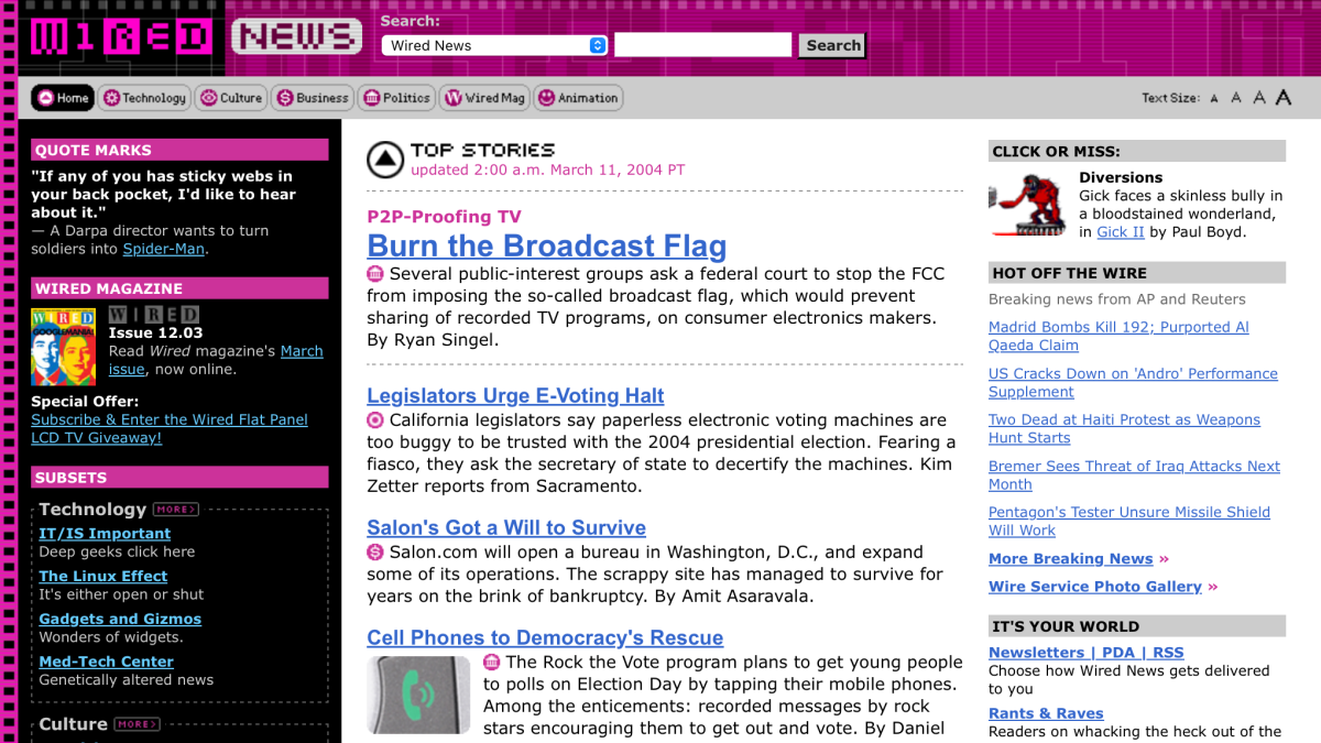
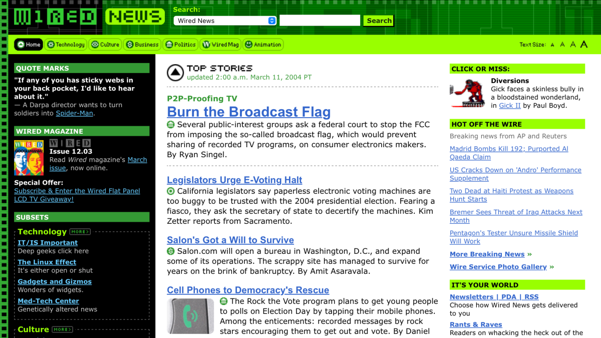
This redesign of Wired News not only provided a fresh look, but pushed the site to the cutting edge of Web design once again by converting over to a total reliance on CSS for all design and layout details. The use of CSS brought many advantages to the site, including faster download time, the ability to easily change entire color schemes on a daily basis, more accessible to all browsers and specialized environments, and the aggregation of design details for thousands of pages into a small group of files. Read more about this redesign by viewing my journal entries tagged as Wired.
Daily themes
Wired magazine was known for changing color schemes on a monthly basis. Since Wired News published much more frequently, we thought it appropriate to change color schemes on a daily basis. The switch to CSS made it trivial to change one class on the body, and compose different themes that allowed changing colors daily. I designed 8 color schemes (one for each day, plus an extra) plus a full grayscale scheme.

