Seattle-bound
In a few minutes, I step onto a plane bound for Seattle for a short two-day trip. I’ll be speaking twice tomorrow at Digital Design World. ~200 words
In a few minutes, I step onto a plane bound for Seattle for a short two-day trip. I’ll be speaking twice tomorrow at Digital Design World. ~200 words
Interesting that the same topic I wrote about at the end of last year (
Looking to keep hacks in your primary style sheet to a minimum? This entry introduces a new CSS filter that can be used to import a separate style sheet for IE5/Mac, named the IE5/Mac Band Pass Filter. ~1,000 words

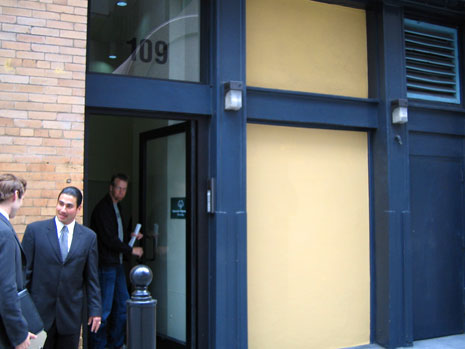
Next in the series of photos used for header images on Stopdesign is a candid photo I never would have expected to make use of in any kind of design, let alone Stopdesign’s Company pages. There’s nothing spectacular about this photo at first glance. Maybe even at second and third glances. In fact, any other designer probably would have passed it over. This is… Office shopping. ~300 words

Picking up where we

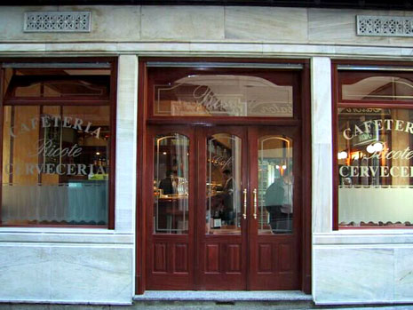
The second of a series, the header image from the Articles section originates from a photo that conjures up great memories with international friends. This is Café en Madrid… ~300 words

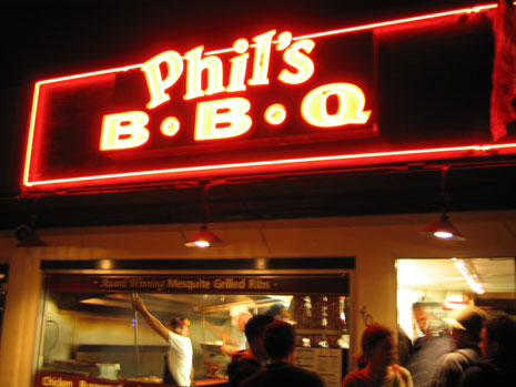
In the first of a series, I present the original, undoctored photo used for one of the header images on Stopdesign. This one: the home page. This photo was taken while visiting Miami in November 2002 for the AIGA
Welcome to Phase II of the new Stopdesign. Baby’s got new shoes. As if I weren’t busy enough as it is with current projects. For some reason, two weeks ago, I decided to start a full-blown redesign by yanking my own style sheets, encouraging me to do something sooner, rather than wait for a lighter workload. For those that count, this would be design version 3 (not counting the short-lived lightly styled version this one replaces). The most obvious change is the much more confident use of photography in the header, followed by a significant re-org of the home page. ~600 words
Remember what was said about a work-in-progress? Certainly you didn’t think Stopdesign could be left stripped of proper attire for long? Phase II is already well underway… ~27 words
The subject is covered frequently in the blogosphere. It’s nothing new for many of you. I’ve been bitten by Stopdesign’s Google page rank for specific search queries several times. I just noticed the most recent instance. What happens when Google gives a particular page too high a page rank? ~1,300 words
Ever wanted to ditch what you’ve got and start over? I sure have. I’ve been wanting to completely wipe the style sheets clean for this site and start over with a blank slate. Finally jumped off the cliff. Wonder if anyone saw me do it. And if they did, will they understand why? ~1,400 words
When creating web comps, it’s not uncommon to underline some of the links on the page. Despite the fact that users have been asking how to underline text in Illustrator for several versions now, Adobe somehow manages to exclude this feature in each new release of the software. Here’s how to work around that limitation. ~1,400 words
This year is certainly my “coming out of the office” year in terms of public speaking. With three events down, and four more on the schedule so far, the year holds lots of opportunities to meet new people. ~600 words
This must be the week — if not the day — to launch new designs of products and services under new ownership. Good friend, and former colleague at Wired, Stephen Blake played a large role in today’s launch of the new CNET-owned mp3.com redesign. XHTML, CSS, Sliding Doors, and rounded corners… oh my. ~200 words
For those of us involved in the project, we’ve been waiting months for this day to come. At long last, I’m proud to announce the launch of a project representing the latest collaboration between Stopdesign and Adaptive Path: the redesign of Blogger.com. Congratulations to the entire Blogger team on completing hundreds of hours, and expending tremendous effort to fit so much into this launch. This is Blogger’s first major overhaul since getting acquired by Google in February 2003, and it’s a biggie. ~1,900 words
As we approach the 6-year anniversary of the original CSS2 Specification that reached W3C Recommendation status on 12 May 1998, and as the major undertaking of CSS 2.1 rapidly nears Proposed Recommendation status, John Allsopp writes a very appropriately-timed post. ~200 words
If you followed my recent mention of the
Benny Evangelista writes an interesting article for the SF Chronicle on the recently installed wifi at SBC Park. I read about the new wifi several weeks ago before opening day, but this is the first I’ve seen public mention about it in local media. My reaction is positive, although I certainly see the stigma attached to opening up a laptop at a sports event… ~500 words
Peter, Keith, Greg, Jon, and Shaun all told me to: Grab the nearest book. Open the book to page 23. Find the fifth sentence. Post the text of the sentence in your journal along with these instructions. ~100 words
After a bit of drilling down through numerous folders of mailboxes, selecting all, then marking as unread, my unread message count is back to normal levels. For the record, there were 280 .mbox files in ~/Library/Mail/Mailboxes, totaling 211MB in size (without attachments). Since that’s 8 years of email for me, at this rate, Gmail’s current size limitations of 1GB could maintain me for about 32 years. ~300 words
Ever felt like you just can’t keep up with unread email? ~600 words
One of the small, less-talked-about features of Saft (the plugin for enhancing Safari’s features) has one person interested enough to write a full entry about it. ~600 words
I’m sure Dave will write from his own perspective, but I thought I’d offer up some answers, information, and details about yesterday’s mischief. ~1,500 words
Feeling inspiration from others who’ve been redesigning, I finally decided it’s time to take this site’s design in a slightly new direction. I’ve been working on this one in the background for a while, whenever I’ve had spare time. The colors were inspired by a photo I took of the Brockton Point Lighthouse in Stanley Park while visiting Vancouver last year for the AIGA National Design Conference. ~100 words
Last night, we went to see Eternal Sunshine of the Spotless Mind. I’ll add my enthusiastic endorsement for the spectacular brilliance of this film. Whether it’s Kaufman’s creative screenwriting, Gondry’s directing, Carrey’s talented acting, or all of the above and more, I don’t care. Something comes together in this film that makes for a wonderful experience. ~400 words
With all due respect to any former colleagues still stuck within the organization, there’s no greater satisfaction than leaving a major internet company over year ago, and now, seeing their home page turn into this. ~35 words
Only when I’m forced to do something a new way do I recognize the variances in habits, routines, and expectations when it comes to living and working online. It’s sort of like being thrown back in time, taking with me the invisible knowledge of what’s possible today. High-speed access — and now, prevalent wireless high-speed access — is changing our use of the Web and our lives in ways that aren’t always immediately obvious. ~1,100 words
Digital Web Magazine just posted another interview for their latest issue, this time, the questions from Craig Saila were directed at me. Read all about why I wrote off CSS as a failed pipedream for so long, what I think about the Wired News design more than a year after our launch, and my sentiments about the end of Webmonkey. ~94 words
I’ve received a few requests for public links to the presentations I used for the CSS panels at SxSW. In the spirit of sharing information–and since they’ve already been linked from other locations–I’ll point to them here. If you weren’t there, you won’t get all the commentary that went along with them, but you’ll get an idea of what I covered for each panel. If you were there, I hope we covered topics on both panels that were interesting and relevant to you. ~900 words
As all of us know who have been to Austin in March one time or many times, SxSW is so much fun each year because of the people who come. The conference is well known for the events, parties, and impromptu gatherings that happen between and after each day’s worth of keynotes and panels. It makes for a very flat structure where everyone is accessible and approachable, and there’s really not much difference between speakers, panelists, and attendees. Whether it’s the pseudo star-struck wide-eyedness of a first-timer, or the anticipation of once-a-year encounters with friends who go every year… hands-down, the people make SxSW one of the most fun conference-like events of the year. ~500 words
South by Southwest is flying by. I’ve only been here for two days, but it already feels like 10 with the number of people I’ve run into, all the parties, and the panels. Well, today is double-down day for panels… ~100 words
One of the major players in the Wired News redesign was Aaron Jones, the Senior Engineer with whom I collaborated to make the redesign a reality. A few weeks ago, Macromedia requested an interview with both of us to discuss the Wired News redesign and our highly publicized leap into the world of CSS. Knowing the strong efforts Macromedia has been making with Dreamweaver’s support for CSS, we graciously agreed. One Thursday afternoon, I met Aaron and the Macromedia team at the Wired office, where a crew set up lots of lights, cameras, and microphones, took over an hour of audio, condensed it down into a concise three-minute micro-interview, and laid down the audio track into a Flash file, matching it with video stills, screenshots, code snippets, and supporting imagery. ~500 words
I’ve seen some approximations that are different enough to write off as pure coincidence. The Stopdesign logo is strong and bold. But I will freely admit it’s a simple concept that is as old as Chinese Taoist philosophy and the Yin Yang symbol they use to represent harmony and equilibrium in the universe. ~200 words
Earlier today, I had the honor of giving a presentation about the beauty of CSS at Digital Design World. The crowd seemed warmly receptive to hearing about (and seeing) how they can make better-looking sites by putting into practice some basic design principles, practical tips, and a few advanced techniques. ~300 words
Ooo, yeah, I know. Jeffrey Zeldman reports that the CSS Validator Changes the Rules. It chokes on the Box Model Hack’s voice-family property when used in a style sheet specified with the “screen” media type.
Update: Olivier Thereaux writes a public response from the W3C that addresses this bug in the CSS Validator.
~300 wordsTechnically, I don’t care much who wins the SuperBowl tomorrow. I am, as always, looking forward to the commercials. Some years disappoint. Others are filled with some of the best creative that lots of money can buy from an ad agency. ~400 words
My original Sliding Doors of CSS article published at A List Apart is now fully translated and available in Italian on gdesign.it. ~55 words
After writing about the
Any person, group, or business which creates or manufactures a product for mass consumption — or offers a wide-spread service (such as a utility company) — is potential target for public scrutiny and criticism. Any noticeable flaws quickly rise to the top, providing fuel for the most outspoken critics. ~600 words
I relate it to a driving experience. One in which I travel to a certain destination often enough, that I become more and more familiar with the route that takes me there. I learn the best streets getting to and off the freeway system, every exit along the way. I know the interesting segments, the boring stretches… ~900 words
Only a couple days left for the current Blogstakes contests. Win a three-book collection from The Onion or a hard-shell CD case. It couldn’t be easier to get entered if you already have a blog — just add a link to one or both of the contests somewhere on your site where others will find it. Nothing else is required from you. ~400 words
This is interesting. HP and Apple are joining forces to create an HP-branded digital music player based on Apple’s iPod™. The device will be due out this summer. I had mixed reactions upon first seeing the news. ~200 words
Price-point aside for a minute while I focus on marketing/branding: is it just me? If we’re speaking in relative terms, shouldn’t the name of this new device be iPod Slightly Smaller™? ~400 words
Each spring, the Interactive portion of the South by Southwest Conference in Austin, Texas brings together some of the most creative and inventive individuals of the online and interactive world for several fun days of keynotes, sessions, panels, and parties. Last year, I finally had a chance to go for the first time, and had a blast. ~200 words
Apparently, there’s been some huff and commotion out there about SimpleBits and Stopdesign dropping liquid layouts in favor of fixed-width designs. This probably wouldn’t have been as big an issue if we both hadn’t changed (by chance) the very same week. ~800 words
After HP’s “you blog” ad attracted so much attention a couple days ago, I thought it appropriate to add a little more context, so no one thinks the campaign is entirely blog-focused. ~300 words
Spotted in the Montgomery BART station last week, I snapped a photo of this ad on the way into the office today. It’s part of a large HP campaign that has ads plastered all over the walls and floors of the Muni/BART stations. ~100 words
Spawned by recent conversations with friends, I’ve been thinking about people who are known for designing and working with web standards. Specifically those who have a strong interest in CSS or are already using style sheets to compliment or construct beautiful design. In these conversations, we’ve noted that this space seems heavily dominated by men. ~600 words
It’s not very often that I point out or write about standards-compliant site designs and launches which get sent to me by email, especially personal sites. But Cameron Adams just launched a site that I think is worth your attention. ~200 words