After subscribing to the feed last week on Inauguration Day, I’ve been reading updates on President Obama’s actions on an almost daily basis. I’m not sure if they can keep up the frequency of posts that have filled the blog already. But isn’t it amazing that we’ve never had this level of insight into the President’s activities — and on such a regular basis — before now?
Free service from a datacenter in Germany that allows you to check the rendering of any website in IE 5.5, 6, 7, or 8. It’s fast — it returned each screenshot for me in about 5 seconds. Screenshot size seems to be fixed at 1024×768, so you won’t see anything “below the fold” and there doesn’t seem to be a way to modify that size. But hey, it’s free. They also list and describe other screenshot services. (via Dan Benjamin)
IE NetRenderer
netrenderer.comNew year, new design
With a bit of humility and even a little nervousness, it’s time to take the wraps off a new design I’ve been working on for nearly a month. My hesitation comes not from revealing the new design, but from my… ~1,400 words
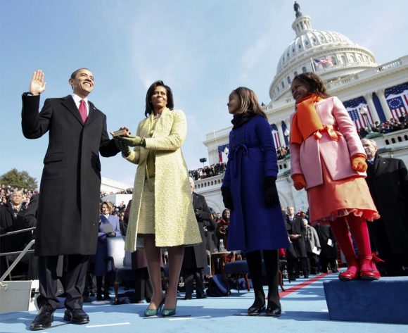
How could I not link to these photos of Obama’s Inauguration posted yesterday on The Big Picture? For some reason, despite numerous other photos that were better composed or more striking in their angle, I was really moved by photo #23, and stared at it for a good 5 minutes, considering everything that was going through Vertie’s mind at the time.
Big Picture: Inauguration of President Barack Obama
archive.boston.com
Interesting shift in what Apple allows into the App Store. Previously, some assumed 3rd-party apps that provided duplicate functionality to the core iPhone apps weren’t allowed. Though somewhere, one of the sources I saw about this story noted that each of the approved browsers are based on WebKit. So that premise may exclude Opera or Firefox from ever appearing in the App Store.
Apple Allows 3rd Party Web Browsers into App Store
macrumors.comAn extension for Dreamweaver that validates HTML/CSS, verifies microformats usage, and checks other nuances of standardista fare. It’s actually branded with the name of The King (of WebStandards).
Jeffrey Zeldman’s Web Standards Advisor
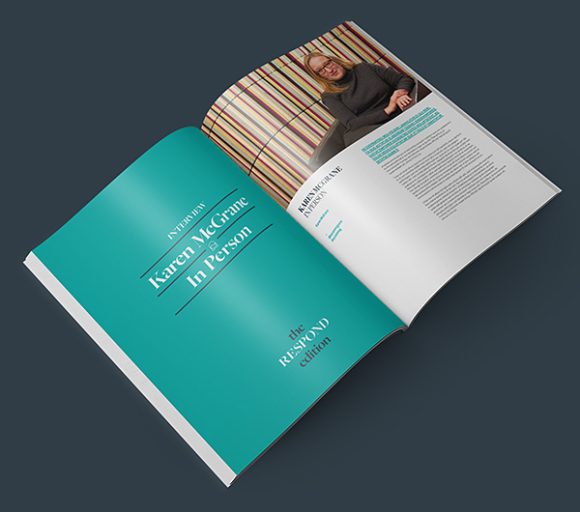
zeldman.comThe full text of articles in John Allsopp and Maxine Sherrin’s first issue of Scroll Magazine is now online. Includes pieces by Indi Young, Aaron Gustafson, Joe Clark, Ethan Marcotte, Veerle Pieters, and Jeff Veen.
Articles from Scroll #1 online
webdirections.orgOnce again, beautiful work by Jon Hicks on icons for FontExplorer Pro. Plus a look at the sketches and process he went through to arrive at the final results.
FontExplorer Pro icons
hicks.designJohn lays down the criticism on they way the W3C is approaching HTML5. He (rightly, IMO) argues that adding new elements is not the way to make HTML5 backwards nor forwards compatible. Toward the end of the article, he suggests that adding new attributes might achieve both goals. Seems logical to me.
Semantics in HTML 5
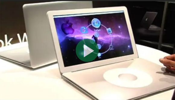
alistapart.comApple introduces revolutionary new laptop with no keyboard. My favorite quotes:
Just press both sides of the wheel concurrently, and center-click, and there, you have an alphabetical listing of every file on your hard drive. Everything is just a few hundred clicks away…
and
I like how the email automatically says ‘Sent from MacBook Wheel.’ That way people know you have one.
The MacBook Wheel
theonion.comNo optician required. (via Jason Fried)
Brilliant water-based eyeglasses for the masses
core77.comBookmarking this late. But an interesting perspective into Jason Santa Maria’s simple system for creating the dynamic layouts of his recent entries.
Making Modular Layout Systems
24ways.orgEric goes into detail on why he chose HTML5 for the AEA site, and what some of the differences are compared to what we already know.
An Event Apart and HTML 5
meyerweb.comJeffrey Zeldman details the design of the new AEA site.
An Event Apart redesigned
zeldman.comJared lays out more defense for why breadcrumbs are a cop-out.
More on Breadcrumbs as a Design Cop-Out
archive.uie.comWe’re recommending that when teams see users needing breadcrumbs, they look for other holistic design solutions. They’ll need to watch users and see the circumstances leading up to how the need arises. In almost all cases, they’ll find a better way to solve the problem than traditional breadcrumbs.
Design Cop-out #2: Breadcrumbs
articles.uie.comA good UI should fade away, putting content in the front seat — it should be transparent.
A Beautiful UI is Not Always the Best UI
usabilitypost.comStart Conference
Been thinking of starting a company? Maybe started one recently? Or just have entrepreneurial tendencies in your blood? Check out Start. Friends and colleagues, Jeffrey Veen and Bryan Mason, are hosting a one-day conference in San Francisco on August 7 “for smart, talented Web people to take hold of their ideas, follow their dreams, and start their own companies.” ~100 words
Choosing the right tool
It’s rare these days that something pulls me out of the woodwork to write something here on Stopdesign. A few recent posts by Jason and David at 37signals (Why we skip Photoshop and Web designers should do their own HTML/CSS, respectively) got me thinking though. This post began as a response on an email thread at work. I’m expanding it here to a wider audience. ~1,000 words
Respect! at SXSW
Though I’m a little leery of the massive size of SXSW this year, I’m really looking forward to seeing and catching up with friends new and old (and meeting a few more) in Austin later this week. It’s that time of year, when geeks from all over the Web physically converge in central Texas, fight for the last few available hotel rooms, and elbow their way to a
choiceseat at any of over 150 Interactive panels. ~200 wordsxScope 2
Simply put, xScope is a back-pocket, time-saving utility for designers and developers created by designers who understand the nature of working on screen. I haven’t written much about the software I use. But once in a while I come across something that’s so useful, I’m compelled to spread the word a little further. And the latest update of xScope to v2.0 adds some really nice enhancements worth drawing me out of hibernation. ~500 words
At the SXSW Google booth
If you’ve ever wondered what it’s like to work for and at Google, or are interested in Google products… Or if we know each other but haven’t had a chance to catch up yet here in Austin–or even if you and I don’t know each other–and you’d like to chat for a bit, just a quick note here to encourage you to come by the Google booth here at SXSW (on the trade show floor, toward the far-right side). I’m scheduled to be in the booth area from noon until about 2pm both today (Monday) and tomorrow (Tuesday). ~200 words
SXSWi Calendar for all
So a few of my fellow Google UXers and I will be at SXSW this year. We thought it odd that we couldn’t find a calendar that aggregated all the sessions, panels, and parties of SXSW in one place, in a traditional calendar-like view… And that’s where I started thinking. Let’s suck all that SXSW Interactive event data into Google Calendar, get all the relevant details entered for as many events as we can and in the right fields, then share the calendar with each other. Or better yet, let’s just make the whole calendar publicly available to anyone who wants it. So a few of us got together and did just that. ~500 words
Inside view
A little over a month ago, just before Web Directions North, John Allsopp asked me a few questions over email about what I’ve been thinking and doing lately. Digital Web Magazine was kind enough to publish the exchange between us. A few friends have emailed me, having discovered the interview by other means, asking why they never saw mention of it here. Somehow, amid preperations for the conference, then ultimately, my back injury and cancelled appearance, I never got around to mentioning the interview. ~100 words
Insult to injury
Last week was supposed to be a big week for me. As John Allsopp put it, I had been lured out of a self-imposed retirement from speaking, and was scheduled to appear at Web Directions North in Vancouver. I was really looking forward to speaking again, along with seeing old friends, making new ones, and the general camaraderie experienced at events like that. ~400 words
Not so Heavenly
Last weekend, Cam and I drove up to South Lake Tahoe for a couple days of snowboarding and escape. Tahoe is too far from us for a one-day there-and-back trip. But it’s close enough (~4 hour drive, sans traffic) for a weekend getaway. It was Cam’s first attempt at boarding. I say, she did remarkably well given her lack of any prior experience skateboarding or surfing. ~300 words
Swing low
Getting back into the swing of writing regularly here never really happened in 2006. When I look back at my archives, I see I only posted 11 times the entire year. And that includes three posts (1, 2, 3) that weren’t really writing-based, as much as they were simple design and code experiments. ~400 words
Going to Google
The cat’s out of the bag. I made the announcement here in New Zealand at Webstock, so I’ll confirm that, yes, the rumors are not just rumors. After a bit of negotiation and a lot of internal debate, I recently… ~300 words
Webstocking in NZ
Until the past few days, you might not have imagined how a small, isolated country somewhere in the South Pacific could have such a significant impact on the Web. We’re early on in the second day of Webstock, a web conference, shaking down in Wellington, New Zealand. And what a conference it is. ~600 words
Google Calendar tips
Since I’ve been an early user of Google Calendar for a few months now, thought I’d share a few tips that may make the jump a little smoother for others. Some tips may seem obvious, other tips may be completely new to you. Specifically, I’ve noticed hesitation by Mac users in trying Google Calendar, which I’ll address in a few Mac-only tips sprinkled in with the rest. ~2,300 words
Google's new dating game
The online calendar space just got a lot more interesting. Create, search, find, discuss, and invite anyone to all kinds of events. Keep your own schedule privately organized and accessible from anywhere. Or share single events or whole calendars with friends and family, or publish to the world. All with the shiny new beta of Google Calendar. ~300 words
Reserving enough for Uncle Sam
With TaxDay in the U.S. rapidly approaching, thought I’d share a small tip for anyone who recently went out on their own to freelance or start a business, or is thinking about doing so. This won’t apply to everyone. And… ~400 words
Mac app: High Priority
Every once in a while, an application/utility comes along that hits a sweet spot. Something for which I’ve been looking, but haven’t been able to find. I’m a list-maker. Especially to-do lists. For more than a year, I’ve been wanting a simple to-do list manager that I can call up from the Mac OS X menu bar. Something simple, light-weight, nicely designed, and above all else, reads and writes to pre-existing data in iCal. ~600 words
Fours
Cameron Adams thinks I need an excuse for a blog entry. As if three months off dried me up. (He also apparently thinks Eric could actually throw down enough to do any damage. Punk.) ~300 words
Returning from a hiatus
So what do I write about when it’s been over three months since my last entry? When I intentionally haven’t opened up my feed reader in over two months. When casual readers start to notice a lack of updates, and add comments or send emails asking, “is everything is OK?” When Aussies are still asking if I need more Tim Tams? ~600 words
Wired redesign turns 3
Silently, and with no fanfare, the Wired News redesign of 2002 turned 3 years old a few days ago. I had to search my own site and find the entry to confirm the date. I almost let it slip by without even thinking about it. ~600 words
Tasty Tim Tams
I acquired a taste for them a year ago when I visited Australia for the first time. John and Sara had a pack of them at their place when Dave, Joe, and I stopped by for a barbie one night after Web Essentials 2004 was over. ~500 words
Web Essentials 2005
Inspirational, energetic, insightful, encouraging. That’s how I’d describe the Web Essentials conference in Sydney, Australia last week. An excellent crowd filled with so many wonderful people. It seems the WE05 team is on to something very successful. Going through the list of other talented presenters for this year, I’m still wondering why they invited me back on stage this year… ~500 words
Photon open sourced
The inner-workings for a clever little plugin named Photon that enables photo export from iPhoto directly to Movable Type and other publishing tools (to create photo galleries like this) are now available for anyone to explore and build upon. Jonathan Younger, who originally created the plugin, doesn’t have enough time to dedicate for updating and expanding the plugin. So he generously released Photon’s source code under the GNU Lesser General Public License so that others could continue evolving it. ~100 words
Photo Gallery Templates available
Since describing and pointing to my photo galleries back in January this year, I received lots of positive feedback, requests for the templates, and questions asking when they’d be available. Since the galleries are a personal, non-paying hobby, they took a back seat to other more pressing projects. In my spare time for the past several months, I made lots of additions and tweaks to the gallery pages. Meanwhile, I also started generalizing the templates, keeping in mind that I might eventually make them publicly available some day. That day has finally come. ~1,100 words
Speaking and wifi at events
Jeff Veen had some interesting thoughts last night on speaking at events where access to wifi might be a potential distraction to the audience and the speaker: Is anyone listening? WiFi and the new ADD. I’ve had similar thoughts at recent conferences. ~900 words
Still throwing tables
On the one year anniversary of the article: Throwing Tables Out the Window, I thought it appropriate to reveal some behind-the-scenes info regarding the Microsoft example discussed in the article. ~700 words
Web Essentials 2.0
Somehow, I managed to finagle my way onto the program for Web Essentials 05 in Sydney as one of the presenters again this year. The WE team just decided to extend early bird registration pricing until Monday, 4 July, so there’s still time to act before the cost goes up. ~400 words
Zoom layout
In a presentation for @media entitled, Zoom the Web, Joe Clark revealed and explained several possible options (a new trend, hopefully) for making sites more accessible and readable for low-vision users. In the continuing effort to make our sites accessible as possible, many have assumed accessibility best practices deal primarily with blind people who often use screen readers. ~1,400 words
Touring London
I returned to London from Copenhagen one day before flying back to San Francisco, and got my second chance to explore the city. A half day still isn’t much time to see all London has to offer. But a tour around London on the top deck of the sightseeing busses at least gave me a good feel for what the parts of the city are like. ~700 words
@media 2005
On my way home now, I can finally sit down in one place long enough to recap the experience in London around @media 2005. My gratitude to Patrick Griffiths for inviting me to speak at the event, and my admiration as well for pulling off a fun, fluid, very professional conference. ~800 words
Disney signage
A couple weeks ago, my girlfriend and I flew to Orlando, Florida to spend some time with my father. Since he works for Disney, we took a day and hopped through a few of the parks for free. My souvenir is a photo gallery of some of the type and signage throughout Magic Kingdom. ~300 words
London and Copenhagen
Just arrived in London. I decided to fly in a few days early, before the flurry of activity later this week. For me, the end of this week will bring an intense set of speaking engagements, tightly packed together. Two overlapping conferences in two cities over three days. ~400 words
Capgemini redesign
Stopdesign proudly announces the new design for Capgemini, a global leader in consulting and technology with headquarters in Paris, and regional operations throughout Europe, North America, and Asia Pacific. Stopdesign worked with Happy Cog Studios and Capgemini’s corporate web team to redesign the site of this worldwide consultancy, showcasing how Capgemini collaborates with each of their clients as partners, working with them to meet unique requirements. ~200 words


