Designing a conference
For the past few years, I’ve been working behind the scenes, supporting a small conference series named FLOCK. Over that time, I’ve learned a lot about what goes into pulling off these conference-type events. ~900 words

For the past few years, I’ve been working behind the scenes, supporting a small conference series named FLOCK. Over that time, I’ve learned a lot about what goes into pulling off these conference-type events. ~900 words

To Twitter friends… Thanks for the introductions, the conversations, the questions, and the answers. For teaching us about brevity, prodding us to be thoughtful, reminding us to be more inclusive, asking us to be generous, encouraging us to be deliberate. ~300 words
Twenty years ago today, Wired launched a seminal redesign of its website that helped catapult forward web technology and what our industry understood as possible for commercial websites. ~1,700 words

Since its inception, our generation has struggled to pin down an answer to the question, “What is Twitter?” I’ve seen attempts at describing Twitter as microblogging, a messaging platform, a broadcasting tool, a social network, an information network, an interest… ~1,300 words

We’re expanding the Twitter Design Studio. Whether you’ve ever thought about working at Twitter or not, think about it now. We have a few open spots that we’re looking to fill in the next couple months. ~700 words

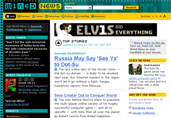
Ten years ago today, we pulled back the curtains on a redesign of Wired.com. The actual design and the code that rendered it are long gone. But they were significant in their time. The redesign of Wired News in 2002… ~500 words
Starting today you’ll begin to notice a simplified Twitter bird. From now on, this bird will be the universally recognizable symbol of Twitter. ~200 words
https://twitter.com/stop/statuses/144894330967035906…
Merlin writes so beautifully.
And, although I’m confident that I will always think my daughter is The Greatest Thing in the Universe, I’m also all too aware that this feeling will not always be reciprocated in quite that same way or with quite that same enthusiasm that we both enjoy right now.
She won’t always run to my bed in footie jammies.
I’ll only get that particularly noisy and personalized wake-up call for a little while. And, I only get a shot at it once a day. At almost exactly 6:00 AM Pacific Time.
Then one day? I won’t get it any more. It will be gone.
Simple is not easy.— Doug Bowman (@stop) March 30, 2011…
Those of you who saw my talks at either Future of Web Design in NYC, or at Webstock in Wellington may remember a segment where I urged delivering value as quickly as possible. In that segment, I compared the act of taking and sharing a photo with Hipstamatic, and the same in Instagram. I posited that one of the biggest reasons for Instagram’s runaway success is how quickly you can snap a photo, apply a filter, and share it with the world. It delivers value in three short steps, and it’s fun.
You have to explain everything you do, and people have to understand it, within seconds. […] In the mobile context, you need to explain what you do in 30 seconds or less because people move on to the next shiny object. There are so many apps and people are vying for your attention on the go. It’s the one context in which you’ve got lots and lots of other stuff going on. You’re not sitting in front of a computer; you’re at a bus stop or in a meeting.
Go, Ari.
In December, he [Ari Ne’eman] was nominated by President Obama to the National Council on Disability (NCD), a panel that advises the President and Congress on ways of reforming health care, schools, support services and employment policy to make society more equitable for people with all forms of disability.
And Ari’s open call to those of us who work in technology:
If we put one-tenth of the money currently spent on looking for causes and cures into developing technologies that enable autistic people with speech challenges to communicate more easily — so-called augmentative and alternative communication [AAC] — we’d have a vast improvement in the quality of life for autistic people and their family members.

Ryan Singer on the power of hover states and non-tablet computers:
But to the geeky or trained, the desktop is a fount of power and speed. Documents are side by side, text flies from here to there, IMs are answered and dismissed, mockups reloaded, batches processed, all with tiny movements of the fingers. For those of us who work all day on computers, touch interfaces are not an impending disruption.
Khoi Vinh on Apple’s lack of full commitment to excellent typography, despite creating oft-superior devices seemingly capable of perfection:
Steve Jobs’ vision for Apple, repeated in yesterday’s keynote address, posits that the company operates at the intersection between technology and the liberal arts. I think it’s reasonable to regard fine typography as falling within that mandate, but unfortunately, they are falling short of that promise. Building a great display for typography without building great typographic tools is a dereliction of duty.
Good article on attention spans and what’s affecting them.
As any experienced meditator knows, the mind has a mind of its own. Left free to wander, that’s just what it will do. When we manage the infinite demands on our attention by trying to juggle them all, we literally weaken our capacity for absorbed focus.

Love what creative minds are producing, no Flash required.
Ethan’s “Responsive Web Design” is an eloquently worded, logical evolution of modern, responsible web design.
Brand New notes the new Google logo. This change was years in the making. We proposed similar changes in 2007.
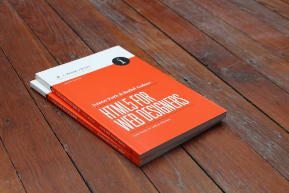
Started reading an advance copy of HTML5 for Web Designers. As with previous works by @adactio, it’s clear and concise.
I’m seeing lots of other folks building out their own archive. In the interest of providing a rough starting point, I’m making the WP theme files for my tweet archive available here. ~200 words
A year ago, today, I joined a small startup with a penchant for brevity. Many of my friends were using it. My mom had only heard mentions of it. I noted some risk, but saw greater reward. Variables were undefined.… ~200 words
In the past, I’ve wanted to browse or search through my own tweets. Viewing my Twitter profile is one way to do that. But if I want to browse back through history, it’s a chore to go back very far.… ~700 words
Though this may not completely eliminate liability if a publisher or artist rewraps a whole series of your tweets in a different shell, Zeldman makes an interesting point on the limitations of copyright in regards to short phrases (i.e. tweets):
As messages sent via Twitter cannot be longer than 140 characters, they cannot be copyrighted. However original, witty, or profound they may be, nothing more than good manners protects your original expression of authorship. If you wish to let other people quote or use your Tweets, you need not “license” them; indeed, technically, you cannot license them, since they are in the public domain the instant you publish them.
Carlos Bueno highlights an oft overlooked aspect of internationalization. His address book auto-complete example at the beginning of the article crystalized the problem for me immediately. The solution he discusses for a fuzzy character match dubbed accent folding seems logical, especially in certain contexts. Beyond those contexts, the problem of transliteration gets complicated quickly.
Smashing Magazine rounds up a few tricks for “CSS Layouts, Visual Effects and Forms”. Not everything in here looks useful to me, but I did notice a few gems while quickly browsing through. Bookmarked for later investigation.
A fairly thorough retrospective of Google and the huge impact the company had over the past year. Check out the list of releases and new ideas Google pushed in 2009. Impressive and scary at the same time. I wish the little blip about me leaving earlier this year weren’t present, though I’ll admit that’s how I found this article. This paragraph toward the end sums it up best:
Google in late 2009 is now covering or aiming to cover web apps, the browser that runs the web apps, the OS that runs the browser, and, according to rumors, even the computer that runs the OS.
Helping Adactio get that perfect pitch. To nail it, even. You should probably link to his page too, if you’re so inclined to fight DMCA take-downs for the sake of SEO.
I agree. Time for the end of bottom-posting arguments.
You’re encouraging the random and random is how you’re going to win. Random is how you’re going to discover a path through a problem that no one else has found and that starts with breathing deeply.
Even though the subject matter and approach differs, this pairs nicely with an article on A List Apart last week: Burnout, by Scott Boms.
Your life should be just that—a life
Good words, all around.
Emphasis is my own…
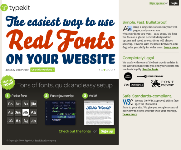
As a Typekit user, you’ll have access to our library of high-quality fonts. Just add a line of JavaScript to your markup, tell us what fonts you want to use, and then craft your pages the way you always have. Except now you’ll be able to use real fonts. This really is going to change web design.
Also worth checking out, Jeff posted a preview of the Typekit home page yesterday. Looking forward to how this will change typography and design for the web.
Mr. Clarke advocates creating one single universal style sheet to handle all styling in IE6, and to stop worrying about making content in IE6 look anything like the high-end experience.
I’m now advocating to my clients (and to you), that where feasible, not to waste hours in time and a client’s money on lengthy workarounds in an unnecessary attempt at cross-browser perfection. Instead, you and I should provide simple but effectively designed HTML elements. This means just great typography for headings, paragraphs, quotations, lists, tables and forms and no styling of layout.
This will work well for content-focused web sites. And then maybe it’s officially time to completely drop support of IE6 for web apps.
Interesting take on the future of Wired (mag vs. website).
Wired is great print, but if the magazine can’t make money and is shuttered, taking the website down with it, I’m going to be livid. Not that making money online is easy—it’s not, especially without sacrificing your ethics and your voice—but if any mainstream outlet should be able to make the transition, it should be Wired.
I fear that may be impossible, not just for Wired but for all these old brands, because they can’t accept that the work at which they have excelled for years will be just as important when it’s online—and online only.
Reading though the comments provides an even more interesting story and a broader perspective. Comments by several former and current Wiredlings, including a few responses by Chris Anderson who passes blame to corporate (Conde Nast) decision-making.
The best design is that which does its job and stays out of the way. Jared Spool on invisible design:
While all these things are what the designers at Netflix work hard on every day, they go unmentioned by their customers. It’s not because these aspects aren’t important. It’s because the designers have done their job really well: they’ve made them invisible.
Craig directed me to this piece today after I complimented him on the new version of Twitterrific for the iPhone, stating how much I love seeing different approaches to Twitter client design. I hadn’t seen his post (from December 2008) before today, but it’s a good read that gives insight into some of the decisions behind Twitteriffic’s design that are still applicable now.
Personally, I welcome this competition. Seeing the work of other developers whose work I respect and admire acts as an inspiration. Looking at how other developers tackle a problem domain often adds insight into solving similar issues with my own code. In other cases, it shows me how I don’t want to implement a feature (without the need to prototype.) In short, competition will make Twitterrific better.
Cameron asks the inevitable question about width on the Web. Probably not time yet for mainstream. But for showcases of design, why not start experimenting with the new real estate?
Stephen Anderson:
The more we learn about people, and how our brains process information, the more we learn the truth of that phrase: form and function aren’t separate items. If we believe that style somehow exists independent of functionality, that we can treat aesthetics and function as two separate pieces, then we ignore the evidence that beauty is much more than decoration. Our brains can’t help but agree.
Can’t say that I agree with all the examples he used. But important points that stand on their own, nonetheless.
Nice going, Ethan. Definitely one to keep in the ol’ bag o’ tricks.
Interesting comparison (my own) of packaging for Apple notebooks. I’ve been noticing a trend over the last few years to cut way down on box size for both hardware and software. But I still think it’s interesting to see side-by-side… ~200 words
Andy Baio digs into the reuse of certain content by AllThingsD for their Voices section:
Ultimately, if authors are happy, there’s no problem. But it seems like there’s a divide between two types of writers online: unaffiliated independent bloggers running their own sites and bloggers employed by larger online magazines.
Also, be sure to read the related response from Anil Dash about how the Associated Press plans to handle a similar reuse of content:
If the Associated Press made its argument on the basis of credibility and reputation, transparency and accountability, as the web-native publishers have, it would be far easier to defend their desire to share in the business model developed by the aggregators.
Part 2 of 2 (here’s Part 1) Yesterday was my first day at Twitter. Yes, it’s true. After reading a bit of speculation over the past few weeks, I’ll confirm here that I am, indeed, joining Twitter. I don’t… ~500 words
Part 1 of 2 (here’s Part 2) Today is my last day at Google. I started working in-house at Google almost three years ago. I built a team from scratch. I was fortunate to hire a team of… ~600 words
I love this in-depth look at implementing grids for liquid layouts. Ethan goes into detail just how it all fits together, and the magic formula needed to make it all work. Now if we could just have the ability to easily scale images inside a liquid layout (without resorting to clipping background images), we’d be golden (pun intended).
Eric Meyer elaborates on why we need a better layout mechanism for web content (whether it be via CSS or not). We know we shouldn’t use tables for layout. Floats are a hack, positioning is flawed, and display:table-cell is no better than using a table itself. But Eric explains here why table behavior works moderately well for layout:
… this is why the old “only use tables for layout” argument keeps coming up over and over: strip away the overheated rhetoric and obvious link-baiting, and you find the core of a real need. Because as powerful as CSS can be, table cells do certain things very easily that CSS makes very, very hard. Cells stretch vertically, keeping equal heights as a matter of their intrinsic nature. They stay out of each others’ way, while still being allowed to sit next to each other and use any sizing dimensions. They tie their layout to their parent elements, and vice versa.
There are a few WordPress plugins that help me publish this site as I want it. Here are a few of the key plugins I currently use on Stopdesign.… ~400 words
I know traffic here is far from representative of the rest of the web. Regardless, I see an interesting trend developing. The numbers are drastic enough, I wonder if they prove the trend extends beyond the focus of Stopdesign and… ~300 words
Paul Boag lays it down. A must read.
You need to take control of the design process. It’s your site and you should get the design you want. The role of the designer is to implement your idea. Do not allow him to drag you down into endless discussions about ‘users needs’, ‘accessibility’ and ‘usability’. These are all distractions from the primary aim – to impress your boss and earn that next promotion.
Ok, I’ll admit, it took me reading past the first point to calm down and avoid jumping through the screen to grab Paul’s throat.
If Twitter existed in 1937, and farmgirls had web access, this is how we would see one teen girl’s account of daily life during the Depression. Fascinating in a strange, time-travel kind of way. Here’s the back story and a few answers to FAQs from David Griner, the great nephew, who is maintaining the account. (via Biz)
Until some future version of HTML gives us new native controls to use in a browser, at Google, we’ve been playing and experimenting with controls we call “custom buttons” in our apps (among other custom controls). These buttons just launched… ~1,800 words
Beautiful (and scary at the same time) visualization of the growth of Walmart from 1962 through 2007. It’s like a virus that spreads across our country. Compare the Walmart viz with another Nathan just posted for Target today. From Nathan’s post describing the Target work:
You might guess that Target and Walmart expanded similarly (I did, at least), but you’d be wrong. Both started in Central United States, and both were officially founded in 1962 by two men who both owned stores under a different name before the Target and Walmart boom. However, besides more rapid growth, Walmart first expanded outwards from its home state before going country-wide while Target seems to have gone wherever opportunity knocked…
Truth as I know it: this design would not be what it is — nor would I be the designer I am nor care as much about what I do — without the inspiration, critiques, guidance, mentorship, contributions, camaraderie, encouragement,… ~600 words